Everyone thinks annual report design is just about making numbers look pretty. Fill a PDF with charts and call it a day. None of that is wrong. But it’s incomplete.
The hard truth? A great annual report is a powerful marketing tool. It’s your chance to tell your company’s story, build trust, and connect with investors, employees, and customers on a deeper level. It’s about strategic communication disguised as a financial document.
1. The Strategic Foundation: Why Are You Doing This?
Defining Objectives
Before a single pixel is placed, you need to know *why* this report exists. Is it purely for regulatory compliance? Or is it a key piece of investor relations collateral? Are you trying to attract new talent or showcase social responsibility?
Each objective shapes the design and content strategy. A compliance-focused report might be leaner and more data-heavy. A brand-building report needs more narrative and visual flair.
Understanding Your Audience
Who are you talking to? Investors? Employees? The general public? What are their priorities? What’s their level of financial literacy?
Tailor your language, tone, and visual complexity to resonate with your primary audience. Don’t bore your investors with HR updates, and don’t overwhelm your employees with complex market analysis.
Content is King (Still)
Great design can’t save bad content. Annual reports need:
- Clear financial statements.
- Compelling narrative summaries.
- Key performance indicators (KPIs).
- Strategic outlooks.
- Stories of impact (social, environmental, human).
- Leadership messages.
Work with your finance, marketing, and communications teams early. The content dictates the design, not the other way around.
2. The Creative Execution: Making Data Engaging
Visual Hierarchy and Flow
An annual report is dense. Good design guides the reader’s eye. Use clear headings, subheadings, and white space to break up text and create logical sections.
Think about the journey. Where should the reader start? What’s the most important information they need to see first?
Data Visualization Done Right
Charts and graphs are essential, but they can be boring or misleading if done poorly. Focus on clarity and accuracy.
- Choose the right chart type for your data (bar charts for comparison, line charts for trends, pie charts for proportions).
- Use color strategically to highlight key data points, not just for decoration.
- Label axes clearly and provide context.
- Avoid 3D charts – they often distort data.
The goal is to make complex information instantly understandable. Check out resources like Nieman Lab's guide for best practices.
Brand Consistency
This is a reflection of your entire organization. Every page should feel like it belongs to your brand.
- Use your brand colors, typography, and logo consistently.
- Maintain your brand’s tone of voice throughout the narrative.
- Ensure photography and illustrations align with your brand aesthetic.
This isn't just about aesthetics; it's about reinforcing brand identity and trust.
Typography Matters
Font choices impact readability and brand perception. Select fonts that are:
- Legible at various sizes.
- Consistent with your brand identity.
- Used purposefully – hierarchy through size, weight, and style.
Don’t overdo it. Two or three font families are usually plenty.
3. Design Elements That Elevate
Photography and Illustration
Beyond stock photos. Use high-quality, authentic imagery that tells your company’s story. Show your people, your work, your impact.
Illustrations can simplify complex ideas or add a unique visual layer. Ensure they are on-brand and serve a purpose.
Infographics
Great for distilling key stats or processes into easily digestible visuals. They break up text and make information more memorable.
Layout and Grid Systems
A well-structured grid ensures consistency and order. It makes the design feel professional and intentional. Most design software has built-in grid tools to help.
White Space
Often overlooked, white space (or negative space) is crucial. It reduces clutter, improves readability, and gives your design breathing room. Don’t be afraid of empty space.
4. Production and Distribution
Print vs. Digital
Will it be printed, digital, or both? This decision impacts design choices. Print requires different considerations for color (CMYK), bleed, and resolution than digital (RGB).
Interactive PDFs can offer embedded links, videos, and navigation, enhancing the digital experience. Consider accessibility standards (WCAG) for digital versions.
File Formats
PDF is standard for print and digital distribution. Ensure it’s optimized for size without sacrificing quality. For web, consider high-resolution JPEGs or PNGs for individual graphics.
Distribution Strategy
How will people access it? Your website? Email campaigns? Investor portals? The design and file format should support your distribution plan.
Where Revue Fits In
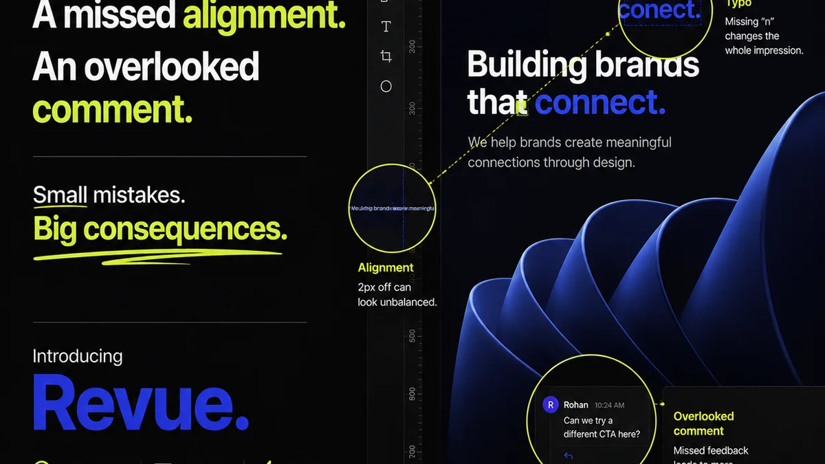
Managing the annual report process involves countless stakeholders, feedback rounds, and approvals. It’s a complex project with high stakes.
Revue streamlines this workflow. Instead of endless email chains and scattered feedback, you get:
- Centralized Feedback: All stakeholder comments and markups live in one place, directly on the design assets. No more digging through inboxes.
- Revision Visibility: Track every change, who made it, and when. See the full revision history at a glance.
- Clear Approvals: Formalize the sign-off process. Know exactly when a design is approved and ready for the next stage, reducing bottlenecks.
- Quality Assurance: Ensure all feedback is addressed and approved before final output, minimizing errors in the final report.
This clarity and control are essential for delivering a polished, professional annual report on time.
Final Thought
An annual report is more than a compliance exercise; it’s a narrative opportunity. It’s your chance to articulate your vision, demonstrate your value, and solidify your brand’s position. Are you treating it as the strategic asset it is?
Frequently asked questions
What are the key elements of an effective annual report design?
An effective annual report design balances strategic communication with engaging visuals. Key elements include clear objectives, audience understanding, compelling content, strong visual hierarchy, accurate data visualization, consistent branding, legible typography, and high-quality imagery or illustrations.
How can I make financial data more engaging in an annual report?
Use clear and appropriate data visualizations like bar charts, line graphs, and pie charts. Ensure labels are clear, and use color strategically to highlight key information. Infographics can also simplify complex data or processes. Focus on telling a story with the numbers.
What's the difference between print and digital annual report design considerations?
For print, consider CMYK color modes, bleed, resolution for physical output, and paper stock. For digital, focus on RGB color, file optimization for web loading times, interactivity (links, videos), and accessibility standards (WCAG) for broader reach.
How does feedback management impact annual report design projects?
Unmanaged feedback leads to confusion, missed revisions, and delays. Centralizing feedback on a single platform, tracking revisions, and formalizing approvals ensures clarity, efficiency, and a higher quality final product, minimizing errors and stakeholder frustration.