Everyone’s talking about the latest annual report design trends for 2026. Shiny new aesthetics, interactive elements, and AI-generated visuals are all the rage. None of that is wrong. But it’s incomplete.
The hard truth? True impact in annual report design isn't about chasing the next visual gimmick. It's about strategic communication. It's about making complex data accessible, building trust, and driving action. That’s what actually matters to shareholders, stakeholders, and the bottom line.
1. Data Storytelling Over Data Dumps
Annual reports are inherently data-heavy. The trend isn't just to present data, but to weave it into a compelling narrative. Think less spreadsheet, more story.
From Static Charts to Dynamic Insights
Static bar charts and pie graphs have their place, but they rarely tell the whole story. The focus in 2026 is on visualizations that reveal relationships, highlight trends, and answer the 'so what?' question immediately.
- Contextualized Infographics: Visuals that explain the 'why' behind the numbers.
- Interactive Dashboards (for digital): Allowing users to explore data relevant to them.
- Comparative Visuals: Showing performance against goals, past periods, or industry benchmarks.
- Key Metric Callouts: Big, bold highlights of the most critical KPIs.
This shift demands a closer collaboration between designers and financial analysts or content strategists. The designer needs to understand the core message the data supports.
The Human Element in Financials
Even the driest financial data can be humanized. Connect the numbers to real-world impact, company values, or future vision.
Instead of just showing revenue growth, show what that growth enabled: new jobs, community investment, product innovation. This makes the report relatable and memorable.
2. Purpose-Driven Design & ESG Integration
Environmental, Social, and Governance (ESG) reporting is no longer a niche concern; it's a core expectation. Annual report design in 2026 must reflect this integrated approach.
Visualizing Impact, Not Just Profit
ESG metrics need to be presented with the same clarity and visual appeal as financial data. This means finding creative ways to represent social impact, sustainability initiatives, and ethical governance.
- Impact Metrics: Quantifying environmental footprint reduction, diversity statistics, volunteer hours, etc.
- Storytelling Through Photography/Videography: Showcasing people, projects, and positive change.
- Clear Sectioning: Dedicated, easily navigable sections for ESG performance.
- Certifications & Standards: Visually highlighting adherence to recognized ESG frameworks.
The design should feel authentic, not like a tacked-on section. It needs to be woven into the fabric of the report's overall narrative and visual identity.
Authenticity Over Greenwashing
Audiences are savvy. They can spot performative sustainability a mile away. The design must support genuine communication, not just a glossy facade. Use data and visuals that are verifiable and transparent.
3. Accessibility and Inclusivity by Design
Accessibility is moving from an afterthought to a fundamental requirement. An annual report that isn't accessible excludes a significant portion of its audience.
Designing for Everyone
This applies to both print and digital formats. Consider legibility, navigation, and comprehension for users with diverse needs.
- Color Contrast: Ensuring text is readable against backgrounds, adhering to WCAG guidelines.
- Font Choice & Size: Selecting clear, legible fonts and offering adjustable text sizes in digital versions.
- Clear Information Hierarchy: Using headings, subheadings, and whitespace effectively.
- Alt Text for Images: Essential for screen readers in digital reports.
- Logical Navigation: Intuitive menus and internal linking for web-based reports.
Adhering to standards like the Web Content Accessibility Guidelines (WCAG) is crucial. It's not just good practice; it's increasingly a legal requirement.
Inclusive Language and Imagery
Beyond technical accessibility, consider the message. Does the language and imagery used represent a diverse range of people and perspectives? This builds broader trust and relevance.
4. Digital-First, Print-Second Mentality
While print reports still hold prestige, the primary consumption and interaction increasingly happen digitally. Design strategies must reflect this.
Responsive and Engaging Digital Experiences
A PDF dump of a print report onto a website is no longer sufficient. Think about how the report functions as a web experience.
- Mobile Optimization: Ensuring readability and usability on smartphones and tablets.
- Interactive Elements: Clickable links, embedded videos, data visualizations that respond to user input.
- Searchability: Making it easy for users to find specific information.
- Downloadable Sections: Allowing users to grab relevant parts (e.g., ESG summary) without downloading the whole document.
Consider a hub-and-spoke model: a main interactive digital report with downloadable PDFs of the full report and executive summaries. This caters to different user preferences.
Maintaining Brand Consistency
The challenge is to translate the polished feel of print into a dynamic digital format without losing brand integrity. This requires thoughtful UX/UI design, not just a visual conversion.
5. Streamlined Processes for Efficient Design
The best design trends are useless if the production process is a bottleneck. Agencies and in-house teams are increasingly focused on efficiency.
Collaboration is Key
Annual reports involve many stakeholders: finance, legal, marketing, executives, designers, copywriters. Siloed work leads to delays, miscommunication, and subpar results.
- Centralized Feedback: A single source of truth for all comments and revisions.
- Clear Approval Workflows: Defined stages and responsible parties for sign-off.
- Version Control: Easily tracking changes and reverting if necessary.
- Defined Roles & Responsibilities: Clarity on who does what and when.
The pressure to deliver high-quality reports on tight deadlines means operational efficiency is as critical as creative execution.
Leveraging Technology
Tools that facilitate collaboration, automate repetitive tasks, and provide clear visibility into the project status are invaluable.
This isn't about replacing designers with software; it's about augmenting their capabilities and freeing them up to focus on strategic creative work.
Where Revue Fits In
Managing the annual report design process can be complex. Multiple stakeholders, countless feedback rounds, and the need for absolute accuracy create friction.
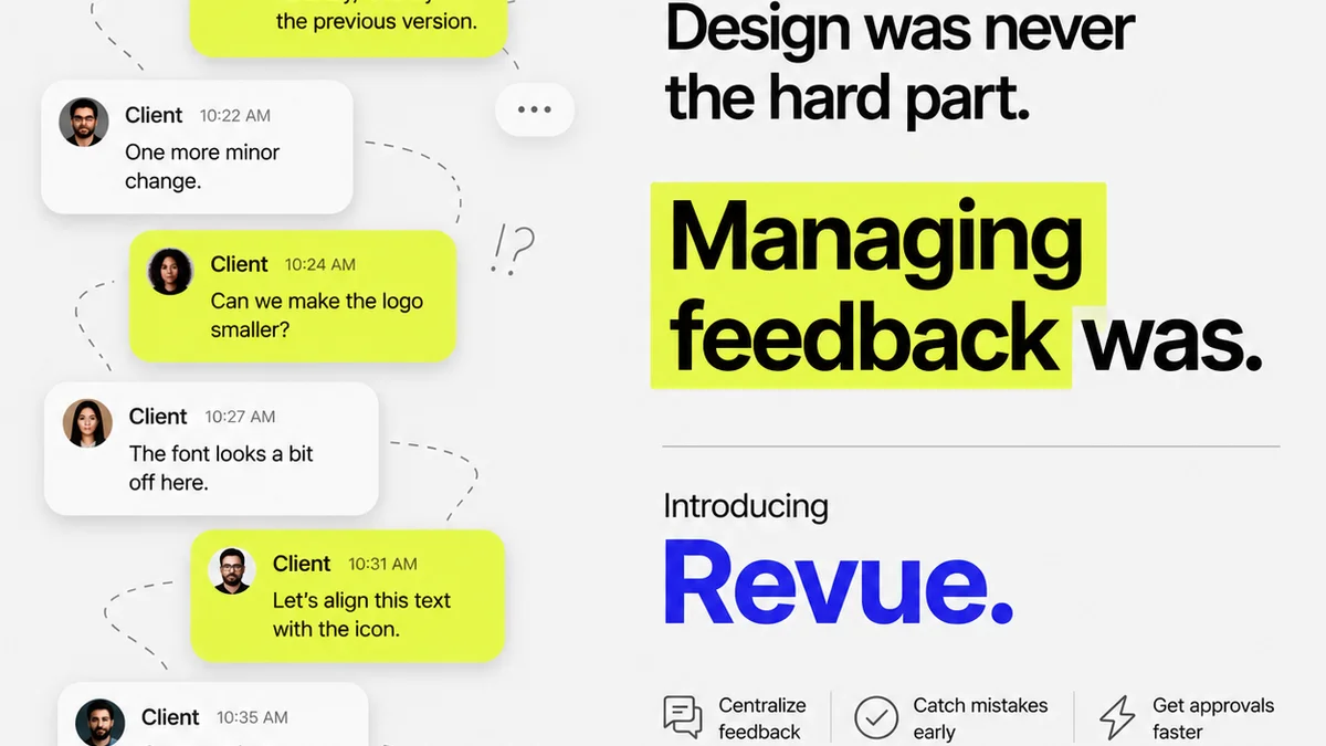
Revue provides a centralized platform designed to streamline this exact workflow. Instead of juggling emails, scattered documents, and endless revision cycles, you can manage client feedback directly on the creative assets.
- Centralized Feedback: All comments, annotations, and discussions happen in one place, linked to specific elements of the design. No more hunting for the latest version or deciphering vague email instructions.
- Revision & Approval Visibility: Track every change, see who approved what, and maintain a clear audit trail. This transparency is crucial for high-stakes projects like annual reports.
- Quality Assurance: Ensure all feedback has been addressed and revisions meet the required standards before final sign-off.
By centralizing communication and simplifying approvals, Revue helps creative teams deliver polished, accurate annual reports more efficiently, reducing stress and improving client satisfaction.
Final Thought
Annual report design in 2026 is a balancing act. It’s about marrying compelling visual storytelling with rigorous data accuracy, embracing digital engagement while respecting print traditions, and ensuring inclusivity and accessibility for all. The most successful reports won't just look good; they will communicate clearly, build trust effectively, and drive the desired actions. Are your design processes built to support this strategic imperative, or are they still stuck in the past?
Frequently asked questions
What are the key differences in annual report design between now and a few years ago?
The biggest shift is from purely aesthetic considerations to a focus on strategic communication. Trends now emphasize data storytelling, integrated ESG reporting, digital-first experiences, and robust accessibility, moving beyond just visual appeal to functional impact and stakeholder engagement.
How important is ESG integration in annual report design for 2026?
It's critical. ESG (Environmental, Social, and Governance) factors are no longer optional add-ons but core components of a company's value and reputation. Design must visually integrate and clearly communicate ESG performance alongside financial data to build trust and meet stakeholder expectations.
What does 'digital-first' mean for annual report design?
It means designing the report primarily for online consumption, focusing on responsiveness, interactivity, searchability, and mobile usability. While a print version might exist, the digital experience is optimized for engagement, often featuring interactive elements and easier navigation than a static PDF.
How can agencies improve their workflow for annual report design?
Streamlining involves centralizing feedback, implementing clear approval processes, using collaborative technology, and ensuring defined roles. Tools that offer a single source of truth for comments and version control, like Revue, significantly reduce friction and improve efficiency.