Everyone thinks great automotive presentations are all about sleek visuals and cutting-edge graphics. That’s what you see in the glossy brochures and the auto shows, right? It’s easy to get lost in the pixels and forget the purpose.
But that’s just the surface. The real power of automotive presentation design isn't in how pretty it looks, but how clearly it communicates complex value and drives action. It’s about operational clarity, not just aesthetic appeal.
1. Beyond Specs: Communicating the Driving Experience
Automotive marketing often leans on horsepower, torque, and fuel efficiency figures. These are important, but they don't sell the *feeling* of driving a car. Your presentation design needs to translate these specs into tangible benefits and emotional connections.
Translating Data into Emotion
Consider the target audience. Are you presenting to potential buyers, dealership owners, or internal stakeholders? The data needs to be framed differently for each.
- For buyers: Translate performance metrics into exhilarating drives, safety features into peace of mind, and tech features into seamless connectivity.
- For dealers: Focus on marketability, profit margins, and customer satisfaction data.
- For internal teams: Highlight innovation, brand positioning, and future roadmap.
The design should visually reinforce these translated benefits. Think dynamic lines that evoke speed, or calming color palettes for safety features.
The Role of Visual Hierarchy
What’s the single most important takeaway from this slide? Your design must make that immediately obvious. Use size, color, and placement to guide the viewer's eye.
Don't make them hunt for the key message. It should be front and center.
2. Brand Consistency: More Than Just a Logo
Automotive brands have decades of heritage and a distinct identity. Presentation design is a critical touchpoint for reinforcing this. It’s not just about slapping the logo on every slide.
Establishing a Visual Language
Every element should feel like it belongs to the brand. This includes:
- Typography: Use brand fonts consistently.
- Color Palette: Stick to primary and secondary brand colors, using them strategically to highlight key information.
- Imagery Style: High-quality, on-brand photography and videography are non-negotiable.
- Iconography: Custom or carefully selected icons that match the brand's aesthetic.
Even the layout and spacing should reflect the brand’s personality – is it bold and aggressive, or refined and elegant?
Avoiding Presentation Pitfalls
Common mistakes include:
- Using generic templates that dilute brand identity.
- Inconsistent application of brand guidelines across different presenters or departments.
- Overcrowding slides with too much text or too many competing visual elements.
A well-defined presentation template is your first line of defense.
3. Storytelling with Data: The Narrative Arc
A presentation is rarely just a collection of facts. It's a story designed to persuade, inform, or excite. In the automotive world, this story often revolves around innovation, performance, and lifestyle.
Structuring Your Narrative
A classic narrative arc works wonders:
- Introduction: Set the stage, introduce the vehicle or concept, and highlight the core problem or opportunity.
- Rising Action: Present the key features, benefits, and supporting data. Build the case.
- Climax: The big reveal, the unique selling proposition, the call to action.
- Falling Action: Address potential concerns, showcase testimonials or case studies.
- Resolution: Summarize the key value and reinforce the desired outcome.
Each slide should serve a purpose in advancing this narrative.
Visualizing the Story
Data visualization is key. Don't just show a table of numbers. Use charts, graphs, and infographics that are easy to understand and visually compelling.
- Bar charts for comparisons.
- Line graphs for trends over time.
- Infographics to explain complex systems (e.g., powertrain, safety tech).
Ensure all data visualizations are clearly labeled and directly support the narrative point being made.
4. User Experience (UX) in Presentation Design
Think of your presentation as a user interface. The audience is 'using' it to consume information. A poor UX leads to frustration and disengagement.
Clarity and Readability
This is fundamental. Text should be legible from a distance. Use sufficient contrast between text and background. Avoid dense blocks of text; break them down into bullet points or short paragraphs.
Consider accessibility standards, even in internal presentations. Tools like WCAG guidelines offer principles that improve readability for everyone.
Navigation and Flow
Slides should transition logically. Use clear titles and section breaks to orient the audience. A consistent design across slides helps users build a mental model of the presentation structure.
Avoid jarring changes in layout or style between slides. Keep it smooth.
5. The Power of Simplicity
In a world saturated with information, simplicity cuts through the noise. Over-designed presentations are often the least effective.
Less is More
Every element on a slide should have a clear purpose. If it doesn't add value or clarity, remove it.
- Minimize text.
- Use high-quality, relevant imagery, not just decorative stock photos.
- Avoid excessive animations or transitions that distract from the message.
Focus on one key idea per slide.
Strategic Use of White Space
White space isn't empty space; it's breathing room. It helps elements stand out, improves readability, and gives the design a clean, professional feel.
Don't feel compelled to fill every inch of the slide.
Where Revue Fits In
Managing the creation and delivery of high-stakes automotive presentations involves multiple stakeholders, countless revisions, and a constant need for quality control. This is where a centralized feedback and approval platform becomes indispensable.
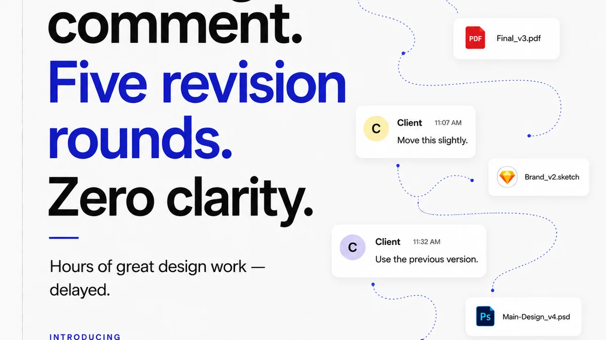
Revue streamlines the entire workflow. Instead of endless email chains and scattered files, all feedback is collected directly on the creative assets. Stakeholders can annotate specific elements, ensuring clarity and reducing misinterpretation.
Revision history is transparent, providing visibility into changes and approvals. This is critical for tracking project progress and ensuring that the final presentation aligns perfectly with brand guidelines and strategic objectives. Quality checks become more efficient when the entire process is managed in one place.
Final Thought
Is your automotive presentation design a tool for clear communication and strategic persuasion, or just a digital brochure? The difference lies in operational discipline, not just creative flair. Are you designing for impact, or just for show?
Frequently asked questions
How can I ensure brand consistency in automotive presentations?
Utilize a consistent visual language including typography, color palette, imagery style, and iconography aligned with brand guidelines. Use pre-approved templates and ensure all presenters adhere to them.
What's the best way to present complex automotive data?
Translate raw data into clear, digestible visuals like charts, graphs, and infographics. Focus on data visualization that tells a story and highlights key benefits rather than just showing numbers.
How does presentation design impact the automotive sales process?
Effective presentation design builds trust, clearly communicates value propositions, and evokes desired emotions, all of which are crucial for persuading buyers and stakeholders in the automotive sector.
What are common mistakes in automotive presentation design?
Common mistakes include using generic templates, inconsistent branding, overcrowding slides with text, poor visual hierarchy, and failing to translate specs into relatable benefits or emotional connections.