You think good B2B SaaS design for telecom marketing is all about slick interfaces and modern aesthetics. None of that is wrong. But it’s incomplete.
The real win? Design that cuts through the complexity of telecom tech and speaks directly to business needs. It’s about clarity, not just coolness.
1. Clarity Over Clutter: The Core of Telecom SaaS Design
Telecom solutions are often intricate. Your marketing design needs to simplify, not amplify, that complexity. Think about the user: a busy IT manager, a CTO, a network administrator. They don't have time for guesswork.
Every visual element, every word, must serve a purpose: to inform, to persuade, to guide.
The Visual Language of Trust
In B2B, especially in a technical field like telecom, trust is paramount. Your design must convey reliability and expertise. This means:
- Consistent branding that aligns with your company’s established identity.
- A color palette that feels professional and stable. Avoid overly trendy or jarring combinations.
- Typography that is highly legible across all devices.
- Clear visual hierarchy that guides the eye to the most important information first.
This isn't about reinventing the wheel. It's about executing foundational design principles with precision.
Information Architecture for the Technical Buyer
Telecom buyers need specific information. Your marketing assets – landing pages, datasheets, case studies – must be structured logically. Think about how they search for solutions.
What are their pain points? What technical specifications are critical? What are the ROI implications?
Design your content to answer these questions proactively. Use clear headings, concise descriptions, and easily scannable layouts.
2. Usability as a Sales Tool
For B2B SaaS, especially in telecom, the product itself is often evaluated based on usability. Your marketing collateral should reflect that same commitment.
If your marketing materials are difficult to navigate or understand, it raises a red flag about the product experience.
Intuitive Navigation and Flow
On any digital asset, users should know where they are and how to get where they want to go. This applies to website pages, interactive demos, and even downloadable PDFs.
- Clear calls-to-action (CTAs) that are obvious and easy to click.
- Logical information grouping.
- Minimal clicks to reach key information or conversion points.
Accessibility Matters (Even in B2B)
While often an afterthought, accessibility is crucial. Your designs need to be usable by everyone, including those with disabilities. This isn't just compliance; it's good business.
Consider WCAG guidelines. Ensure sufficient color contrast, keyboard navigability, and compatibility with screen readers.
A commitment to accessibility signals a thoughtful, user-centric approach that extends to your product.
3. Content and Context: Speaking the Telecom Language
Your design must support your content, not compete with it. In telecom, this means understanding the nuances of the industry and its buyers.
Are you targeting network engineers, CIOs, or procurement managers? Each has a different focus and a different level of technical understanding.
Visualizing Complex Data
Telecom is data-heavy. Charts, graphs, and infographics are essential tools. But they need to be designed for clarity, not just decoration.
- Choose the right chart type for the data you're presenting.
- Label axes clearly.
- Use color strategically to highlight key trends or comparisons.
- Ensure data visualizations are responsive and render well on all screen sizes.
Avoid overwhelming the viewer. Focus on the story the data tells.
Tailoring to the Buyer Journey
A prospect early in their research phase needs different information and a different design approach than someone ready to make a purchase decision.
Top-of-funnel content might be more conceptual, using broader visuals and simpler language. Bottom-of-funnel assets demand detailed specifications, clear pricing structures (if applicable), and strong proof points like case studies.
Your design system should be flexible enough to accommodate these different needs while maintaining brand consistency.
4. Performance and Responsiveness: The Unseen Essentials
A beautiful design that loads slowly or breaks on a mobile device is worse than useless. It’s actively detrimental to your brand perception.
Speed is King
Optimize all visual assets for web performance. Large image files, unoptimized videos, and bloated code can kill conversion rates.
- Compress images without sacrificing quality.
- Use modern image formats like WebP.
- Lazy load images and videos.
- Minify CSS and JavaScript.
Every second saved in load time is a second gained in user engagement.
Mobile-First (or Mobile-Aware)
Many B2B decisions start on mobile. Your designs must look and function flawlessly on smartphones and tablets.
Test your layouts across various devices and screen sizes. Ensure touch targets are large enough and interactive elements are easy to use with a thumb.
5. Where Revue Fits In
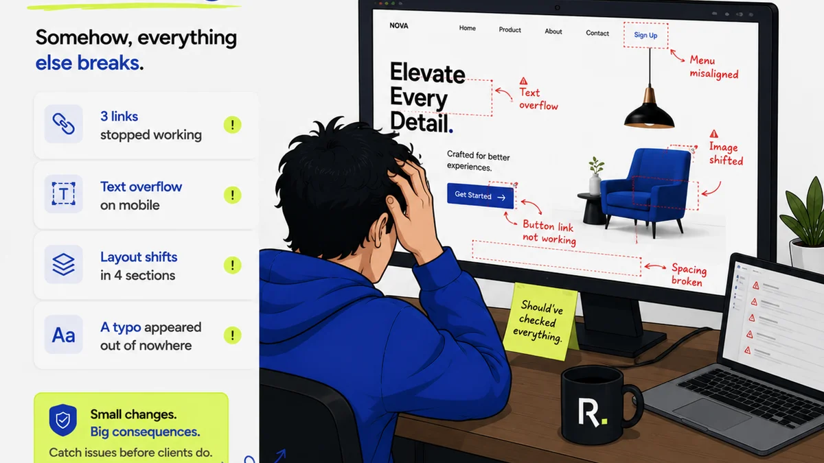
Managing the design process for complex B2B SaaS marketing collateral can be chaotic. Feedback gets lost in email threads, revisions are tracked manually, and approvals can bottleneck the entire workflow.
Revue helps bring order to this chaos. Centralizing client feedback on designs means everyone sees the same comments, in context, on the specific version being reviewed. This eliminates ambiguity and speeds up revision cycles.
Tracking revisions and approvals becomes transparent. You know exactly who signed off on what, and when. This visibility is critical for maintaining quality and accountability, especially when dealing with technical specifications and client requirements in the telecom space.
Ultimately, a streamlined feedback and approval process leads to higher quality creative output, delivered on time. It ensures your marketing designs are not just aesthetically pleasing, but also strategically effective.
6. Final Thought
Is your B2B SaaS marketing design truly serving your telecom audience, or is it just looking pretty?
The difference between a visually appealing asset and a conversion-driving tool lies in its ability to communicate complex solutions with absolute clarity and ease of use. That's the hard truth.
Frequently asked questions
What are the most critical design elements for B2B SaaS marketing in the telecom industry?
Clarity, usability, and trust are paramount. This means clean layouts, legible typography, consistent branding, intuitive navigation, and clear calls-to-action that simplify complex technical information for business buyers.
How can design improve the perception of a complex telecom B2B SaaS product?
By demonstrating a commitment to clarity and user experience in your marketing. If your marketing materials are easy to understand and navigate, it suggests the product itself will be similarly user-friendly and well-thought-out.
Why is accessibility important for B2B SaaS marketing in telecom?
Accessibility ensures your marketing materials can be used by everyone, including individuals with disabilities. It signals a user-centric approach, enhances brand reputation, and can be a factor in procurement processes for larger organizations.
How does Revue help with B2B SaaS design workflows in telecom?
Revue centralizes feedback and streamlines revision/approval processes. This eliminates confusion from scattered communication, provides clear version history, and ensures accountability, leading to more efficient and higher-quality design output.