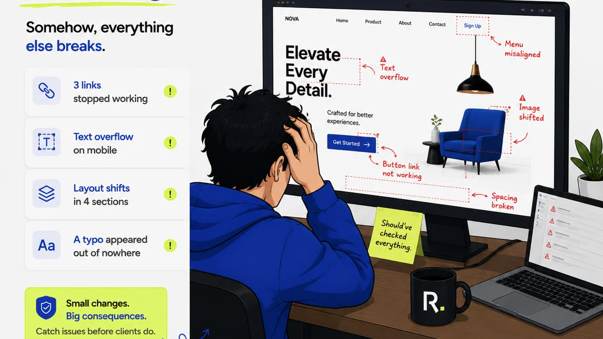
Everyone thinks good design for B2B SaaS is about aesthetics. Sleek interfaces, modern fonts, the right color palette. None of that is wrong. But it’s incomplete.
The real cost of bad B2B SaaS design for nonprofits isn't just ugly buttons. It's wasted time, missed opportunities, and ultimately, less impact. It's money literally flying out the window.
1. The Assumption: 'It just needs to work.'
This is the most common trap. For a nonprofit, the pressure to deliver on mission is immense. Every dollar, every hour, must count. So, the thinking goes, 'If the core functionality is there, that's enough.' Features over usability. Speed over clarity.
This is a dangerous shortcut.
The Hard Truth: 'Working' is a Low Bar. 'Effective' is the Goal.
A nonprofit's B2B SaaS platform isn't just an internal tool; it's often the primary interface for donors, volunteers, beneficiaries, or partners. If it's clunky, confusing, or frustrating, it actively harms your relationships and your ability to execute your mission.
Think about it:
- A donor struggling to complete a recurring donation form might give up entirely.
- A volunteer confused by the scheduling interface might miss critical shifts.
- A program manager unable to easily access client data might delay crucial interventions.
- A partner organization getting lost in a clunky portal might reduce collaboration.
These aren't minor inconveniences. These are direct hits to your operational capacity and fundraising potential.
2. The Assumption: 'We can't afford good design.'
For nonprofits, budget constraints are a constant reality. Investing in a top-tier UX designer or a comprehensive design system can feel like a luxury they simply can't afford. The default is often to use out-of-the-box templates, hire the cheapest freelancer, or let the most technically savvy person on staff cobble something together.
This thinking is backward.
The Hard Truth: You Can't Afford *Not* to Invest in Good Design.
The cost of *bad* design far outweighs the investment in good design. Let's break down where nonprofits bleed money due to poor B2B SaaS design:
- Lost Donations: A confusing donation process is a direct revenue leak. Every lost donor is lost potential funding for your cause.
- Reduced Volunteer Engagement: If volunteers can't easily sign up, track hours, or access information, they'll disengage. This means more time spent on recruitment and less on mission-critical tasks.
- Inefficient Operations: Staff spending excessive time figuring out software instead of doing their jobs. This translates to lower productivity and potentially the need for more staff than necessary.
- Poor Data Quality: If data entry is cumbersome or error-prone, the insights derived from that data are unreliable. This can lead to misinformed strategic decisions.
- Damaged Reputation: A clunky, unprofessional-looking platform can reflect poorly on the organization's overall competence and trustworthiness.
Consider the usability principles championed by the Nielsen Norman Group. If users can't easily learn and use your system, they won't. It's that simple.
3. The Assumption: 'Our users are tech-savvy.'
Especially in tech-adjacent fields or when dealing with younger demographics, there's a tendency to assume everyone is comfortable with complex interfaces and cutting-edge digital tools. This leads to over-engineered solutions that alienate a significant portion of the user base.
This assumption is often wrong.
The Hard Truth: User Needs Vary Dramatically. Design Must Accommodate Everyone.
Your user base is diverse. It includes:
- Seasoned tech professionals who expect efficiency.
- Older donors or volunteers who may be less comfortable with digital interfaces.
- Individuals with disabilities who rely on accessibility features.
- Staff members with varying levels of technical proficiency.
A design that caters only to the most technically adept will exclude many others. This exclusion means missed engagement, reduced participation, and a failure to serve your full community.
Accessibility is not an afterthought; it's a fundamental requirement. Adhering to standards like the Web Content Accessibility Guidelines (WCAG) ensures your platform is usable by as many people as possible, fulfilling both ethical and legal obligations.
4. The Assumption: 'We can iterate later.'
The agile development mantra of 'build fast, iterate often' is valuable. However, when applied to core user experience without a solid foundation, it can lead to a chaotic, inconsistent product. 'Iterating later' often means patching a fundamentally flawed design, which is far more expensive and time-consuming than getting it right initially.
This is a costly mistake.
The Hard Truth: Foundational Design Decisions Are Hard to Undo.
Major UX/UI decisions impact the entire architecture of your application. Changing core navigation, information architecture, or fundamental interaction patterns after launch can:
- Require significant re-coding.
- Break existing integrations.
- Confuse and alienate existing users who have adapted to the old system.
- Lead to a loss of trust and engagement during the transition.
It's far more efficient to invest in solid user research and foundational UX design *before* extensive development begins. Understanding user flows, mapping out information architecture, and creating clear prototypes can prevent costly pivots down the line.
5. The Assumption: 'Feedback is just about bugs.'
When feedback comes in, many teams focus solely on bug reports and feature requests. They treat feedback as a reactive list of problems to be fixed, rather than a proactive source of insight into user behavior and unmet needs.
This misses the bigger picture.
The Hard Truth: Feedback is a Goldmine for Strategic Improvement.
User feedback, when systematically collected and analyzed, can reveal:
- Usability Friction Points: Where are users getting stuck? What tasks are taking longer than they should?
- Unarticulated Needs: What are users trying to achieve that the current design doesn't support?
- Workflow Inefficiencies: How does the software fit into (or disrupt) their daily work?
- Opportunities for Innovation: What new features or improvements could significantly enhance value?
Treating feedback as a strategic asset, rather than just a bug list, requires a structured approach to collection, analysis, and action. This is where a centralized system becomes invaluable.
Where Revue Fits In
Managing client feedback, especially for complex B2B SaaS platforms, can quickly become a chaotic mess of emails, spreadsheets, and Slack messages. This fragmentation leads to missed feedback, conflicting priorities, and ultimately, design decisions based on incomplete or inaccurate information.
Revue is built to solve this. It provides a single source of truth for all creative feedback.
Imagine:
- Centralized Feedback: All comments, revisions, and approvals from stakeholders logged against specific design assets. No more hunting through inboxes.
- Clear Revision History: Understand the evolution of a design, who requested what, and why. Track approvals and identify bottlenecks.
- Quality Assurance Checklists: Ensure that every iteration meets the necessary standards before launch, reducing costly post-launch fixes.
For nonprofits, this means ensuring that every design decision is informed, every resource is used efficiently, and the final product truly serves the mission, not hinders it.
Final Thought
Your nonprofit's B2B SaaS platform is a critical asset. It's not just code and pixels; it's the engine that drives your operations, engages your supporters, and ultimately, helps you achieve your mission. Are you treating its design as a strategic imperative, or an afterthought you can't afford?
Frequently asked questions
What's the biggest financial risk of poor B2B SaaS design for a nonprofit?
The biggest financial risk is often lost revenue due to a confusing donation process or reduced donor engagement. Beyond that, inefficient operations, decreased volunteer participation, and poor data quality all contribute to significant financial drains.
How can a nonprofit afford better B2B SaaS design?
View design investment not as an expense, but as a cost-saving measure. Good design reduces errors, increases efficiency, improves user retention, and boosts conversion rates (like donations). The ROI of good design significantly outweighs the initial investment by preventing costlier problems down the line.
What are the key accessibility considerations for nonprofit SaaS platforms?
Key considerations include ensuring keyboard navigability, providing sufficient color contrast, offering alternative text for images, using clear and understandable language, and making sure the platform is compatible with screen readers. Adhering to WCAG guidelines is crucial.
How does centralized feedback help improve B2B SaaS design for nonprofits?
Centralized feedback consolidates all comments, requests, and approvals in one place. This prevents crucial feedback from getting lost, clarifies priorities, ensures stakeholders are aligned, and allows design and development teams to make decisions based on comprehensive information, leading to a more effective and efficient product.