Everyone thinks a brand review is about making sure the logo looks good and the colors are right. It’s a quick once-over, a nod of approval, and then on to the next thing. That’s what most people do.
But that approach misses the entire point.
A true brand review isn’t about ticking boxes on a visual spec sheet. It’s about operational integrity. It’s about ensuring the brand’s promise is being kept, consistently, across every single touchpoint. It’s a quality control gate that catches more than just visual errors.
1. The Hard Truth: Brand Reviews Are Operational Audits
The deeper, harder truth is that a brand review is fundamentally an operational audit disguised as a creative check. It’s where you uncover systemic issues in your workflow, communication, and quality control processes. If a brand element is off, it’s rarely just a one-off mistake. It’s a symptom of a deeper problem.
Too many agencies and in-house teams treat these reviews as a final aesthetic polish. They assume that if it *looks* right, it *is* right. This thinking leads to costly rework, client dissatisfaction, and diluted brand impact down the line.
A proper brand review checklist forces you to look beyond the surface. It’s about process, consistency, and impact.
2. Foundation: Strategic Alignment Check
Before anyone looks at a single pixel, confirm the creative aligns with the strategy. This isn't about subjective taste; it's about objective alignment.
2.1. Recalibrating Against the Brief
Was the original brief clear? Did the creative output directly address the objectives and target audience defined in that brief?
This step prevents scope creep and ensures everyone is still rowing in the same direction. If the creative has drifted, why? Was the brief misunderstood? Did strategy shift without a formal update?
2.2. Target Audience Resonance
Does the creative speak the language of the intended audience? Does it reflect their values, aspirations, and understanding?
This isn't about whether *you* like it. It’s about whether the *intended user* will connect with it. A beautiful design that alienates the target audience is a failure.
2.3. Competitive Landscape
How does this creative stand out (or blend in) against competitors? Does it reinforce a unique selling proposition?
A strong brand needs differentiation. A review should confirm that the creative isn't just a me-too effort, but actively carving out a distinct space.
3. Visual Integrity: The Non-Negotiables
This is where many reviews stop, but it’s only one part of the picture. Ensure the core visual elements are correct and consistently applied.
3.1. Logo Application
Is the logo used correctly? Check for:
- Correct proportions and clear space.
- Appropriate color variations (primary, secondary, monochrome).
- Minimum size requirements met.
- No distortion, stretching, or alteration.
- Correct placement and exclusion zones observed.
This is the most basic check, but errors here are rampant and undermine credibility instantly.
3.2. Color Palette Adherence
Are the approved brand colors being used? Are the correct tints, tones, and shades applied?
Ensure color values (CMYK, RGB, Hex, Pantone) are referenced and correctly implemented. Inconsistent color is a fast track to brand dilution.
3.3. Typography Hierarchy and Usage
Is the correct typeface family used? Are font weights, sizes, and line-spacing consistent with the brand guidelines?
Check for:
- Proper use of primary and secondary fonts.
- Consistent hierarchy for headings, subheadings, and body copy.
- Legibility and readability across different applications.
- No unauthorized font substitutions.
Typography is a silent communicator. Get it wrong, and the message is muddled.
3.4. Imagery and Iconography Style
Does the photography, illustration, or iconography style match the brand's personality and guidelines?
Ensure imagery is on-brand in terms of mood, subject matter, and quality. Icons should be consistent in stroke weight, style, and rendering.
4. Application & Context: Where the Brand Lives
This is where many brand reviews falter. It's not enough for a logo to be correct in isolation. It must work in the real world.
4.1. Cross-Platform Consistency
How does the brand element perform across different media and devices?
Review its application on:
- Websites and mobile apps.
- Social media profiles and posts.
- Print collateral (brochures, business cards).
- Video and motion graphics.
- Physical signage and merchandise.
A design that looks great on a desktop mockup might fail on a small mobile screen or a giant billboard.
4.2. Accessibility Standards
Does the design meet accessibility requirements? This is non-negotiable for inclusive brands.
Key checks include:
- Color contrast ratios (WCAG guidelines are your friend here).
- Legibility of typefaces at various sizes.
- Clear and understandable iconography.
- Consideration for users with visual, auditory, or motor impairments.
Ignoring accessibility isn't just bad practice; it's exclusionary. WCAG provides the standard.
4.3. User Experience (UX) Integration
Does the brand element enhance or detract from the user experience?
Consider how the design impacts:
- Navigation and usability.
- Information hierarchy and clarity.
- Emotional connection and trust.
A brand is more than just visuals; it's an experience. The design must support that experience, not hinder it.
5. Production Readiness: The Operational Gate
This is the final, critical stage. Can this asset be produced reliably and efficiently?
5.1. File Format and Delivery
Are assets provided in the correct file formats (e.g., SVG, PNG, JPG, AI, EPS)? Are they optimized for their intended use?
Ensure files are named logically and organized for easy access. This saves massive headaches in production.
5.2. Technical Specifications
Does the output meet technical requirements for various platforms (e.g., bleed, resolution, color profiles for print; file size, dimensions for web)?
This is where many design handoffs break down. Production teams waste hours fixing files that weren't prepared correctly.
5.3. Scalability and Reusability
Can these brand elements be easily scaled and reused by different teams or for future projects?
Are templates set up correctly? Are components modular and adaptable?
6. Where Revue Fits In
Managing this rigorous brand review process, especially across multiple projects and clients, can become chaotic. That’s where a centralized platform like Revue becomes essential.
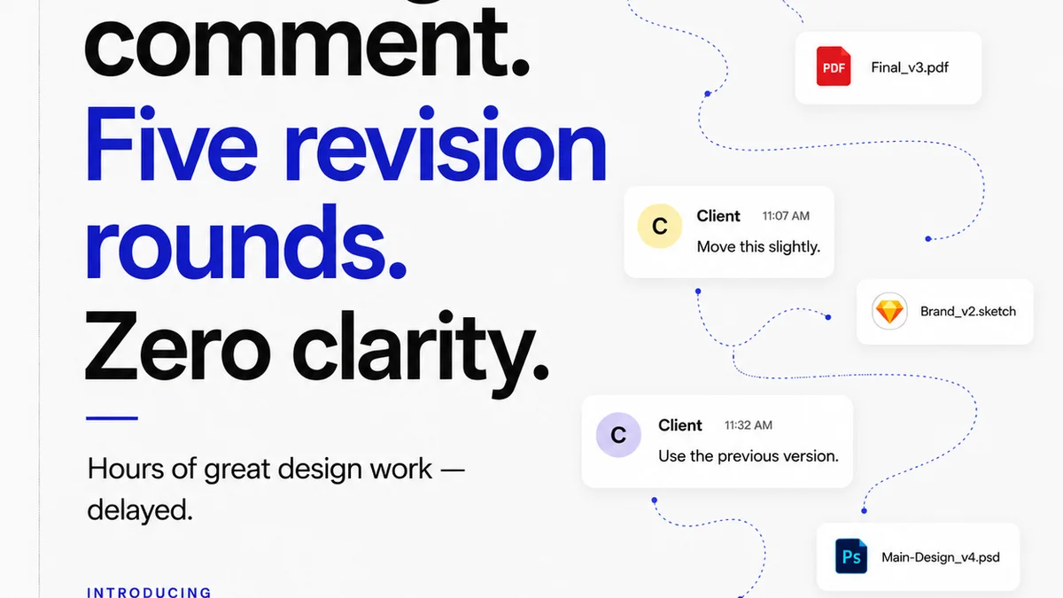
Revue streamlines the entire feedback and approval cycle. Instead of chasing down emails or deciphering Slack messages, all feedback lives attached to the specific creative asset. This means:
- Centralized Feedback: All comments, annotations, and revisions are in one place, linked directly to the project. No more hunting for lost feedback.
- Revision History: Track every iteration and approval. You can see exactly who approved what and when, providing a clear audit trail.
- Quality Control Workflow: Implement custom review stages and checklists. Ensure every brand review, from initial concept to final delivery, follows a consistent, documented process.
- Clear Approvals: Formalize the sign-off process. Know definitively when an asset is approved and ready for production, reducing ambiguity and delays.
By centralizing these critical steps, Revue helps ensure that brand consistency isn't just an aspiration, but an operational reality.
7. Final Thought
A brand review isn't just a final check; it's a diagnostic tool. It reveals the health of your creative operations. Are you just looking at the pretty picture, or are you ensuring the engine running beneath it is robust, reliable, and producing work that truly serves the strategy?
Frequently asked questions
What are the key areas to cover in a brand review checklist?
A comprehensive brand review checklist should cover strategic alignment (brief, audience, competition), visual integrity (logo, color, typography, imagery), application and context (cross-platform, accessibility, UX), and production readiness (file formats, technical specs, reusability).
Why is brand review more than just checking visuals?
Brand review is an operational audit. It ensures the brand's promise is consistently delivered across all touchpoints, revealing deeper workflow, communication, and quality control issues, not just aesthetic errors.
How can a brand review checklist improve client satisfaction?
By ensuring consistency, accuracy, and strategic alignment before final delivery, a robust checklist minimizes errors, reduces costly rework, and ensures the final creative output meets client objectives and resonates with their target audience.
What role does accessibility play in a brand review?
Accessibility is crucial. A brand review should verify that designs meet standards like WCAG for color contrast and legibility, ensuring the brand is inclusive and usable by everyone, regardless of ability.