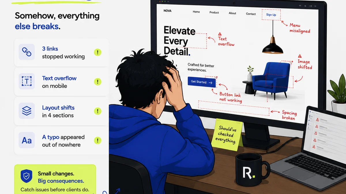
Everyone thinks Canva design review is simple. Just look at the screen, make sure the logo is there, and hit approve. Easy, right?
Wrong.
That superficial check misses the operational chaos lurking beneath the surface. It ignores the real pain points: unclear feedback, endless revision cycles, and the risk of shipping subpar creative because the review process broke down. Mastering Canva design review isn't about aesthetics; it's about robust workflow management.
1. The Feedback Illusion: Clarity Over Quantity
The biggest mistake in Canva design review is treating feedback like a popularity contest. More comments don't mean better design. They often mean confusion.
Clients and stakeholders, often not designers, see a visually appealing draft and think their job is done by pointing out minor tweaks. This leads to a barrage of subjective notes that, while well-intentioned, can easily derail the project's core objectives.
The Problem with Vague Notes
Generic feedback like:
- "Make it pop."
- "I don't like this color."
- "Can we try something else?"
These aren't actionable. They create guesswork and waste valuable time. The designer is left to interpret what "pop" means, or which "something else" might satisfy an undefined preference.
Actionable Feedback: The Gold Standard
Good feedback is specific, objective, and tied to project goals. It answers the 'what' and the 'why'.
Instead of "Make it pop," try:
- "Increase the contrast between the headline and background to improve readability for users with low vision."
- "This blue clashes with our existing brand palette. Let's use the approved Hex code #XXXXXX."
- "This layout doesn't effectively highlight the call-to-action button, reducing click-through potential. Consider moving it higher."
This kind of precision saves everyone time and ensures revisions align with strategic intent. It transforms subjective opinion into objective critique.
2. Managing Revisions: The Endless Loop Trap
Canva's collaborative features are a double-edged sword. They enable real-time input, but they can also foster an environment where revisions become a perpetual motion machine.
Without a structured process, you risk falling into the "revision loop," where each change sparks another, and the project drifts further from its original brief.
Defining the Scope of Revisions
Before any design review even begins, establish clear revision rounds. Typically, two to three rounds are standard for most projects.
Each round should have a defined purpose:
- Round 1: Concept & Layout Approval – Focus on the overall structure, messaging hierarchy, and core visual direction.
- Round 2: Refinement & Details – Address specific element adjustments, copy tweaks, and minor visual polish.
- Round 3: Final Polish & QA – Catch any remaining inconsistencies, typos, or minor bugs before final delivery.
Communicate this structure upfront to clients and stakeholders. Manage expectations about what feedback is appropriate at each stage.
The "Scope Creep" Killer
What happens when feedback in Round 3 introduces a concept that should have been addressed in Round 1? That's scope creep.
It's crucial to have a gatekeeper – usually the project manager or creative lead – who can identify and flag feedback that falls outside the agreed-upon scope for the current revision round. This doesn't mean ignoring valid points, but rather deferring them for a potential change order or the next project phase.
This protects your team's time and the project's budget.
3. Version Control: The Lost-in-Translation Nightmare
Canva's inherent versioning can be helpful, but it can also become a source of confusion if not managed diligently, especially in larger teams or complex projects.
Which version is the *actual* latest? Who made the last change, and why?
The Danger of Multiple Drafts
When multiple people are making edits simultaneously or saving over previous versions without clear documentation, you create a mess.
This often leads to:
- Accidentally reverting to an older version.
- Conflicting edits that overwrite each other.
- Lost feedback or design iterations.
- Significant time wasted trying to reconstruct the correct version.
Establishing a Single Source of Truth
Designate a primary editor or a small group responsible for making the final direct edits within Canva based on consolidated feedback.
Use clear naming conventions for files and versions, although this can become cumbersome quickly. A better approach is to centralize the feedback process itself.
4. Quality Assurance: The Unseen Bottleneck
The final check before delivery is critical. This isn't just about aesthetics; it's about functionality, brand consistency, and technical accuracy.
A hurried or incomplete QA process in Canva can lead to embarrassing errors making it into the final output.
Common QA Pitfalls
- Typos and Grammatical Errors: Spellcheckers aren't foolproof, and tired eyes miss obvious mistakes.
- Inconsistent Formatting: Font sizes, spacing, and alignment can vary subtly.
- Broken Links or Incorrect URLs: Especially critical for digital assets.
- Color Profile Mismatches: For print assets, this can ruin color reproduction.
- Brand Guideline Violations: Incorrect logo usage, color application, or typography.
A Structured QA Checklist
Develop a comprehensive QA checklist tailored to the type of asset being produced. This should be a non-negotiable step before any final export or handover.
A typical checklist might include:
- Verify all text for accuracy and consistency.
- Check all links and calls-to-action.
- Ensure color usage adheres to brand guidelines.
- Confirm correct file format and resolution for intended output.
- Validate against the original brief and client approvals.
This systematic approach minimizes the risk of errors and ensures a professional, polished final product.
Where Revue Fits In
Canva is a powerful tool for creation, but its built-in review features can quickly become unwieldy for professional agencies and in-house teams managing multiple clients and complex projects.
This is where a dedicated platform like Revue becomes indispensable for streamlining your Canva design review process.
Revue centralizes all client feedback, eliminating the scattered, often contradictory notes that plague email chains and comment threads within design tools.
It provides clear visibility into revision history and approval statuses, so you always know exactly where a project stands and who has signed off on what. This dramatically reduces the chance of miscommunication and the dreaded "scope creep" during the Canva revision process.
Furthermore, Revue helps ensure quality checks are thorough and documented, providing a single source of truth for all project iterations and approvals. It transforms the chaotic reality of creative feedback into a manageable, transparent workflow, allowing your team to focus on what they do best: creating great work.
Final Thought
Is your team treating Canva design review as a simple sign-off, or as a critical stage in the creative project lifecycle? The difference dictates whether you're efficiently delivering great work or drowning in revisions.
Frequently asked questions
What are the biggest mistakes in Canva design review?
The biggest mistakes include treating feedback as a popularity contest, accepting vague or non-actionable notes, falling into endless revision loops without defined scope, poor version control leading to confusion, and skipping a structured quality assurance process.
How can I make Canva feedback more actionable?
Encourage stakeholders to provide specific, objective feedback tied to project goals. Instead of 'Make it pop,' ask for 'Increase contrast for readability' or 'Adjust color to match brand Hex code #XXXXXX.'
How do I prevent scope creep during Canva revisions?
Clearly define the number of revision rounds and the scope of feedback appropriate for each stage before the review begins. A project manager or creative lead should flag feedback that falls outside the agreed scope for potential change orders.
What's the best way to manage versions in Canva?
While Canva has versioning, it's best to centralize feedback and designate a primary editor. Use clear communication about which version is the 'master' and avoid simultaneous edits by multiple team members without a clear process.