Everyone thinks a good dashboard is about data visualization. Throw some charts and graphs on a screen, and suddenly everyone's on the same page. That's not wrong. But it’s incomplete.
The hard truth is that many construction project dashboards are designed with little regard for the actual human workflows they're supposed to support. This leads to subtle, but costly, mistakes that ripple through the entire project lifecycle.
1. The 'Data Dump' Dashboard
The most common mistake? Believing that more data equals better insights. Project managers and stakeholders are often overwhelmed with raw, uncontextualized information. They see dozens of metrics, but struggle to connect them to actionable decisions.
This isn't just an annoyance; it's a direct path to missed opportunities and delayed problem-solving.
Lack of Prioritization
Not all data is created equal. A dashboard that doesn't highlight the most critical KPIs (Key Performance Indicators) for a specific project phase is actively hiding what matters most. This forces users to sift through noise, wasting precious time.
No Clear 'Why'
Why is this number important? A dashboard should answer this implicitly. If a user has to guess the significance of a metric or how it impacts project goals, the design has failed. This is especially true in construction, where timelines and budgets are tight.
Ignoring User Roles
A site supervisor needs different information at a glance than a CFO. A dashboard designed for a single, generic 'user' will fail everyone. Different roles require tailored views that surface their specific responsibilities and decision-making needs.
2. Visual Clutter and Cognitive Overload
Designers often fall into the trap of 'filling the space.' They might use too many colors, inconsistent chart types, or overly complex layouts. This makes the dashboard hard to read and understand quickly.
In construction, where decisions need to be made rapidly on-site or in the office, visual clutter is a productivity killer.
Inconsistent Visual Language
Using different color schemes for similar data points across different sections, or employing varied chart types for comparable metrics, creates confusion. Users have to re-learn how to interpret information in each module.
Information Hierarchy is Flat
Without clear visual hierarchy, users don't know where to look first. Important alerts can get lost amongst routine status updates. This can lead to critical issues being overlooked until they become emergencies.
Too Much Text
Dashboards are not reports. Long blocks of text explaining metrics are a sign of poor design. Visualizations should do the heavy lifting, with concise labels and tooltips for clarification.
3. The 'Set It and Forget It' Mentality
Construction projects are dynamic. A dashboard that was perfect at the start of a project can quickly become outdated and irrelevant. The underlying data sources might change, project priorities can shift, or new risks can emerge.
Failing to iterate on dashboard design leads to a loss of trust and adoption by the very people who need it most.
Lack of Real-Time Updates
If your dashboard isn't reflecting near real-time data, it's already obsolete. Delays in data input or processing mean decisions are based on outdated information, potentially leading to costly rework or missed deadlines.
Ignoring Feedback Loops
The best dashboards evolve. If you're not actively soliciting feedback from the people using the dashboard daily, you're missing crucial insights into what's working and what isn't. This leads to stagnation.
Outdated KPIs
As a project progresses, the key metrics that matter will change. A dashboard that continues to display metrics from the early planning phase when the project is in its final stages is not providing value. It's just noise.
4. Poor Data Integration and Accuracy
A beautiful dashboard is useless if the data feeding it is inaccurate or incomplete. In construction, data often comes from disparate sources: project management software, accounting systems, field reports, IoT sensors, and more.
If these sources aren't properly integrated, or if data entry is manual and error-prone, the dashboard becomes a source of misinformation.
Siloed Data Sources
When data lives in different systems that don't talk to each other, creating a unified view is impossible. This forces manual data aggregation, which is time-consuming and prone to errors.
Manual Data Entry Errors
Relying on manual input from field teams or office staff introduces human error. A single typo in a cost figure or a missed entry for a crucial task can skew the entire dashboard.
Lack of Data Validation
Without checks and balances, incorrect data can propagate through the system. Dashboards should ideally have built-in validation rules to catch obvious errors before they are displayed.
5. Ignoring the 'Human Element' in Design
Ultimately, dashboards are tools for people. Designs that are overly technical, lack intuitive navigation, or don't consider the psychological impact of the data presented are doomed to fail.
Construction professionals are busy. Their tools need to be efficient, clear, and supportive, not another hurdle.
Complex Navigation
If users can't find the information they need within a few clicks, they'll stop looking. Intuitive navigation that mirrors natural workflows is essential.
Lack of Contextual Information
Presenting a number without context is unhelpful. For example, showing a budget variance without indicating the reason or the specific line item is meaningless. Tooltips and brief explanations are key.
Ignoring Mobile Access
Many construction professionals are in the field. A dashboard that isn't responsive and easily accessible on mobile devices is a significant oversight. They need to check status, provide updates, and make decisions on the go.
Where Revue Fits In
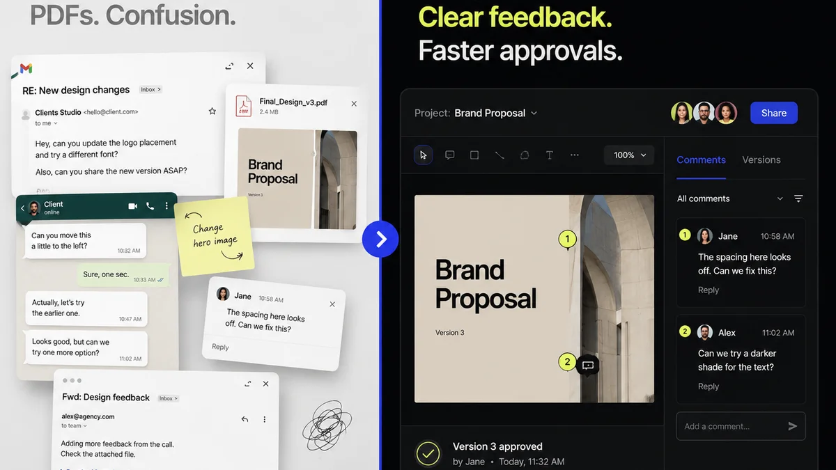
While Revue isn't a project management dashboard, it addresses critical underlying issues that impact the data and decisions flowing into them. Miscommunication and delayed feedback loops are major contributors to inaccurate project data and costly revisions.
Revue centralizes client feedback and stakeholder communication around specific creative assets. This means:
- Clearer Communication: All feedback is in one place, attached to the specific version of the design. No more hunting through emails or Slack messages.
- Streamlined Revisions: Designers and project managers can see exactly what needs to be changed, reducing the back-and-forth that leads to errors and delays.
- Visible Approvals: Tracking approvals becomes straightforward, providing a clear audit trail and preventing confusion about project status.
- Reduced Rework: By clarifying feedback and approvals early, you minimize the chances of costly rework later in the project, ensuring the data feeding your dashboards is more accurate from the start.
By ensuring clarity and efficiency in the creative review process, Revue helps to reduce the chaos that often leads to the dashboard design mistakes we've discussed.
Final Thought
A construction dashboard is more than just a collection of charts. It's a communication tool, a decision-making aid, and a reflection of your project's health. Are you designing yours for data, or for people?
Frequently asked questions
What is the biggest mistake in construction dashboard design?
The biggest mistake is focusing solely on data visualization without considering the actual human workflows and decision-making needs of different user roles. This leads to dashboards that are cluttered, prioritize the wrong information, and fail to provide actionable insights, ultimately costing time and money.
How does poor dashboard design impact construction project costs?
Poor design leads to miscommunication, delayed decision-making, and increased errors. This can result in costly rework, missed deadlines, inefficient resource allocation, and a general lack of project oversight, all of which directly increase project expenses.
Can a dashboard be too complex for construction teams?
Absolutely. If a dashboard is visually cluttered, has inconsistent navigation, or requires users to dig too deep for information, it becomes a hindrance rather than a help. Construction professionals need clear, concise, and easily accessible data to make rapid decisions, especially when in the field.
How important is real-time data in a construction dashboard?
Extremely important. Construction projects are dynamic. If a dashboard isn't updated in near real-time, the information is already outdated. Decisions based on old data can lead to significant problems, rework, and budget overruns. Timeliness is critical for effective project management.