Everyone thinks a creative operations dashboard is about seeing what’s happening. That all your projects are visible, your team’s workload is clear, and client feedback is logged. None of that is wrong. But it’s incomplete.
The hard truth? A dashboard that only shows you what’s happening is just a rearview mirror. You need a dashboard that tells you where you’re going, why you’re going there, and how to get there faster and more efficiently.
1. Define Your Core Objectives First
Before you even think about what data to display, ask yourself: What problem am I trying to solve with this dashboard?
Are you trying to:
- Reduce project turnaround time?
- Increase profitability per project?
- Improve client satisfaction scores?
- Spot bottlenecks in the review process?
- Forecast resource needs more accurately?
Without clear objectives, you’ll end up with a cluttered mess of charts and graphs that tells you nothing useful. It’s like trying to navigate without a destination.
The Vanity Metric Trap
Many dashboards fall into the trap of displaying metrics that look good but don't impact the bottom line. Number of projects completed? Sure, it’s a number. But is it a number that reflects *successful* completion, or just *completed* completion?
Focus on metrics that directly tie back to your business goals. If your goal is efficiency, track time-to-completion, not just project count.
2. Identify Key Performance Indicators (KPIs) That Matter
Once your objectives are clear, you can define the KPIs that will measure your progress. These should be specific, measurable, achievable, relevant, and time-bound (SMART).
For a creative agency, common areas for KPIs include:
- Project Delivery: On-time completion rate, average project duration, adherence to scope.
- Financial Performance: Profit margin per project, billable hours utilization, revenue per employee.
- Client Satisfaction: Net Promoter Score (NPS), client retention rate, number of revision rounds per project.
- Team Performance: Workload distribution, task completion velocity, team member utilization.
- Quality Assurance: Error rate post-launch, adherence to brand guidelines, number of critical bugs.
Focus on Leading vs. Lagging Indicators
Lagging indicators tell you what *happened*. Leading indicators predict what *will* happen. A good dashboard needs a mix, but you should prioritize leading indicators to enable proactive decision-making.
Lagging: Total revenue last quarter. (Good to know, but too late to change).
Leading: Number of new proposals sent this week, pipeline value. (Indicates future revenue potential).
Lagging: Average number of revision rounds on completed projects. (Shows past inefficiency).
Leading: Average time for client feedback on active projects. (If this is increasing, expect more rounds and delays).
3. Design for Your Users, Not Just for Yourself
Who will be using this dashboard? The answer is likely multiple people with different needs.
Tailor Views for Different Roles
A creative director needs to see team capacity and project status. A project manager needs to see deadlines, budgets, and resource allocation. An account manager needs to see client communication status and satisfaction metrics.
Your dashboard shouldn't be a one-size-fits-all monstrosity. Consider role-based dashboards or customizable views.
Keep It Simple and Actionable
Clutter is the enemy. Don't overload users with too much information at once. Use clear visualizations – charts, graphs, progress bars – that are easy to understand at a glance.
Each piece of data should ideally lead to a potential action. If you see a project is falling behind, the dashboard should make it obvious who needs to be alerted or what resource needs to be reallocated.
Visual Hierarchy Matters
Place the most important information at the top left, where the eye naturally falls first. Use color consistently and meaningfully. Red for alerts, green for on-track, etc. But don't overdo it.
4. Integrate Your Data Sources Wisely
A dashboard is only as good as the data it pulls from. Siloed data leads to incomplete pictures and manual data entry headaches.
Think about integrating with:
- Project management tools (e.g., Asana, Monday.com)
- Time tracking software
- Financial systems (e.g., QuickBooks, Xero)
- CRM systems
- Client feedback tools
The goal is a single source of truth, or at least a connected ecosystem where data flows freely and accurately.
The Dangers of Manual Data Entry
If your dashboard relies on people manually inputting data from spreadsheets or other systems, you're building in error and inefficiency from the start. This is a common pitfall that undermines the entire purpose of a dashboard.
5. Build for Iteration and Improvement
Your first dashboard won't be perfect. No one's is.
The best creative operations dashboards are living documents. They evolve as your agency evolves.
Regularly Review and Refine
Schedule regular check-ins (quarterly, perhaps) to review the dashboard's effectiveness. Are the KPIs still relevant? Are the visuals clear? Is it actually helping you make better decisions?
Gather feedback from the people using it. They’ll have the best insights into what’s working and what’s not.
Don’t Be Afraid to Cut What’s Not Working
If a metric or a visualization isn't providing value, get rid of it. A cleaner, more focused dashboard is always better than a comprehensive but useless one.
Where Revue Fits In
Managing creative operations effectively means having crystal-clear visibility into every stage of the creative process. This includes understanding where feedback is coming from, how revisions are being managed, and ensuring the final output meets quality standards.
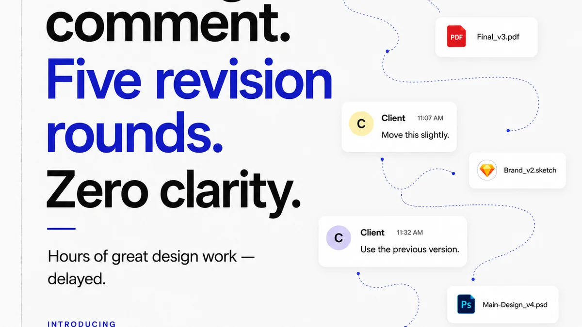
Revue is built to centralize this vital information. By consolidating client feedback and revision history in one place, you eliminate the guesswork and the endless email chains that plague creative workflows. This direct line to client approvals and revision status directly feeds into your operational insights.
When you can see precisely how long feedback cycles are taking, which stakeholders are providing input, and the complexity of revisions, you’re gathering data points that are crucial for any effective creative operations dashboard. This visibility helps identify bottlenecks, forecast timelines more accurately, and ultimately, improve the efficiency and profitability of your projects.
Final Thought
A creative operations dashboard isn't just a reporting tool; it's a strategic asset. It should empower you to see not just what is, but what could be. Are you using yours to drive your agency forward, or just to document its past?
Frequently asked questions
What is the primary goal of a creative operations dashboard?
The primary goal is to provide actionable insights that drive efficiency, improve project outcomes, and support strategic decision-making, rather than just displaying raw data.
What's the difference between a leading and a lagging indicator for creative operations?
Lagging indicators show past performance (e.g., total revenue last quarter), while leading indicators predict future performance (e.g., number of new proposals). A good dashboard uses a mix, prioritizing leading indicators for proactive management.
How can I ensure my dashboard is useful for different roles within my agency?
Design role-based dashboards or customizable views. Tailor the information and visualizations to the specific needs and responsibilities of each user group, such as creative directors, project managers, or account managers.
Why is data integration important for a creative operations dashboard?
Data integration connects disparate systems (project management, finance, CRM) to create a single source of truth. This eliminates manual data entry, reduces errors, and provides a more accurate and holistic view of operations.
How often should I review and update my creative operations dashboard?
Regular reviews, perhaps quarterly, are recommended. Gather feedback from users, assess the relevance of KPIs, and refine visualizations to ensure the dashboard remains an effective and evolving strategic tool.