Everyone talks about the importance of a creative operations dashboard. They say it's key to visibility, efficiency, and making smarter decisions. And none of that is wrong. But it’s incomplete. A dashboard isn't a magic wand. It's a tool. And like any tool, its value depends entirely on how you build and use it.
The hard truth? Most creative operations dashboards are glorified reporting tools. They show what happened, but they don't tell you *why* it happened or *what* to do about it. They become a source of data paralysis, not actionable insight. You end up staring at charts, feeling informed, but ultimately stuck.
1. The Myth of the Universal Dashboard
The biggest mistake agencies and creative teams make is assuming there's a one-size-fits-all dashboard for creative operations. You see a slick example online or in a demo, and you try to replicate it. But your team's needs, your clients, and your specific workflow bottlenecks are unique.
A dashboard needs to be tailored. It needs to answer the specific questions that keep your team up at night. Is it project profitability? Resource allocation? Client feedback turnaround time? Without a clear understanding of your core problems, you'll just end up with a collection of metrics that don't actually help you improve.
Ask the Right Questions First
Before you even think about tools or charts, sit down with your team. Ask:
- What are our biggest operational headaches right now?
- What data do we *wish* we had to solve these problems?
- What decisions do we need to make daily, weekly, or monthly that could be informed by data?
- What metrics, if improved, would have the biggest impact on our bottom line or client satisfaction?
Your answers to these questions should dictate what goes on your dashboard, not the other way around.
2. Moving Past Vanity Metrics
Many dashboards are filled with vanity metrics. These are numbers that look good but don't actually drive business value. Think total projects completed, total hours logged, or total clients served. Sure, they’re numbers. But what do they *mean* operationally?
A project completed is great, but was it on budget? On time? Did the client love it? A project that loses money or requires endless revisions isn't a win, no matter how many you tick off a list. Hours logged are meaningless without context. Are they billable? Are they productive hours, or time spent waiting for feedback?
Focus on Actionable KPIs
You need Key Performance Indicators (KPIs) that directly relate to the health and efficiency of your creative process. For creative operations, this means focusing on:
- Profitability per project/client: Tracking not just revenue, but actual profit margins.
- Resource utilization: Understanding who is overbooked, who is underutilized, and where the bottlenecks are in team capacity.
- Cycle time: Measuring the time it takes for a project to move through key stages, from kickoff to final delivery.
- Client feedback loop: Quantifying the time it takes to receive and implement client feedback. This is often a major drag on efficiency.
- Revision rounds: Tracking the number of revision rounds per project. Too many often indicates scope creep or unclear initial briefs.
- On-time delivery rate: A classic, but crucial, indicator of efficiency and client satisfaction.
These metrics give you levers to pull. They highlight areas where you can intervene and make changes that will have a tangible impact.
3. The Data Pipeline Problem
Even if you identify the right KPIs, you can't measure them without reliable data. And this is where many creative operations dashboards fall apart. The data is scattered, inconsistent, or simply missing.
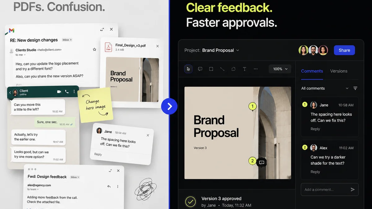
You might have project details in one system, time tracking in another, client communication in email, and feedback buried in shared documents. Trying to pull this all together for a dashboard is a nightmare. It’s manual, time-consuming, and prone to errors. This makes the data unreliable, and if your data isn't reliable, your dashboard is useless.
Connecting the Dots
The solution isn't just to add more tools; it's to ensure your tools talk to each other and that data flows seamlessly. This requires a disciplined approach to:
- Standardized intake: Ensure all new projects start with a clear, structured brief that captures essential information.
- Centralized project management: All project-related tasks, deadlines, and communications should live in one place.
- Integrated time tracking: Time tracking needs to be tied directly to projects and tasks, making it easy to see where time is actually spent.
- Clear feedback channels: Establish a single source of truth for client feedback and approvals.
When data flows automatically from one stage to the next, your dashboard metrics become accurate and readily available.
4. Context is King: Visualizing for Insight, Not Just Data
Raw numbers on a dashboard are just that: numbers. To be useful, they need context. A dashboard that simply spits out a number for
Frequently asked questions
What's the difference between a reporting dashboard and an operational dashboard?
A reporting dashboard primarily shows what happened (historical data). An operational dashboard focuses on what's happening now and what actions can be taken to improve current performance. It's about real-time insights and driving immediate decisions.
What are the most important KPIs for a creative operations dashboard?
Key KPIs include project profitability, resource utilization, cycle time, client feedback loop duration, number of revision rounds, and on-time delivery rate. These directly impact efficiency and profitability.
How can I ensure the data on my dashboard is accurate?
Accuracy comes from a disciplined data pipeline. Use standardized intake processes, a centralized project management system, integrated time tracking, and clear feedback channels. Ensure your tools are integrated so data flows automatically and consistently.
Can a dashboard help with resource allocation?
Absolutely. By tracking resource utilization rates, project deadlines, and team capacity, a dashboard can highlight potential overloads or underutilization, allowing for proactive adjustments to resource allocation and preventing burnout or idle time.