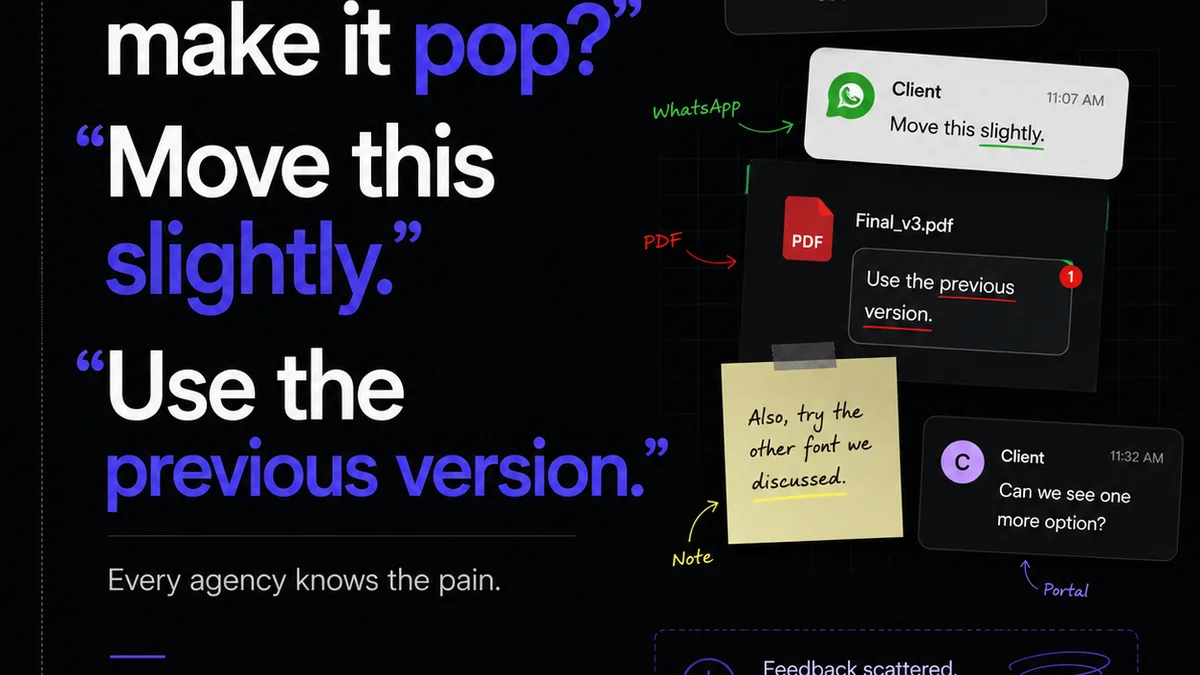
Everyone thinks design annotation is just about leaving comments. Clients drop notes, designers reply, and somehow, magic happens. That’s the common wisdom. It’s not wrong. But it’s incomplete.
The hard truth? Haphazard annotation is a slow, painful death for creative workflows. It breeds confusion, delays projects, and erodes client trust. You need a system. A design annotation checklist isn't just a nice-to-have; it’s a fundamental operational tool.
1. The Illusion of Clarity: Why Your Current Annotation is Failing
Think about your last few projects. How many times did a client comment get lost in a sea of Slack messages, emails, or a shared Google Doc? How often did a designer chase down the *exact* meaning of a vague note like “make it pop”?
This isn’t a designer problem. It’s a process problem.
Without a structured approach, annotations become subjective, disconnected, and frankly, useless. They create more work than they solve. You end up with:
- Endless clarification back-and-forth.
- Misinterpretations leading to rework.
- Lost feedback buried in communication threads.
- Frustrated clients and demoralized teams.
- Approvals based on guesswork, not clear requirements.
Your annotation process needs to be as robust as your design system.
2. Building Your Design Annotation Checklist: The Core Components
A good annotation checklist transforms feedback from a chaotic mess into actionable intelligence. It’s about setting expectations and defining the *type* of feedback required.
Consider these elements:
a. Feedback Type Categorization
Not all feedback is created equal. Teach clients and stakeholders to categorize their input. This is crucial for efficient review.
- Strategic Feedback: Does this align with the project goals? Is the messaging on point?
- Creative Feedback: How does the aesthetic feel? Is it on-brand?
- Usability/UX Feedback: Is it intuitive? Easy to navigate? Does it meet user needs?
- Technical Feedback: Does it adhere to brand guidelines? Are there accessibility concerns?
- Minor Edits/Typos: Grammatical errors, broken links, small adjustments.
By categorizing, you immediately signal the *weight* and *context* of a comment. A typo is not a strategic pivot.
b. Annotation Scope Definition
What are you actually asking for feedback on? Be explicit. Are you reviewing a static mockup, an interactive prototype, or a live build?
For static mockups, feedback should focus on layout, content hierarchy, visual style, and messaging. For prototypes, interaction and user flow are key.
Clearly defining the scope prevents feedback that’s out of bounds.
c. Actionability Criteria
This is where many checklists fall apart. How do you ensure a comment is actually *actionable*?
- Specificity: Vague comments are useless. “Looks good” tells you nothing. “The headline font size needs to be increased by 2pt for better readability” is actionable.
- Context: Why is the change needed? What problem does it solve?
- Location: Pinpoint the exact element being commented on.
- Proposed Solution (Optional but helpful): Sometimes a client can suggest a fix. Other times, it prompts the designer to explore one.
Require feedback to meet at least two of these criteria to be considered for implementation.
d. Revision Round Limits
Setting clear limits on the number of revision rounds is essential. But so is defining what constitutes a “round.”
Does a client providing feedback on a single element count as a full round? Or only when they’ve reviewed the entire piece?
Your checklist should clarify this. A common approach is to define a full review cycle as feedback provided on the complete deliverable.
e. Approval Thresholds
What constitutes a final approval? Is it one person signing off? Or consensus from a specific group?
Your checklist can outline who has final say on different types of feedback (e.g., Creative Director for aesthetics, Product Manager for functionality).
3. Implementing Your Design Annotation Checklist
A checklist is only as good as its adoption. Here’s how to make it stick:
a. Make it Visible and Accessible
Don't hide it in a dusty project brief. Make it a prominent part of your client onboarding and project kickoff materials.
Include it in your proposal, mention it in kickoff meetings, and link to it directly within your feedback tools.
b. Educate Your Clients (and Your Team!)
Clients aren't mind-readers. They need to be trained on how to provide effective feedback using your checklist.
Frame it not as a restriction, but as a tool to help *them* get the best possible outcome, faster. “This checklist helps us ensure we’re addressing your most important points clearly and efficiently, so we can deliver exactly what you need.”
Your internal team also needs to understand how to use the checklist to guide their review and response process.
c. Integrate with Your Tools
The best checklist is one that’s part of your daily workflow. This is where dedicated feedback and collaboration tools shine.
Tools that allow for annotated comments directly on the design, categorized feedback, and clear approval workflows are game-changers. They reduce the need to manually track who said what, where.
d. Conduct Regular Retrospectives
No process is perfect on the first try. Regularly review how the checklist is working.
What’s causing friction? What feedback is still hard to act on? Use team and client retrospectives to refine the checklist and its implementation.
4. Advanced Annotation Tactics: Beyond the Basics
Once your core checklist is in place, you can layer in more sophisticated practices.
a. Visual Annotation Tools
Leverage tools that allow for visual markup directly on the design. This is far more precise than text-only comments.
Think about tools that support:
- Clickable hotspots for specific elements.
- Drawing tools for general areas.
- Color-coding for different feedback types.
This visual context is invaluable, especially for complex interfaces.
b. Prototype Annotation
For interactive designs, annotation needs to account for user flow and interactions.
Your checklist should encourage feedback on:
- Navigation clarity.
- Interaction states (hover, active, disabled).
- Transitions and micro-interactions.
- Task completion success.
Annotating a prototype requires a different mindset than a static image. The checklist should guide this.
c. Accessibility Annotations
This is non-negotiable. Ensure your checklist prompts feedback on accessibility standards.
Consider adding specific points for:
- Color contrast ratios.
- Keyboard navigation.
- Screen reader compatibility (where applicable).
- Focus states.
Adhering to standards like the Web Content Accessibility Guidelines (WCAG) is critical.
d. Version Control for Feedback
Feedback evolves. Ensure your system can track changes and approvals across multiple iterations.
Knowing which version of the design a comment refers to, and seeing the history of approvals, prevents costly mistakes.
Where Revue Fits In
Managing feedback, revisions, and approvals across multiple projects and clients can quickly become unmanageable. That’s where a tool like Revue becomes essential.
Revue helps centralize all client feedback, regardless of where it originates. You can track comments, see who provided them, and understand the context, all in one place.
This eliminates the need to hunt through emails or Slack channels. It provides a clear audit trail for every revision and approval, ensuring everyone is on the same page.
When you have a structured checklist, and a tool to manage the output, you gain unparalleled clarity. You can run quality checks with confidence, knowing that feedback has been systematically gathered, reviewed, and addressed.
5. The Cost of Poor Annotation
Let’s be blunt. Ignoring the need for a structured annotation process isn't saving you time or money. It’s costing you both.
Consider the ripple effect:
- Wasted Designer Hours: Chasing down vague feedback, redoing work based on misinterpretations.
- Extended Timelines: Projects that drag on due to endless clarification loops.
- Client Dissatisfaction: Frustration from both sides when expectations aren't met.
- Damaged Reputation: A consistent inability to deliver on time and on budget.
- Missed Opportunities: Teams spending more time managing chaos and less time on strategic creative work.
The investment in a clear annotation checklist and the right tools pays for itself many times over.
Final Thought
Is your current design feedback process a well-oiled machine, or a leaky sieve? The difference often comes down to the discipline of structured annotation. Stop accepting vague comments as the norm. Start building a system that demands clarity, context, and actionability. Your team, your clients, and your bottom line will thank you.
Frequently asked questions
What is a design annotation checklist?
A design annotation checklist is a structured guide used during the design review process to ensure feedback is clear, specific, actionable, and categorized appropriately. It helps standardize how clients and teams provide and respond to comments, leading to more efficient revisions and approvals.
Why is categorizing feedback important?
Categorizing feedback (e.g., strategic, creative, technical, minor edits) helps prioritize comments, manage expectations, and ensures that the right people are addressing the right types of issues. It prevents minor edits from derailing strategic discussions and vice versa.
How can I make clients use the annotation checklist effectively?
Educate your clients by explaining how the checklist benefits them – faster, clearer results. Integrate it into your onboarding, kickoff meetings, and feedback tools. Frame it as a collaborative tool for achieving the best outcome, rather than a restrictive rule.
What makes feedback actionable?
Actionable feedback is specific, provides context (why the change is needed), clearly identifies the element being commented on, and ideally, suggests a potential solution. Vague comments like 'make it better' are not actionable.
Can a design annotation checklist help with accessibility?
Absolutely. You can incorporate specific points into your checklist that prompt reviewers to consider accessibility aspects like color contrast, keyboard navigation, and focus states, ensuring designs meet crucial standards like WCAG.