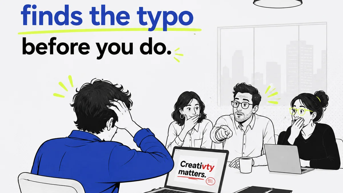
You think a design QA checklist is about catching misplaced pixels or a typo in the button text. And sure, that’s part of it.
But it’s not the whole story. Not even close.
The real value of a design QA checklist isn't in spotting the obvious. It's in building a repeatable process that prevents those obvious mistakes from happening in the first place, and catches the subtle but critical errors that can derail a project.
1. The Myth of the 'Done' Design
Many teams operate under the assumption that once a design is approved, it’s essentially done. Approved means perfect, right?
Wrong.
Approval is a milestone, not an endpoint. It signifies client buy-in on the direction, the concept, and the overall execution. It does not guarantee bug-free, production-ready assets.
This is where the deeper truth emerges: Design QA is not a final inspection; it's an integrated part of the creative workflow. It’s about ensuring quality at every stage, not just a last-minute scrub.
The Cost of 'Good Enough'
Cutting corners on QA might feel like saving time. In reality, it’s borrowing time from the future, with interest.
- Late-stage bug fixes blow up budgets.
- Rework erodes client trust.
- Inconsistent quality damages brand perception.
- Technical debt accumulates, making future updates harder.
A robust design QA process, guided by a comprehensive checklist, mitigates these risks.
2. Building Your Design QA Checklist: Core Components
A great checklist isn't just a list of things to look for. It’s a reflection of your team’s standards and your client’s objectives.
Start with the fundamentals, then layer in project-specific needs.
Brand and Visual Consistency
This is more than just brand colors. It’s about the holistic application of the brand identity.
- Logos: Correct usage, clear space, minimum size, correct variations (color, mono, etc.).
- Typography: Correct fonts, weights, sizes, leading, tracking, and hierarchy across all elements.
- Color Palette: Adherence to primary, secondary, and accent colors. Accessibility checks for contrast ratios.
- Imagery: Consistent style, tone, and quality. Proper cropping and resolution.
- Iconography: Uniform style, weight, and sizing. Clear visual language.
User Experience (UX) and Usability
Does the design actually work for the user?
- Navigation: Clear, intuitive, and consistent. All links functional and lead to the correct destinations.
- Calls to Action (CTAs): Prominent, clear, and actionable. Consistent styling.
- Forms: All fields labeled correctly, input masks work, error states are clear and helpful.
- Responsiveness: Design adapts gracefully across defined breakpoints (desktop, tablet, mobile). Elements don't break or overlap.
- Accessibility: Meets WCAG guidelines (e.g., color contrast, keyboard navigation, focus states, alt text for images).
Content and Copy
Words matter. Ensure they are right.
- Accuracy: All text is correct, up-to-date, and free of typos or grammatical errors.
- Tone of Voice: Consistent with brand guidelines.
- Readability: Text is easy to scan and understand. Paragraphs and headings are structured logically.
- Placeholder Text: No ‘Lorem Ipsum’ or generic placeholders left in final assets.
Technical and Production Readiness
Can this design actually be built? Is it production-ready?
- File Naming Conventions: Consistent and logical.
- Layer Organization: Clean, named layers in design files.
- Asset Export: Correct formats, resolutions, and naming for development.
- Specs: Clear measurements, colors (HEX, RGB, CMYK), and typography provided.
- Interactions/Animations: Clearly defined and documented if applicable.
3. Integrating QA into Your Workflow
The biggest mistake agencies make? Treating QA as an afterthought. A bolt-on step at the very end.
This is where the contrarian view kicks in: The best design QA isn't a separate phase; it's woven into the fabric of your daily work.
Early and Often
Catching issues early is exponentially cheaper and faster than fixing them late.
- Kickoff: Establish clear project goals, brand guidelines, and technical constraints upfront.
- Wireframing: QA for information architecture and user flow. Is the structure sound?
- Mood Boards/Style Tiles: QA for brand alignment and visual direction.
- Mockups: QA for UI elements, consistency, and usability.
- Prototypes: QA for interactions and user flows in a simulated environment.
- Pre-production Handoff: Final, thorough QA before handing off to development.
Each stage has its own mini-checklist.
The Power of Peer Review
Fresh eyes catch things you’ve become blind to. Implement regular internal reviews.
- Designer-to-Designer: A peer checks the work before it moves up.
- Creative Director Review: A strategic and aesthetic overview.
- Cross-functional Review: If possible, have a developer or project manager briefly review for technical feasibility or scope.
This isn't about criticism; it's about collective quality.
4. Tools and Techniques for Effective QA
You don’t need a complex system to do good QA. Often, the right setup makes all the difference.
Standardize Your Checklists
Use digital tools to make checklists accessible and trackable.
- Spreadsheets: Simple, flexible, and universally accessible.
- Project Management Software: Integrate QA tasks directly into your project timelines.
- Dedicated QA Tools: Platforms designed for bug tracking and visual review.
Automated Checks
Leverage technology where it makes sense.
- Accessibility Checkers: Tools like WAVE or browser extensions can flag contrast issues and other accessibility problems.
- Linters: For code, linters automatically check for stylistic errors and potential bugs.
- Design System Checkers: Ensure components adhere to the established system.
Automation frees up human reviewers for more complex, nuanced checks.
Documentation is Key
Clear documentation prevents misunderstandings.
- Style Guides: Centralize brand rules, typography, color palettes, and component usage.
- Design System: A single source of truth for UI components and patterns.
- Client Briefs: Always refer back to the original requirements.
5. Where Revue Fits In
Managing feedback and revisions is central to maintaining quality. Scattered feedback leads to missed details and inconsistent execution.
Revue helps streamline this process, ensuring your design QA checklist is not just a document, but an actionable part of your workflow.
- Centralized Feedback: All client comments and internal reviews live in one place, linked directly to the creative asset. No more hunting through emails or chat logs.
- Version Control: Easily track revisions and compare versions. This makes it clear what changed and why, simplifying the QA review process.
- Clear Approval Status: Understand at a glance which versions are approved, pending, or rejected, providing clear checkpoints for your QA flow.
- Actionable Insights: See the history of feedback and revisions, helping you identify patterns or recurring issues that might need addressing in your core design QA checklist.
When feedback is organized, your QA process becomes more efficient and effective. You can focus on the critical checks, confident that you haven't missed a crucial comment buried in an old thread.
6. Common Pitfalls to Avoid
Even with a checklist, QA can go wrong. Be aware of these traps.
The 'Check the Box' Mentality
Simply ticking items off a list without genuine critical review. This is the superficial QA we talked about.
Lack of Clarity on Standards
If your team isn't clear on what
Frequently asked questions
What is the primary goal of a design QA checklist?
The primary goal is to ensure consistency, accuracy, and usability of design deliverables by establishing a standardized set of checks. It moves beyond superficial pixel-peeping to verify adherence to brand guidelines, user experience principles, and technical specifications, ultimately preventing costly errors and improving client satisfaction.
How often should a design QA checklist be used?
A design QA checklist should be integrated into multiple stages of the creative workflow, not just at the end. This includes reviews during wireframing, mockups, prototyping, and before final handoff to development. Regular internal reviews and peer checks are also crucial components.
What are the key areas to cover in a design QA checklist?
Key areas typically include Brand and Visual Consistency (logos, typography, color, imagery), User Experience and Usability (navigation, CTAs, forms, responsiveness, accessibility), Content and Copy (accuracy, tone, readability), and Technical and Production Readiness (file naming, layer organization, export formats, specs).
Can automated tools replace a manual design QA checklist?
Automated tools are excellent for catching technical issues like broken links, contrast errors, or code inconsistencies. However, they cannot replace the nuanced judgment of a human reviewer for aspects like brand voice, overall user experience, aesthetic appeal, or strategic alignment. A combination of automated checks and manual review is most effective.
How does a tool like Revue help with design QA?
Revue centralizes client feedback and revision history, making it easier to track changes and ensure all comments are addressed. This organized approach prevents critical feedback from getting lost, allowing teams to conduct more thorough and efficient QA reviews based on a clear record of decisions and approvals.