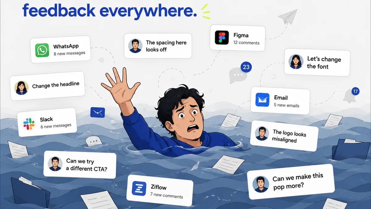
Everyone agrees: a good design review checklist is essential. It's the bedrock of quality control, the guardian against embarrassing errors. It’s the difference between a client saying “Looks good!” and a client saying “This isn’t what we discussed.”
None of that is wrong. But it’s incomplete.
The hard truth is, most design review checklists are too generic. They focus on the ‘what’ – did we check the spelling? Is the logo present? – but miss the ‘how’ and the ‘why.’ They become a rote exercise, a list of potential pitfalls rather than a proactive instrument for elevating creative output and ensuring client alignment.
A truly effective design review checklist doesn't just catch mistakes; it drives better design and smoother client relationships. It’s a strategic asset, not just an operational chore. Here’s how to build one that actually works.
1. Elevate Your Checklist from Ticking Boxes to Asking Questions
The most common mistake? Treating your checklist like a grocery list. Each item is a task to be checked off. This approach is passive. It assumes the reviewer knows *why* they're checking.
A better checklist prompts critical thinking. Instead of 'Check spelling,' try 'Are there any typos or grammatical errors that could undermine the message?' Instead of 'Logo present,' try 'Is the logo correctly placed, sized, and in the approved brand color, reinforcing brand identity?'
The Shift: From Verification to Validation
Verification is about confirming something exists. Validation is about confirming it serves its purpose.
- Verification: Is the CTA button blue?
- Validation: Does the blue CTA button stand out appropriately and guide the user's eye effectively towards the desired action?
This subtle shift forces reviewers to engage with the design's intent, not just its superficial elements. It moves the needle from 'did we do it?' to 'did we do it *well*?'
2. Tailor Your Checklist to the Project Type and Client
A one-size-fits-all checklist is a recipe for mediocrity. A quick social media graphic has different review needs than a complex website redesign or a comprehensive brand identity system.
Your checklist needs to be adaptable. Segment it by project type.
Key Project Categories and Their Unique Needs:
- Web Design/UI: Focus on user flow, accessibility (WCAG compliance), responsive behavior, cross-browser compatibility, and interaction states.
- Branding/Logo Design: Emphasize brand consistency, scalability, application across different media, and adherence to brand guidelines.
- Marketing Collateral (Brochures, Ads): Prioritize clear messaging, call-to-action effectiveness, visual hierarchy, and print-readiness (bleed, resolution).
- App Design: Consider intuitive navigation, platform conventions (iOS HIG, Material Design), performance, and error handling.
Beyond project type, consider the client’s specific goals and sensitivities. A client focused on lead generation will scrutinize conversion elements more. A client prioritizing brand prestige will look closer at aesthetic polish.
Client-Specific Additions:
Maintain a library of client-specific review points. Did a previous project have issues with tone of voice? Add a specific check for that. Is this client obsessed with a particular competitor's aesthetic? Note that for comparison.
3. Integrate Functional and Technical Checks
Design isn't just about aesthetics. It has to work. Too many checklists stop at visual appeal and basic functionality.
Your review process should incorporate technical and functional validation. This prevents issues from surfacing late in development, saving time and money.
Examples of Functional & Technical Checks:
- Web: Broken links, image loading times, form validation, basic SEO elements (meta descriptions, title tags), accessibility (keyboard navigation, alt text).
- Software/App: Usability testing scenarios, performance under load (simulated), adherence to platform guidelines, data security considerations.
- Print: Color profiles (CMYK vs. RGB), bleed and trim marks, font embedding, resolution for print size.
This requires collaboration. Designers and developers need to be in sync. The checklist can be the bridge, ensuring both perspectives are considered before sign-off.
4. Embed Accessibility and Inclusivity from the Start
Accessibility is often an afterthought, bolted on at the end. This is a critical error. True design excellence means creating for everyone.
Your checklist must include robust accessibility checks. This isn't just about compliance; it's about expanding your audience and demonstrating ethical design practice.
Core Accessibility Checks:
- Color Contrast: Ensure text and interactive elements meet minimum contrast ratios. Tools like the WebAIM Contrast Checker are invaluable.
- Keyboard Navigation: Can all interactive elements be reached and operated using only a keyboard? Is the focus indicator visible?
- Alt Text for Images: Are informative images described accurately for screen reader users?
- Clear Typography: Is the font readable? Is there adequate line spacing?
- Form Labels: Are all form fields clearly labeled?
Inclusivity goes beyond accessibility. Does the design represent diverse user groups respectfully? Does it avoid stereotypes? These are qualitative checks, but vital.
5. Define Clear Success Criteria and Sign-Off Points
What does 'approved' actually mean? If it's vague, you'll face endless revision cycles and client dissatisfaction.
Your checklist should culminate in clearly defined success criteria. What must be true for this design to be considered complete and ready for the next stage?
Defining Success:
- Objective Metrics: e.g., 'All specified brand colors are used correctly,' 'No spelling errors identified by Grammarly Premium,' 'Page load time under 3 seconds.'
- Subjective Criteria (with guardrails): e.g., 'Client's primary brand message is clearly communicated,' 'User is intuitively guided to the CTA.' These need to be discussed and agreed upon *before* the review.
This clarity also helps manage client expectations. When they sign off, they understand what they are approving against.
6. Where Revue Fits In
Managing these detailed checklists, especially across multiple projects and clients, can become chaotic. This is where a centralized feedback and workflow platform like Revue becomes indispensable.
Revue helps you:
- Centralize Feedback: All client comments, internal reviews, and revisions live in one place, tied directly to the creative asset. No more hunting through emails or scattered documents.
- Streamline Revisions: Track the history of changes, see who approved what, and easily compare versions. This visibility is crucial for accountability and efficient iteration.
- Ensure Quality Checks: Implement your tailored checklists directly within the workflow. Assign specific review tasks to team members and track their completion. This operationalizes your improved checklist, ensuring it’s used consistently and effectively.
- Visibility for All: Stakeholders can see the progress and the feedback loop, fostering transparency and reducing miscommunication.
By integrating your refined checklists into a structured workflow, you move from reactive error-catching to proactive quality assurance.
7. Iterate and Evolve Your Checklist
Your checklist is not a static document. It’s a living tool that should evolve with your team, your clients, and the industry.
Regularly review its effectiveness. What items are consistently cleared without issue? What items are frequently points of contention or late-stage discovery?
Post-Project Review:
- Team Debrief: After major projects, discuss what worked and what didn’t in the review process.
- Client Feedback: Ask clients about their experience with the review process. Was it clear? Efficient?
- Industry Trends: Stay updated on best practices in UX, accessibility, and design technology.
Use these insights to refine your checklist. Add new checks, remove redundant ones, and rephrase ambiguous points. Continuous improvement is key.
Final Thought
Is your design review checklist a safety net, or a springboard? Does it merely prevent disaster, or does it actively propel your work towards excellence and deeper client trust? The difference lies not just in the items you list, but in the strategic thinking you apply to their creation and use.
Frequently asked questions
What's the difference between a verification and validation checklist item?
Verification checks if something exists or is present (e.g., 'Logo is on the page'). Validation checks if it serves its intended purpose effectively (e.g., 'Logo placement and size reinforce brand identity and are visually balanced').
How often should I update my design review checklist?
Your checklist should be a living document. Aim for a review and update at least quarterly, or after significant projects where lessons were learned. Also, update it whenever industry best practices or client needs change.
Can a checklist really improve client satisfaction?
Yes. A well-crafted checklist ensures designs meet objectives, reduces errors, and leads to fewer revision cycles. This clarity and efficiency directly translate to a better client experience and higher satisfaction.
How can I make my checklist relevant for different project types?
Create modular checklists. Have a core set of universal checks, then add specific sections for web design, branding, print, etc. You can also create client-specific addendums based on their unique requirements and past feedback.