Everyone agrees that a great user experience is crucial for a fintech app. You need to build trust, make complex transactions simple, and keep users engaged. That’s the common wisdom.
None of that is wrong. But it’s incomplete.
The hard truth? Most fintech apps are leaving money on the table, not because of a lack of features, but because of subtle, insidious design mistakes that undermine trust, create friction, and drive users away. These aren't just aesthetic quibbles; they are direct drains on your bottom line.
1. Over-Complicating Onboarding
You’ve got a slick new fintech product. You want users to experience its full power immediately. So, you throw them into a multi-step onboarding flow with endless forms and jargon.
This is a classic over-engineering trap. Users don't need to understand your entire backend architecture on day one. They need to achieve their primary goal, fast.
The Cost of Friction
- High abandonment rates during sign-up.
- Users who get stuck early never convert to active customers.
- Negative first impressions lead to poor reviews and word-of-mouth.
Think about the core action a user wants to take. Is it opening an investment account? Transferring money? Paying a bill? Design your onboarding to facilitate that single, critical action first. Everything else can come later, contextually.
2. Underestimating Visual Trust Cues
Fintech is built on trust. Users are handing over sensitive financial data. Yet, many apps look… cheap. Inconsistent branding, pixelated icons, or generic stock photos scream amateur hour.
Your app’s visual design is the first and most persistent signal of trustworthiness. If it looks like it was built by an intern in a weekend, why would anyone trust you with their money?
Signs of Low Visual Trust
- Inconsistent typography and color palettes.
- Low-resolution or poorly chosen imagery.
- Dated UI elements that feel out of sync with modern standards.
- Lack of clear visual hierarchy, making information hard to scan.
Invest in professional UI/UX design. This means a cohesive brand identity, high-quality custom assets, and a clean, modern interface. It's not just about looking good; it's about signaling competence and security.
3. Obscuring Key Information and Actions
Users come to your app with specific tasks. They expect to find what they need quickly. When critical information or primary actions are buried under layers of navigation or hidden behind obscure icons, frustration mounts.
This is especially dangerous in fintech. Imagine a user trying to find their account balance, transfer limits, or security settings and failing. The resulting anxiety can lead them to seek alternatives.
Where Information Hides
- Primary CTAs (Call to Actions) are not prominent.
- Account summaries are not immediately visible on the dashboard.
- Important transaction details are collapsed or require multiple taps to reveal.
- Navigation menus are cluttered or unintuitive.
Apply principles of clear information architecture and visual hierarchy. Make the most important elements the most accessible. Use clear, concise language, avoiding internal jargon. Users should never have to guess where to find something critical.
4. Ignoring Accessibility Standards
A significant portion of the population has some form of disability. If your app isn't designed with accessibility in mind, you're not just excluding users; you're potentially violating regulations and missing out on a large market segment.
Accessibility isn't an afterthought; it's a fundamental aspect of good design. It benefits everyone by creating clearer, more usable interfaces.
Accessibility Pitfalls
- Insufficient color contrast ratios.
- Lack of keyboard navigation support.
- Missing or inadequate alt text for images.
- Unclear focus indicators for interactive elements.
- Inflexible font sizes that cannot be adjusted.
Adhere to Web Content Accessibility Guidelines (WCAG). This includes ensuring sufficient contrast, providing alternative text for images, making the app navigable via keyboard, and supporting screen readers. Designing for accessibility broadens your audience and signals a commitment to inclusivity.
5. Poor Error Handling and Feedback
Mistakes happen. Transactions fail, inputs are incorrect, or systems go down. How your app communicates these errors can make or break the user experience.
Vague error messages like “An error occurred” are infuriating. They leave users confused, frustrated, and unsure of what to do next. This erodes confidence and can lead to users abandoning the task or the app entirely.
Effective Error Communication
- Clearly state what went wrong.
- Explain why it happened (if possible, without technical jargon).
- Provide specific, actionable steps the user can take to resolve the issue.
- Offer a clear path to support if the user cannot resolve it themselves.
Good error handling turns a potential crisis into a manageable moment. It shows users you're transparent and helpful, even when things go wrong.
6. Neglecting Mobile-First Principles
While this might seem obvious, many fintech companies still treat their mobile app as a secondary product or a stripped-down version of their desktop experience. This is a critical error.
Users expect a seamless, intuitive experience tailored specifically for mobile devices. This means considering touch targets, screen real estate, and on-the-go usage patterns.
Mobile-First Fails
- Tiny buttons that are difficult to tap accurately.
- Information density that’s too high for small screens.
- Requiring desktop-like workflows that are cumbersome on mobile.
- Poor performance due to unoptimized assets.
Embrace a mobile-first design philosophy. Prioritize the core user journeys on the small screen. Ensure all interactive elements are appropriately sized and spaced. Optimize performance for mobile networks.
7. Lack of Clear Value Proposition in the UI
Why should a user choose your app over a competitor's? Your app's interface should constantly reinforce its unique value proposition.
If users can't quickly understand what makes your app special or how it benefits them directly, they'll default to familiarity or simply churn.
Communicating Value
- Highlighting key benefits prominently on the dashboard.
- Using clear, benefit-oriented language in feature descriptions.
- Showcasing unique selling points through subtle UI cues or onboarding tips.
Your UI is your most direct sales tool. Ensure it's actively selling the core value your app provides.
Where Revue Fits In
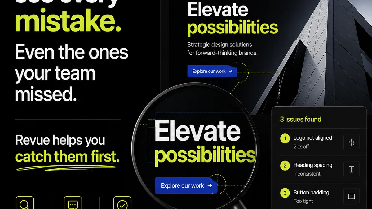
Managing feedback and revisions on complex fintech applications can be a labyrinth. Designers and product managers often struggle to keep track of stakeholder input, ensuring all crucial feedback is addressed without derailing the development timeline.
This is where a centralized feedback and revision management platform becomes indispensable. Revue provides a single source of truth for all creative assets and client communications.
Imagine streamlining the entire review process. Stakeholders can provide contextual feedback directly on designs, prototypes, or live builds. Revision history is meticulously tracked, offering clear visibility into changes and approvals.
This clarity is vital for fintech, where accuracy and security are paramount. By centralizing feedback, managing revisions effectively, and ensuring quality checks are robust, teams can reduce costly misunderstandings, accelerate development cycles, and deliver polished, user-centric applications with greater confidence.
Final Thought
In the competitive fintech landscape, user trust is your most valuable asset. Every design decision, from the initial onboarding flow to the clarity of an error message, directly impacts that trust.
Are your app's design choices building bridges or creating barriers? The answer likely lies in looking beyond the surface and addressing the subtle, costly mistakes that are silently eroding your user base and your revenue.
Frequently asked questions
What is the biggest mistake fintech apps make in onboarding?
The biggest mistake is over-complicating the onboarding process. Users need to achieve their primary goal quickly. Cramming too many steps, forms, or jargon upfront leads to high abandonment rates and negative first impressions.
How can fintech apps build visual trust?
Fintech apps build visual trust through professional, consistent branding, high-quality custom assets, clean modern UI elements, and clear visual hierarchy. A polished appearance signals competence and security.
Why is accessibility important for fintech apps?
Accessibility is crucial because it ensures a significant portion of the population can use your app, potentially expanding your market reach and avoiding regulatory issues. Designing for accessibility also leads to clearer, more usable interfaces for all users.
What makes a good error message in a fintech app?
A good error message clearly states what went wrong, explains why if possible, and provides specific, actionable steps for the user to resolve the issue or contact support. Vague messages like 'An error occurred' are detrimental.