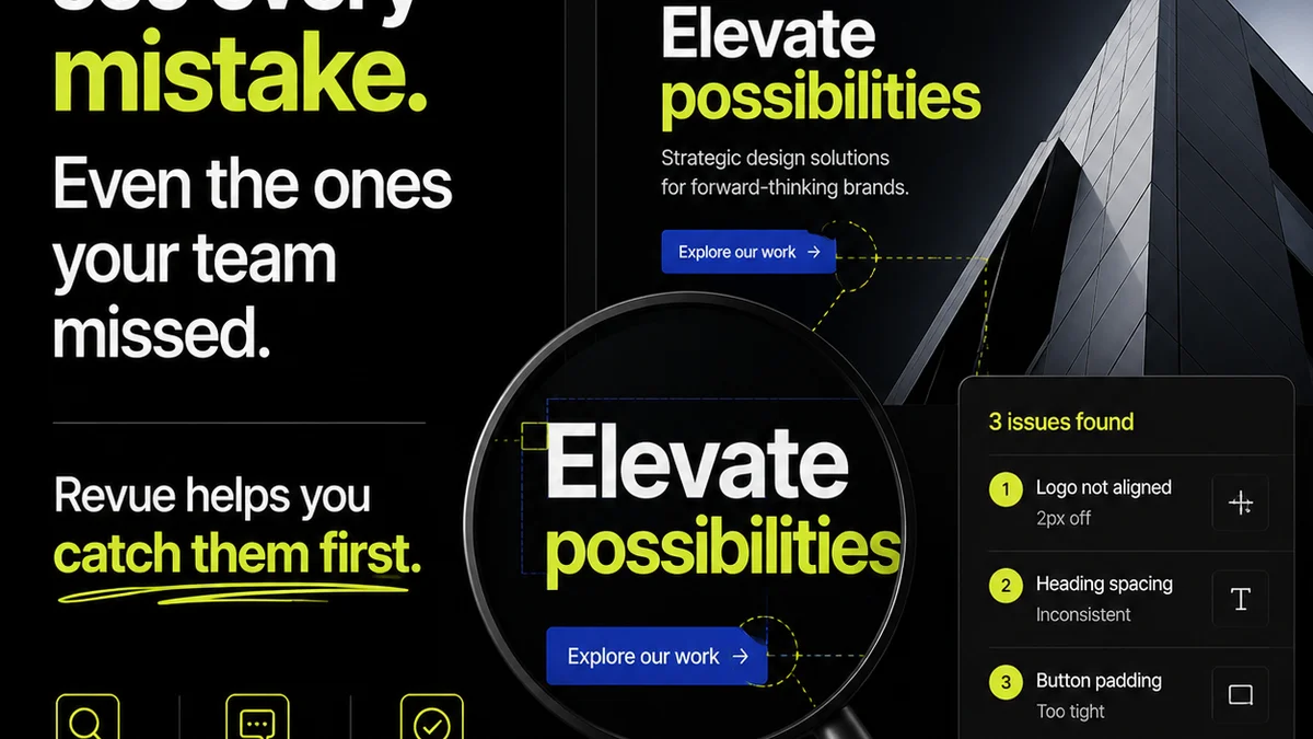
Everyone knows layout quality assurance (QA) is crucial. You’ve got your checklists, your style guides, your pixel-perfect standards. You’re checking for alignment, typography, spacing, and color consistency. None of that is wrong. But it’s incomplete.
The hard truth is that most layout QA processes are reactive, not proactive. They catch mistakes after they’ve been made, leading to endless revision cycles and frustrated clients. True layout QA isn't just about spotting errors; it's about building a system that prevents them and ensures the final output truly serves the project’s goals.
1. Rethink 'Done'
What does 'done' really mean for a design layout? It's not just about the pixels looking right on screen. It's about the layout achieving its intended purpose.
Does the layout guide the user effectively? Is it accessible? Does it adhere to brand guidelines not just in color, but in spirit? Does it support the overall user experience?
Defining Success Metrics
Before you even start checking, define what success looks like. This goes beyond visual fidelity.
- Usability: Can a target user easily navigate and understand the content?
- Accessibility: Does it meet WCAG standards (or your project’s specific accessibility targets)?
- Brand Consistency: Does it *feel* like the brand, not just use its colors?
- Performance: Are assets optimized for web or print without sacrificing quality?
- Technical Feasibility: Can this be built or produced as designed?
These metrics form the foundation of a more robust QA process.
2. The Human Element in Layout QA
You can’t automate everything. While tools are essential, the human eye and critical thinking are irreplaceable in layout QA.
It’s easy to get lost in the weeds, staring at a screen for hours. This leads to tunnel vision and missed issues. A fresh perspective is invaluable.
Leverage Diverse Perspectives
Don't let QA be the sole responsibility of one person or team. Different roles bring different insights.
- Designers: They understand the intent and can spot deviations from the original vision.
- Developers: They see potential implementation issues and performance bottlenecks.
- Project Managers: They keep the project goals and client needs front of mind.
- QA Specialists: They have a systematic approach to finding bugs and inconsistencies.
- Clients (with guidance): Their perspective on clarity and meeting business objectives is vital.
Establish a clear process for collecting and acting on feedback from these varied sources.
3. Context is King: QA Beyond the Mockup
A static mockup is only one piece of the puzzle. Layouts live and breathe within a larger context.
Effective layout QA considers the entire user journey and the technical environment. A design that looks perfect in Figma might fail in a live production environment.
Consider the Ecosystem
When performing QA, ask:
- Responsiveness: How does the layout adapt across different screen sizes and devices?
- Interactivity: Do hover states, animations, and transitions work as intended?
- Content Integration: How does the layout handle varying lengths of text or different image formats?
- Performance Impact: Are there large image files or complex CSS that will slow down loading times?
- Browser/Platform Compatibility: Does it render correctly across all target browsers and operating systems?
This holistic view catches issues that a simple checklist would miss.
4. Process Over Perfection: Building a System
Trying to achieve pixel-perfect layouts on every single revision is a losing battle. It’s inefficient and demoralizing.
A better approach is to build a consistent, repeatable QA process that catches the most critical issues early and often.
Streamlining Your QA Workflow
Implement these practices:
- Standardized Checklists: Yes, checklists are useful, but make them dynamic and context-aware.
- Version Control for Feedback: Track every change, comment, and approval.
- Clear Communication Channels: Ensure feedback is specific, actionable, and directed to the right person.
- Regular Audits: Periodically review your QA process itself. Is it still effective?
- Automated Checks (Where Possible): Use tools for basic consistency checks, accessibility scans, or code validation.
The goal is to make QA a natural, integrated part of the design and development lifecycle, not an afterthought.
5. Document Everything: The Power of a Single Source of Truth
Ambiguity is the enemy of good QA. When feedback is scattered across emails, Slack messages, and random documents, things get missed.
A centralized system for feedback and revisions is non-negotiable for efficient layout QA.
Where Revue Fits In
Revue helps agencies and creative teams centralize client feedback, manage revisions, and run quality checks effectively. Instead of sifting through endless email threads or Slack channels, all feedback lives in one place, linked directly to the creative asset.
This means you can:
- Track Revisions: See the history of changes and approvals for any layout.
- Centralize Feedback: Gather comments and markups directly on the design files.
- Improve Communication: Ensure everyone is working from the latest version and has visibility into feedback.
- Streamline Approvals: Get clear sign-offs that reduce ambiguity and speed up the process.
This level of clarity dramatically reduces the chance of overlooking critical feedback during layout QA.
6. Accessibility and Usability: Non-Negotiables
It’s no longer acceptable to treat accessibility and usability as optional add-ons. They are fundamental to good layout design.
A beautiful layout that alienates a portion of your audience is a failed layout.
Key Considerations
When reviewing layouts, always check:
- Color Contrast: Ensure text is readable against its background. Tools like the WCAG contrast checker are essential.
- Typography: Is the font size readable? Is line spacing adequate?
- Interactive Elements: Are buttons and links clearly identifiable and large enough to tap easily?
- Keyboard Navigation: Can users navigate the interface using only a keyboard?
- Focus States: Is it clear which element is currently selected?
These checks are not just about compliance; they’re about creating inclusive and effective user experiences.
Final Thought
Layout QA is more than just a final check. It’s a continuous process of refinement, communication, and strategic thinking. By moving beyond simple checklists and embracing a more holistic, system-driven approach, you can ensure your creative work not only looks good but also performs exceptionally.
Are you treating layout QA as a gatekeeper of quality, or just a hurdle to clear?
Frequently asked questions
What is the difference between basic and advanced layout QA?
Basic layout QA typically focuses on visual consistency and adherence to style guides (e.g., colors, fonts, spacing). Advanced layout QA expands this to include usability, accessibility, performance, responsiveness, and alignment with project goals, ensuring the layout functions effectively in its intended context.
How can I make my layout QA process more efficient?
Efficiency comes from a systems-based approach. Standardize your checklists, centralize feedback using tools like Revue, ensure clear communication channels, leverage diverse team perspectives, and automate basic checks where possible. The goal is to integrate QA seamlessly into the workflow, not treat it as a separate, time-consuming task.
What are the key non-negotiables for accessible layout design?
Essential elements include sufficient color contrast for readability, clear and readable typography, easily identifiable and tappable interactive elements, proper keyboard navigation support, and clear focus states. These ensure your layouts are usable by everyone.
How important is responsiveness in layout QA?
Responsiveness is critical. Layouts must adapt seamlessly across various devices and screen sizes. QA should involve testing the design on multiple breakpoints to ensure usability and visual integrity are maintained, preventing broken layouts on different platforms.