Everyone thinks magazine layout quality assurance (QA) is about catching typos and making sure the client’s logo is the right color. That’s part of it, sure.
But it’s not the whole story. Not even close.
The real truth about magazine layout QA? It’s a systematic process that prevents costly errors, protects brand integrity, and ultimately drives client retention. Most agencies treat it like an afterthought, a quick glance before hitting send. That’s a mistake. A big one.
1. The Real Cost of a Bad Layout
A minor error in a magazine layout isn’t just a visual blemish. It’s a crack in the foundation of trust between you and your client.
Consider the ripple effect:
- Missed deadlines due to last-minute, avoidable revisions.
- Client frustration that erodes the relationship.
- Damage to the client’s brand perception if the error is significant or repeated.
- Wasted designer hours on rework that could be spent on billable projects.
- Potential legal issues if regulatory information is incorrect.
These aren’t hypothetical scenarios. They happen every day in agencies that skimp on proper QA.
Brand Consistency is Non-Negotiable
Your client hires you for your expertise in visual communication. That means maintaining their brand standards is paramount. A layout QA process that misses off-brand fonts, incorrect color palettes, or inconsistent spacing undermines your core value proposition.
Client Perception is Everything
Clients expect professionalism and attention to detail. When they receive a proof riddled with errors, it signals carelessness. It makes them question your team’s competence and your agency’s overall quality.
2. Building a Robust Magazine Layout QA Process
A strong QA process isn't a single person's job; it's a team effort embedded in your workflow. It requires clear guidelines, defined roles, and the right tools.
Define Your QA Checklist
Don’t rely on memory or gut feeling. Create a comprehensive checklist that covers every critical aspect of the layout. This should be a living document, updated as client needs or project types evolve.
Your checklist might include:
- Typography: Font families, weights, sizes, leading, kerning, hyphenation, widows, orphans.
- Color: CMYK/RGB values, spot colors, consistency across elements, bleed.
- Imagery: Resolution, cropping, file formats, attribution/licensing.
- Content: Spelling, grammar, factual accuracy, headline/body copy match, calls to action.
- Layout: Grid alignment, spacing, margins, bleed, trim, page numbering, table of contents accuracy.
- Brand Elements: Logo usage, tagline placement, color palette adherence.
- Technical: File format, resolution for print/web, printer specifications.
Assign Clear Roles
Who is responsible for what during QA? This needs to be explicit.
- Designer: Self-proofing their own work against the brief and checklist.
- Art Director/Senior Designer: A second pair of eyes, focusing on creative execution and brand alignment.
- Copy Editor/Proofreader: Dedicated to textual accuracy and consistency.
- Project Manager: Verifying adherence to the brief, client requirements, and deadlines.
- Client: The final approver, but their feedback should ideally be on a near-final, thoroughly vetted piece.
The key is layered review. The more eyes on the work, the better. But those eyes need a framework.
Standardize Your Tools
Are you using shared documents for feedback? Are proofs being marked up in a way that’s easy to understand and track? Using disparate tools leads to confusion and missed feedback.
Consider:
- Centralized feedback platforms.
- Version control for proofs.
- Clear naming conventions for files.
3. The Nuances of Print vs. Digital Layout QA
While many QA principles overlap, print and digital layouts have distinct requirements that demand tailored checks.
Print QA Essentials
Print is unforgiving. What you see on screen isn't always what you get on paper. Focus on:
- Color Separation: Ensure CMYK values are correct and spot colors are properly defined for the printer.
- Bleed and Trim: Verify that elements intended to extend to the edge of the page have sufficient bleed and that no critical content is too close to the trim line.
- Resolution: All images must be at least 300 DPI (dots per inch) at their intended print size.
- Font Embedding: Ensure all fonts are correctly embedded for the printer.
- Printer Specifications: Adhere strictly to the printer’s technical requirements for file setup.
Digital Layout QA Essentials
Digital is about adaptability and user experience. Focus on:
- Responsiveness: How does the layout adapt across different screen sizes and devices?
- Interactivity: Are links working correctly? Are interactive elements functioning as intended?
- Performance: Image optimization and load times are crucial for user engagement.
- Accessibility: Does the layout meet accessibility standards (e.g., sufficient color contrast, keyboard navigation)? Refer to guidelines like the Web Content Accessibility Guidelines (WCAG).
- Cross-Browser/Platform Compatibility: Test on different browsers and operating systems.
Each medium requires a specific lens.
4. Common Pitfalls in Magazine Layout QA
Even with a process, agencies stumble. Recognizing these common mistakes is the first step to avoiding them.
- Relying solely on the designer: Designers are too close to the work. They often miss their own errors.
- Vague feedback: Comments like “make it pop” or “looks off” are useless without context or specific examples.
- Lack of version control: Multiple versions of a file floating around leads to confusion and approval of the wrong iteration.
- Ignoring the brief: QA should always check back against the original client brief and objectives.
- Skipping the final check: Thinking the client’s approval means the job is done. A final internal check before final output is essential.
- Inconsistent application of brand guidelines: A client’s brand guide is the source of truth; deviations must be intentional and approved.
These issues stem from a lack of process discipline.
Where Revue Fits In
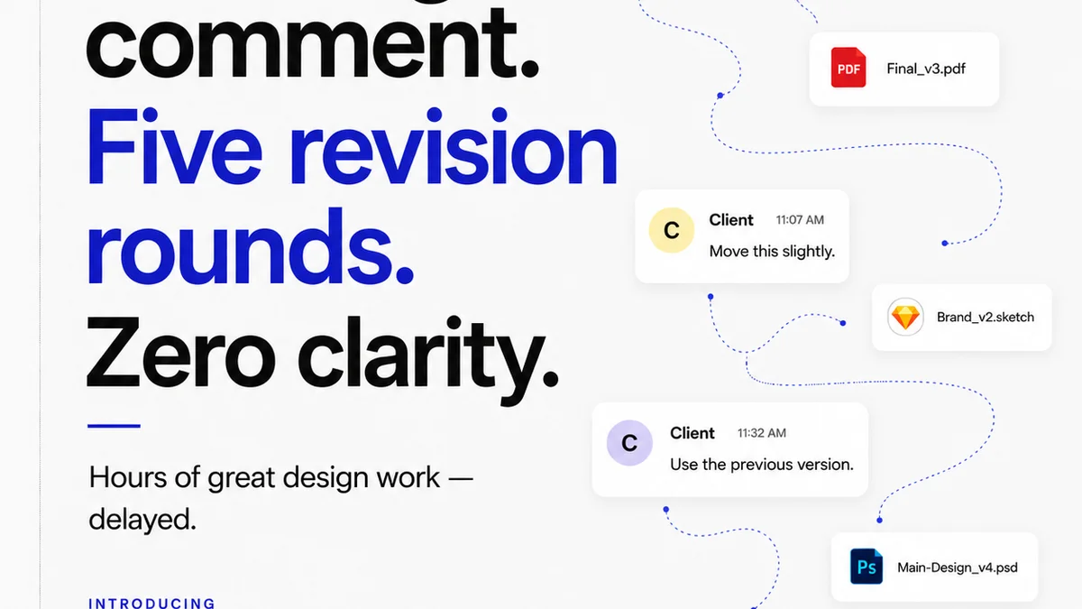
Managing feedback and revisions across multiple stakeholders for complex magazine layouts can quickly become chaotic. Emails get lost, comments are missed, and version control becomes a nightmare.
Revue offers a centralized platform designed to streamline this exact process. It allows for clear, contextual feedback directly on the design assets.
- Centralized Feedback: All comments, markups, and discussions live in one place, attached to specific versions of the layout. No more hunting through email chains.
- Revision Visibility: Track every iteration, every change, and every approval. This creates an audit trail and ensures everyone is working from the latest version.
- Quality Control: By having a single source of truth for feedback and approvals, your team can conduct more thorough quality checks against the agreed-upon revisions, minimizing the chance of errors slipping through.
This structured approach to feedback and approvals is crucial for effective QA, especially in high-stakes projects like magazine production.
Final Thought
Magazine layout QA isn't just a final step; it's a continuous thread woven through the entire design and production process. Are you treating it as a critical checkpoint or a hurried formality?
The difference impacts everything from client satisfaction to your agency’s bottom line.
Frequently asked questions
What are the key elements of a magazine layout QA checklist?
A comprehensive checklist should cover typography (fonts, sizes, spacing), color (values, consistency), imagery (resolution, format), content (spelling, grammar, accuracy), layout (alignment, spacing, margins, bleed), brand elements (logo, colors), and technical specifications (file format, resolution for print/web).
How does digital layout QA differ from print layout QA?
Print QA focuses on physical output aspects like color separation, bleed, trim, and image resolution (DPI). Digital QA emphasizes responsiveness across devices, interactivity, performance, accessibility, and cross-browser compatibility.
Who should be involved in the magazine layout QA process?
Ideally, multiple roles should be involved: the designer (self-proofing), an art director or senior designer (creative review), a dedicated copy editor/proofreader (text accuracy), and a project manager (brief adherence). The client serves as the final approver.
What are the biggest mistakes agencies make in layout QA?
Common mistakes include relying solely on the designer, providing vague feedback, lacking version control, ignoring the original brief, skipping final checks, and inconsistent application of brand guidelines.