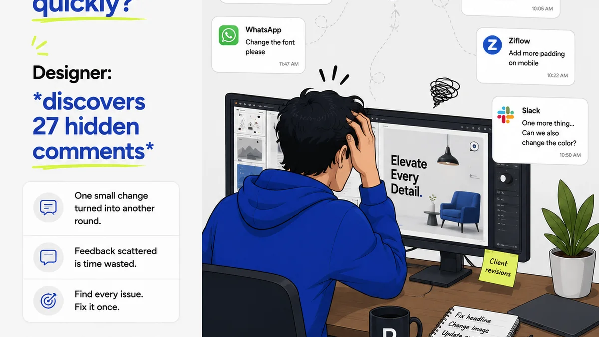
Everyone thinks visual annotation is about drawing red lines on a design. That’s part of it, sure. But it’s not the whole story. Not even close.
The hard truth? Poorly executed visual annotation is a bottleneck. It creates confusion, wastes time, and damages client relationships. It’s the silent killer of creative project velocity.
1. The Assumption: Annotation is Just Feedback
Clients and even some internal teams assume their job is done once they’ve pointed out what they don’t like. They scribble, they type, they send it off. They think they’ve provided feedback. They haven’t.
This is where the disconnect happens. They’re giving you *observations*, not actionable *instructions*.
What’s the difference? An observation is a symptom. “This blue is too dark.” An instruction is a solution or a clear directive. “Please try a lighter shade of blue, similar to the secondary brand color.”
The Real Goal: Clarity, Not Just Correction
Effective visual annotation isn't about identifying flaws. It's about providing clear, unambiguous direction for improvement. The goal is to move the project forward with minimal back-and-forth.
- Vague feedback leads to guesswork.
- Guesswork leads to revisions that miss the mark.
- Missed marks lead to more feedback loops.
- More loops mean delayed timelines and frustrated teams.
Your role isn't just to receive feedback; it's to ensure that feedback is usable. This means guiding your clients and stakeholders toward better annotation practices.
2. The Problem: Annotation Tools Are Often Too Simple
Many tools offer basic markup. Click, draw, type. Done. This simplicity is a double-edged sword. It’s easy to use, but it encourages shallow interaction.
Think about a PDF annotation tool. You can draw an arrow and write “make this bigger.” What does “bigger” mean? 10%? 20%? Wider? Taller? Without context, it’s a shot in the dark.
This lack of depth forces creative teams to play detective. They have to interpret vague comments, guess at intent, and often, ask clarifying questions that should have been part of the initial annotation.
The Cost of Ambiguity
Every moment spent deciphering unclear feedback is time stolen from actual creative work. It’s time spent in meetings asking, “What did they mean by that?” It’s time spent on revisions that get rejected again for the same reason.
This isn't just about making pretty pictures. It’s about efficient project delivery. When annotation is weak, the entire workflow suffers.
3. The Solution: Structured and Contextual Annotation
To improve visual annotation, you need to move beyond simple markup. You need a system that encourages context and clarity.
Context is King
What’s missing from basic tools? Context. Why is a change needed? What is the desired outcome? Who is asking for this change, and why?
When feedback is contextualized, it becomes a directive, not an observation.
Leverage Annotation Features
Modern tools offer more than just drawing. They allow for:
- Specific point annotation: Pinpointing an exact element.
- Text annotation with context: Adding notes that explain the *why*.
- Status tracking: Marking feedback as addressed, pending, or disputed.
- User attribution: Knowing who provided the feedback.
- Revision history: Seeing how feedback evolved.
The key is to use these features deliberately. Don’t just slap a comment on a screenshot. Use the tool’s capabilities to guide the annotator toward providing useful information.
Educate Your Stakeholders
This is crucial. You can have the best tools, but if your clients don’t know how to use them effectively, you’re still stuck.
Short, clear training sessions or simple guides can make a world of difference. Show them:
- How to use specific annotation tools.
- The importance of clear, actionable language.
- How to reference specific design elements.
- When to use comments versus markup.
Make it easy for them to give good feedback. Guide them towards it.
4. Best Practices for Clear Visual Annotation
Let’s get practical. How do you foster better annotation within your team and with clients?
1. Define Annotation Standards
Establish clear guidelines for feedback. What constitutes actionable feedback? What level of detail is required?
For example:
- Instead of: “Make this pop.”
- Use: “Increase the contrast of the CTA button by using the primary brand red to draw attention.”
- Instead of: “This layout is messy.”
- Use: “The spacing between the headline and the body text feels cramped. Increase the line height by 4px for better readability.”
2. Utilize Annotation Layers
If your tool supports it, use layers for different types of feedback. One layer for client approvals, another for internal design reviews, a third for QA checks.
This prevents feedback from becoming an unmanageable pile. It also helps track who is responsible for which set of comments.
3. Focus on Actionability
Every annotation should ideally lead to a clear action. If a comment is subjective or vague, it needs clarification. Build this clarification step into your process.
4. Link to Source Material
Where possible, allow annotators to link feedback directly to specific design elements, style guides, or requirements documents. This provides immediate context.
5. Use Statuses Religiously
Mark every piece of feedback as ‘Open,’ ‘In Progress,’ ‘Resolved,’ or ‘Rejected.’ This creates visibility and accountability.
6. Keep It Concise
While context is key, avoid lengthy essays. Short, direct comments are best. Use bullet points within comments if necessary.
5. Where Revue Fits In
This is precisely why we built Revue. Creative feedback and revision management are often the messiest parts of agency and in-house workflows. Basic annotation tools just can’t keep up.
Revue centralizes all your client feedback and internal reviews in one place. No more digging through emails, Slack threads, or disparate PDF markups.
Centralized Feedback: All comments, whether visual annotations or general notes, live on the specific creative asset. Stakeholders can annotate directly on mockups, videos, or documents.
Revision Visibility: When feedback is consolidated and contextualized within Revue, tracking revisions becomes straightforward. You can clearly see what feedback led to which change, and who approved it.
Quality Checks: By having a clear record of feedback and revisions, your QA process becomes more robust. You can verify that all approved changes have been implemented correctly and that no new issues have been introduced.
Revue streamlines the annotation process by providing a structured environment where feedback is clear, actionable, and trackable. It turns fuzzy feedback into a clear roadmap for your creative team.
6. Final Thought
Visual annotation is more than just a feature in a design tool. It’s a critical communication bridge between creative vision and client expectation.
Are you using your annotation tools to build bridges, or are you inadvertently building walls of confusion?
Frequently asked questions
What is the main problem with basic visual annotation tools?
Basic tools often encourage shallow, vague feedback. They lack the context needed to make annotations actionable, leading to guesswork, unnecessary revisions, and project delays.
How can I make client feedback more actionable?
Educate your clients on providing contextual feedback. Encourage them to explain the 'why' behind their comments, use specific language, and leverage features like point annotation and status updates.
What are the benefits of structured visual annotation?
Structured annotation leads to clearer communication, fewer misunderstandings, reduced revision cycles, faster project delivery, and improved client satisfaction. It transforms feedback from a symptom into a solution.
How does a tool like Revue help with visual annotation?
Revue centralizes all feedback on creative assets, providing context and structure. It tracks revisions, ensures clarity, and streamlines quality checks, turning chaotic feedback into actionable tasks.