Everyone thinks infographics are just about making data look pretty. A splash of color here, a few icons there, and suddenly complex information is digestible. That’s not wrong. But it’s dangerously incomplete.
The hard truth is that for media companies in 2026, infographics are evolving from mere visual aids into powerful storytelling engines and crucial drivers of engagement. If you’re still treating them as afterthoughts, you’re missing out on their true potential.
1. The Rise of Interactive and Dynamic Infographics
Static infographics have had their moment. The future, especially in the fast-paced media landscape, is dynamic. Think infographics that change based on user input, scroll-triggered animations, or embedded video elements. These aren’t just for tech giants; they are becoming accessible to more agencies and in-house teams.
Why does this matter for media?
- Deeper Engagement: Interactive elements keep users on the page longer, increasing dwell time and the likelihood of absorbing information.
- Personalized Experiences: Users can explore data points most relevant to them, creating a more meaningful connection.
- Enhanced Storytelling: Animation and transitions allow for a more narrative-driven presentation of facts and figures, crucial for media content.
This shift demands a new skill set, moving beyond graphic design into UX and basic animation principles. Tools are catching up, making these capabilities more user-friendly.
The Tech Stack for Dynamic Infographics
While traditional design tools are still essential, consider exploring:
- Animation Software: Adobe After Effects for complex animations, Lottie for web-ready animations.
- Interactive Design Platforms: Tools that allow for coding-free interactivity, like Canva’s Pro features or specialized platforms.
- Data Visualization Libraries: For custom web-based infographics, JavaScript libraries like D3.js remain powerful.
The goal isn’t just to present data, but to invite users into the data.
2. Data Storytelling as the Core Competency
The most effective infographics in 2026 will be those that tell a compelling story. Data alone is inert. It’s the narrative woven around it that gives it power and makes it memorable.
For media outlets, this means understanding the narrative arc:
- The Hook: Start with a surprising statistic or a relatable problem.
- The Build-up: Introduce supporting data points that explain the context and scope.
- The Climax: Present the key finding or insight.
- The Resolution: Offer solutions, implications, or a call to action.
This requires a collaborative effort between data analysts, journalists, and designers. The designer’s role expands from visual execution to strategic narrative structuring.
From Presentation to Persuasion
Infographics are no longer just for explaining; they are for persuading. Whether it’s convincing readers of a trend, highlighting an injustice, or showcasing the impact of a policy, the narrative must be clear and emotionally resonant.
Consider the source of your data and how it frames the story. Is it objective? Is it telling the whole picture?
3. AI-Assisted Infographic Creation
Artificial intelligence is already changing content creation, and infographics are no exception. While AI won’t replace human creativity entirely, it will become an indispensable assistant.
Expect AI tools to:
- Automate Data Analysis: Quickly identify trends and insights from large datasets.
- Suggest Visualizations: Recommend chart types and layouts based on the data.
- Generate Design Elements: Create icons, color palettes, and basic layouts.
- Optimize for Readability: Analyze text and suggest improvements for clarity and conciseness.
This frees up human designers and content creators to focus on the higher-level strategy: the story, the audience, and the unique creative execution that AI can’t replicate.
The Human Element Remains Critical
AI can generate a thousand variations, but it lacks true understanding of nuance, cultural context, or brand voice. The critical thinking, ethical considerations, and original creative spark will always come from human professionals.
Use AI as a tool to accelerate the process, not as a crutch for creativity.
4. Hyper-Personalization and Niche Audiences
The era of one-size-fits-all content is fading. In 2026, media companies will increasingly use infographics to speak directly to highly specific audience segments.
This means:
- Audience Segmentation: Understanding the unique data needs and interests of different reader groups.
- Tailored Data Points: Highlighting information that resonates most with a particular segment.
- Platform-Specific Formats: Adapting infographics for different channels (e.g., vertical formats for social media stories, interactive for web).
This approach moves beyond broad appeal and focuses on building deeper loyalty within specific communities.
Measuring Impact Beyond Views
How do you measure the success of a hyper-personalized infographic? It’s not just about shares. Look at:
- Conversion Rates: Did the infographic drive desired actions within that segment?
- Time Spent: Did users engage deeply with the content?
- Qualitative Feedback: What are users saying in comments and forums?
This granular approach requires robust analytics and a willingness to iterate based on segment-specific performance.
5. Accessibility as a Non-Negotiable Standard
Designing for accessibility is no longer a nice-to-have; it’s a must-have. Infographics must be usable by everyone, including people with disabilities.
Key considerations include:
- Color Contrast: Ensure sufficient contrast between text and background elements, adhering to standards like WCAG 2.1.
- Alternative Text (Alt Text): Provide descriptive alt text for all informative images and charts so screen readers can convey the content.
- Keyboard Navigation: If interactive, ensure all elements can be accessed and operated via keyboard.
- Clear Typography: Use legible fonts and appropriate sizing. Avoid relying solely on color to convey information.
- Structured Data: For web-based infographics, ensure the underlying data is structured semantically.
Ignoring accessibility alienates a significant portion of your audience and can lead to legal issues.
Beyond Compliance: Inclusive Design
True inclusivity goes beyond meeting minimum standards. It means designing with diverse needs in mind from the outset. This often leads to better design for *everyone*.
For instance, clear, concise language benefits not only those with cognitive disabilities but all readers trying to quickly grasp information.
Where Revue Fits In
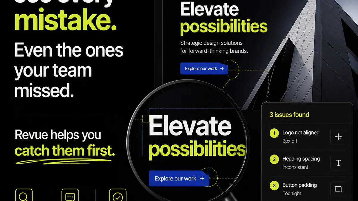
Creating sophisticated, engaging infographics requires a streamlined workflow. Managing feedback, revisions, and approvals across multiple stakeholders can quickly become chaotic.
Revue helps centralize this entire process. Imagine:
- Centralized Feedback: All client comments and internal reviews live in one place, attached directly to the infographic asset. No more hunting through endless email threads.
- Version Control & Revision Tracking: Clearly see who made what changes, when, and why. Track the evolution of the infographic from initial concept to final approval.
- Clear Approval Status: Know exactly where an infographic stands in the approval process, reducing bottlenecks and ensuring everyone is aligned.
- Quality Assurance Checkpoints: Integrate final checks for accuracy, consistency, and accessibility before publication.
This operational efficiency frees up your creative team to focus on the strategic and creative aspects of infographic development, rather than getting bogged down in administrative tasks.
Final Thought
The landscape of visual communication is constantly shifting. For media companies, infographics in 2026 will be less about static data dumps and more about dynamic, story-driven, accessible experiences. Are you prepared to move beyond the pretty pictures and embrace the strategic power of infographics?
Frequently asked questions
What is the biggest shift in infographic design for 2026?
The biggest shift is towards dynamic and interactive infographics. Instead of static images, expect more elements that respond to user input, feature animations, or embed multimedia, making them more engaging for media audiences.
How can AI assist in creating infographics for media?
AI can help by automating data analysis to find insights, suggesting appropriate visualizations, generating basic design elements like icons and color palettes, and optimizing text for clarity. This allows human creators to focus on strategic storytelling and creative execution.
Why is accessibility crucial for infographics in 2026?
Accessibility ensures that infographics can be understood by everyone, including people with disabilities. This involves using sufficient color contrast, providing alt text for screen readers, ensuring keyboard navigation for interactive elements, and using clear typography. It's essential for inclusivity and legal compliance.
How do media companies benefit from hyper-personalized infographics?
Hyper-personalized infographics allow media companies to speak directly to specific audience segments with tailored data and narratives. This fosters deeper engagement, builds loyalty within niche communities, and can lead to higher conversion rates for targeted content.