Everyone thinks infographics are just about making data look pretty. That’s the common assumption. Make it colorful, add some icons, and boom – engagement!
None of that is wrong. But it’s incomplete.
The hard truth is, in the hospitality industry, an infographic isn't just a visual aid; it's a strategic communication tool. If it doesn't serve a clear business purpose, it's just noise. And noise is the last thing a busy traveler or a discerning guest needs.
1. Define Your Objective First
Before you even think about colors or charts, ask yourself: What do I want this infographic to *do*?
Are you trying to:
- Showcase the unique selling points of a new resort package?
- Explain the complex benefits of a loyalty program?
- Highlight seasonal trends in travel to a specific destination?
- Communicate sustainability efforts to eco-conscious travelers?
- Simplify a complex booking process or amenity guide?
Every design decision should flow from this objective. Without a clear goal, your infographic will lack focus and fail to resonate.
The Danger of Vanity Metrics
Don't chase likes or shares for their own sake. Your goal is to drive tangible results: more bookings, higher customer satisfaction, increased loyalty, or better understanding of your services.
2. Know Your Audience Inside and Out
Who are you talking to? A luxury business traveler has different needs and expectations than a budget-conscious family on vacation.
Consider:
- Demographics: Age, income, location, family status.
- Psychographics: Interests, values, lifestyle, travel motivations.
- Pain Points: What challenges do they face when planning or experiencing travel?
- Information Needs: What specific data points will help them make a decision or enhance their experience?
An infographic designed for a millennial adventure seeker will look and feel vastly different from one targeting retirees looking for a relaxing cruise.
Tailor the Tone and Visuals
Match the language, imagery, and overall aesthetic to your target audience. A playful, vibrant design might work for a theme park, while a sophisticated, minimalist approach is better for a high-end spa.
3. Data Integrity is Non-Negotiable
This is where many hospitality infographics falter. They present data that is:
- Outdated
- Inaccurate
- Misleading
- Unsourced
In hospitality, trust is paramount. If your data isn't credible, you erode that trust instantly.
Best Practices for Data in Hospitality Infographics
- Use Reliable Sources: Internal booking data, reputable travel industry reports, official tourism statistics.
- Cite Your Sources Clearly: Add a small note at the bottom indicating where the data came from. This adds legitimacy.
- Keep Data Current: Ensure statistics reflect the most recent available period.
- Context is Key: Don't just present a number; explain what it means. For example, instead of "50% increase in bookings," say "50% increase in bookings for our summer packages, driven by early bird discounts.".
- Avoid Cherry-Picking: Present a balanced view. Highlighting only positive data while ignoring potential drawbacks can backfire.
Accuracy builds confidence. Inaccurate data breeds suspicion.
4. Storytelling Over Statistics
People don't connect with raw numbers. They connect with stories. Your infographic should tell a compelling story that the data supports.
Think about narrative arcs:
- Problem/Solution: The traveler's dilemma (e.g., planning stress) and how your offering solves it (e.g., all-inclusive packages).
- Journey: The guest's experience from booking to departure, highlighting key touchpoints.
- Transformation: How a stay at your property changes the guest's perspective or mood.
Use your data points as building blocks for this narrative, not just as standalone facts.
Visual Hierarchy Matters
Guide the viewer's eye through the story. Use size, color, and placement to emphasize the most important information first, then lead them through the supporting details.
5. Design for Clarity, Not Clutter
A common mistake is trying to cram too much information into one graphic. This leads to visual overload and confusion.
Focus on:
- White Space: Give elements room to breathe. It improves readability and makes the design feel less overwhelming.
- Consistent Branding: Use your brand colors, fonts, and logo appropriately. This reinforces identity.
- Appropriate Chart Types: Bar charts for comparisons, line charts for trends, pie charts for proportions (use sparingly). Ensure they accurately represent the data.
- Readable Typography: Choose fonts that are easy to read, even at smaller sizes. Avoid overly decorative fonts.
- Clear Call to Action (CTA): What should the viewer do next? Visit a website? Book now? Download a guide? Make it obvious.
Simplicity is often the most effective design.
6. Optimize for Distribution Channels
Where will this infographic live? How will people see it?
Consider:
- Website/Blog: Design for desktop and mobile viewing. Ensure it’s responsive.
- Social Media: Break down longer infographics into smaller, shareable snippets or vertical formats for platforms like Instagram Stories or Pinterest.
- Email Marketing: Use a compelling header image and link to the full infographic on your site.
- Print Materials: If used in brochures or at events, ensure print resolution and layout are optimized.
A single design might not fit all channels perfectly. Adaptability is key.
Where Revue Fits In
Creating effective infographics is an iterative process. You'll likely go through several rounds of feedback and revisions.
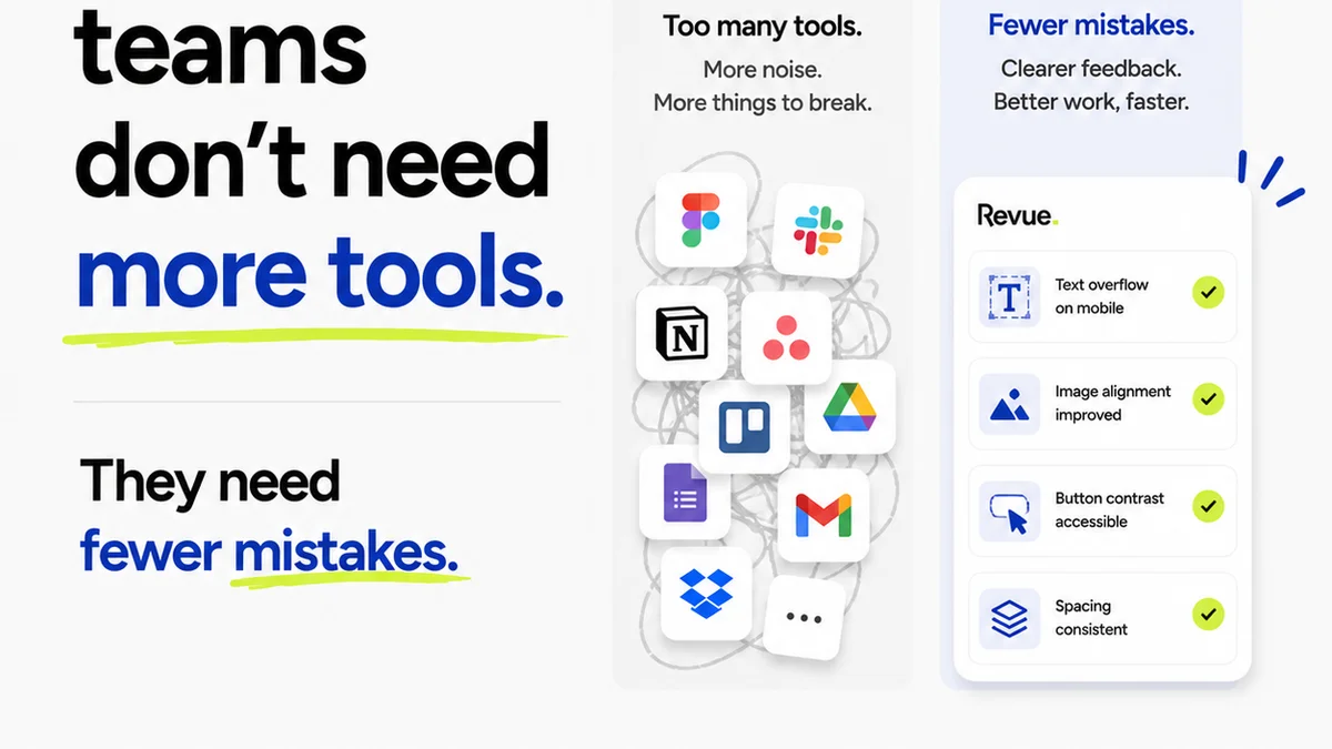
This is where a centralized feedback platform like Revue becomes invaluable. Instead of scattered email threads and confusing annotation layers, you get:
- Centralized Client Feedback: All comments and approvals in one place, linked directly to the design asset.
- Version Control: Easily track revisions and ensure everyone is working on the latest version.
- Clear Approval Workflows: Streamline the sign-off process, reducing bottlenecks and misunderstandings.
- Quality Assurance: Ensure the final infographic meets all objectives and brand standards before publication.
Revue helps ensure your creative assets, including infographics, are polished, accurate, and ready to make an impact.
Final Thought
Is your hospitality infographic just a pretty picture, or is it a hard-working asset driving real business results? The difference lies in strategy, audience understanding, and relentless focus on clarity and accuracy.
Are you leveraging visuals to tell a story, or just to fill space?
Frequently asked questions
What is the primary goal of an infographic in hospitality?
The primary goal is to communicate information clearly and engagingly to drive a specific action, such as increasing bookings, improving understanding of services, or building brand loyalty. It's about strategic communication, not just aesthetics.
How can I ensure the data in my hospitality infographic is credible?
Use reliable sources like internal booking data, reputable industry reports, or official statistics. Always cite your sources clearly at the bottom of the infographic and ensure the data is current and presented in context.
What are common design mistakes to avoid in hospitality infographics?
Common mistakes include cluttering the design with too much information, using inconsistent branding, choosing unreadable fonts, ignoring white space, and lacking a clear call to action. Prioritize clarity and simplicity.
How can I adapt infographics for different distribution channels?
Design for responsiveness on websites and mobile. For social media, consider breaking down longer infographics into smaller, shareable snippets or creating vertical formats. For email, use a compelling header and link to the full version.