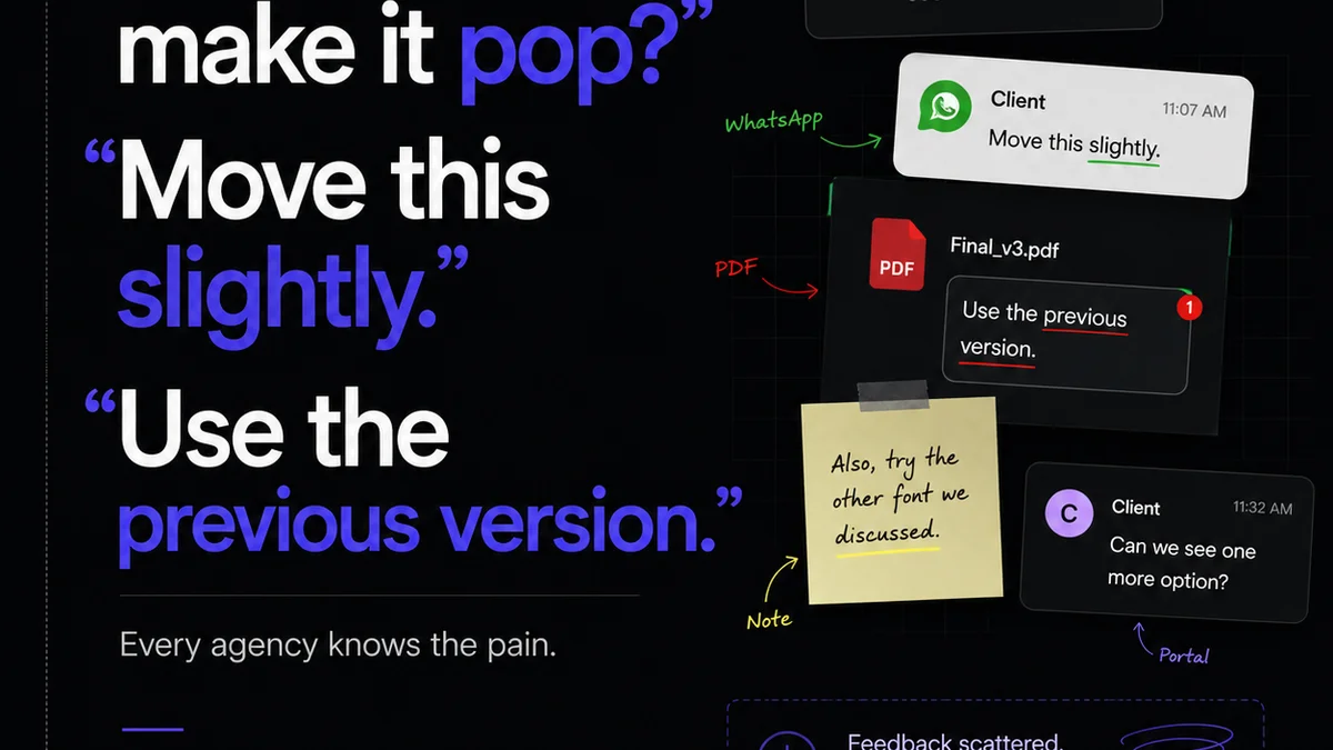
You think layout QA is just about checking if the logo is the right size and the text is aligned. That’s what everyone assumes. But that’s just the checklist. The real work happens before and after the pixel-pushing.
The hard truth is, robust layout quality assurance (QA) isn’t just a final step; it’s a continuous process woven into your entire creative workflow. It’s about preventing errors, not just finding them.
1. The Illusion of 'Done'
Creative teams often treat layout QA as the final gate. The design is 'finished,' and then someone does a quick check. This approach is fundamentally flawed.
It assumes perfection on the first (or last) pass. It ignores the inherent complexity and potential for error in multi-stage creative projects.
Layout QA should start the moment a layout concept is born. It evolves with every iteration.
Early Detection is Key
Catching issues early saves immense time and resources. A misplaced element in a wireframe is trivial to fix. The same element in a final, client-approved PSD or Figma file? That’s a costly rework.
- Misaligned elements
- Incorrect spacing
- Inconsistent typography
- Broken grids
- Accessibility concerns
These aren’t just aesthetic glitches. They erode trust and can lead to significant project delays.
2. Beyond the Obvious: Deeper Layout Checks
Most teams stop at visual checks. They look for things that are obviously wrong. But true layout QA digs deeper into the structure, consistency, and technical execution.
Grid Integrity and Responsiveness
A layout isn't just a static image. It's a system designed to adapt. How well does your layout hold up across different screen sizes and devices? This is critical for web and app design.
Check your breakpoints. Ensure elements reflow gracefully, not just break or overlap.
Consider the underlying grid system. Is it consistently applied? Are gutters and margins behaving as expected?
Typography Hierarchy and Readability
This is more than just font choice. It’s about how text is structured and presented.
Hierarchy: Does the visual weight of headings, subheadings, and body text clearly guide the reader’s eye? Is the information structured logically?
Readability: Are line lengths appropriate? Is there sufficient line spacing (leading)? Are contrast ratios adequate for legibility? WCAG guidelines provide essential benchmarks here.
Visual Weight and Balance
Does the layout feel balanced? Or is there too much visual weight on one side? This relates to element size, color, and placement.
A well-balanced layout feels stable and intentional. An unbalanced one can feel jarring or amateurish.
Consistency Across States and Variations
For interactive elements, QA needs to cover different states: hover, active, disabled, error, success. Are these states visually distinct and consistent with the overall design language?
If the layout appears in multiple contexts (e.g., print vs. web, different product versions), ensure consistency there too.
3. Establishing a Layout QA Workflow
A haphazard approach to layout QA is a recipe for disaster. You need a systematic process.
Define Clear Standards and Checklists
What constitutes a
Frequently asked questions
What is the most common mistake in layout QA?
The most common mistake is treating layout QA as a final, superficial check rather than an integrated process. This leads to missing critical structural, consistency, and responsiveness issues.
How can I make layout QA more efficient?
Establish clear standards and checklists, automate checks where possible (e.g., using linters for code), and integrate QA early and continuously into the design and development process. Proper tooling also helps centralize feedback.
What are the key areas to check during layout QA?
Key areas include grid integrity, responsiveness across devices, typography hierarchy and readability, visual balance, consistency of interactive states, and adherence to brand guidelines.
How does layout QA differ for print vs. digital?
Print QA focuses on physical output: color accuracy (CMYK), bleed, trim, resolution, and paper stock. Digital QA emphasizes interactivity, responsiveness, accessibility, performance, and cross-browser/device compatibility.