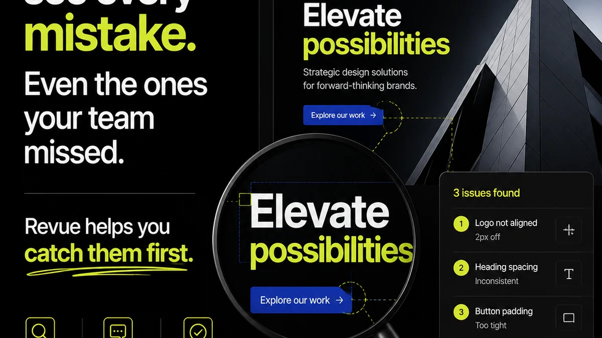
Layout quality assurance. It sounds simple, right? Just check if everything looks right before it goes out the door.
None of that is wrong. But it’s incomplete.
The hard truth? Layout QA is a critical operational bottleneck that most agencies manage poorly, leading to scope creep, client frustration, and endless revision cycles. It’s not just about catching typos; it's about protecting your agency’s time, budget, and reputation.
1. The Real Cost of Bad Layout QA
You probably think your current process is fine. A quick glance, a few notes, and you’re done. That’s the assumption. The reality is far more expensive.
Every missed error, every ambiguous comment, every delayed approval ripples through your project timeline and budget. It’s not just about the hours spent fixing it; it’s about the opportunity cost of what your team *could* have been doing.
Consider these hidden costs:
- Extended project timelines
- Increased scope creep due to unclear feedback
- Client dissatisfaction and erosion of trust
- Wasted billable hours on rework
- Burnout for your creative and production teams
- Damage to your agency’s reputation for quality
This isn't about perfectionism. It’s about operational efficiency and profitability. A robust layout QA process is an investment, not an expense.
2. Beyond the Obvious: What to *Actually* Check
Most teams stop at the surface level. Is the logo there? Is the text readable? Is it the right color?
That’s a start. But a thorough layout QA goes deeper, scrutinizing the foundational elements that ensure usability, brand consistency, and technical correctness.
Think like a meticulous engineer, not just a casual observer.
Visual Hierarchy and Flow
Does the layout guide the user’s eye naturally? Are the most important elements given appropriate prominence?
A common mistake is overcrowding the design. Too many competing elements dilute the message. Ensure clear visual pathways.
Typography and Readability
Beyond just font choice, check:
- Line height and leading
- Character and word spacing (kerning and tracking)
- Widows and orphans (avoiding single words or lines at the end of paragraphs)
- Contrast ratios for text and background (check against WCAG guidelines)
Readable text isn’t just about font size; it’s about the entire typographic ecosystem.
Grid and Alignment
Is the design built on a consistent grid? Are elements aligned precisely? Even a few pixels off can look unprofessional.
This is where digital tools are invaluable. Use alignment tools religiously. Check spacing between elements – is it consistent and intentional?
Color and Contrast
Ensure colors are applied consistently across all elements and states (e.g., hover, active). Most importantly, check contrast ratios. Accessibility isn't optional.
Use tools to verify color contrast meets WCAG standards for text and interactive elements.
Asset Integrity
Are all images and graphics loading correctly? Are they the right resolution for the intended output (web vs. print)? Are they optimized for performance?
Check for broken links, low-resolution images, and incorrect file formats.
Responsiveness and Adaptability
For digital projects, does the layout adapt gracefully across different screen sizes and devices? Test on key breakpoints.
Don't just rely on browser developer tools. Test on actual devices whenever possible.
Brand Consistency
Does the layout adhere to the established brand guidelines? This includes logo usage, color palettes, typography, and overall tone.
This is often where subjective feedback creeps in. Having clear, documented brand guidelines is paramount.
3. Building a Bulletproof Layout QA Process
Your assumption might be that a checklist is enough. It’s a good start, but it needs structure and accountability.
A truly effective layout QA process is integrated into your workflow, not tacked on at the end.
1. Define Clear Standards
What does
Frequently asked questions
What is the primary goal of layout QA?
The primary goal of layout QA is to ensure that all visual and functional elements of a design or creative asset are accurate, consistent, and meet project requirements before delivery or publication. This includes checking for visual errors, technical issues, brand adherence, and overall user experience.
How can agencies improve their layout QA process?
Agencies can improve layout QA by establishing clear standards and checklists, integrating QA into every stage of the workflow (not just at the end), using collaborative feedback tools, training team members on QA best practices, and conducting regular audits of the QA process itself.
What are common layout QA mistakes to avoid?
Common mistakes include treating QA as an afterthought, relying solely on subjective visual checks, not testing across multiple devices and screen sizes, neglecting accessibility standards (like color contrast), and failing to document feedback clearly, leading to misinterpretations and rework.
How does layout QA impact project profitability?
Effective layout QA reduces costly rework, prevents scope creep caused by unclear feedback, shortens project timelines by catching errors early, and minimizes client dissatisfaction. This directly contributes to better profitability by optimizing billable hours and protecting margins.