Everyone assumes a packaging QA checklist is about catching typos and ensuring the logo is the right color. That’s the easy stuff. It’s table stakes.
The hard truth is, a truly effective packaging QA checklist is about protecting your agency’s reputation and profitability by catching the subtle, costly errors that slip through the cracks. It’s about operational excellence, not just aesthetic perfection.
1. Beyond the Brand Guidelines: The Deep Dive
Brand guidelines are your North Star, yes. But they’re often a starting point, not the finish line, especially in the complex world of packaging.
Think about the variables:
- Print processes (offset, digital, flexo, gravure)
- Material substrates (cardboard, plastic, metal, glass)
- Finishes (varnish, foil, embossing, spot UV)
- Die-lines and structural elements
- Regulatory compliance
Your checklist needs to address these nuances, not just the RGB values.
1.1 Color Accuracy: More Than Just CMYK
It’s not just about getting the CMYK values right. It’s about anticipating how those colors will translate across different print methods and substrates.
- Pantone Matching: Are spot colors specified correctly? Are the correct Pantone libraries being used (e.g., Coated vs. Uncoated)?
- Color Profiles: Is the correct color profile embedded for the intended print output (e.g., SWOP, GRACoL)?
- Ink Trapping: Are overlaps set appropriately to avoid gaps or misregistration, especially with multiple spot colors?
- Rich Black: Is a suitable rich black formula specified to avoid muddy blacks and ensure deep coverage, particularly on uncoated stocks?
- White Ink: If white ink is used as a base or for highlights, is its opacity and coverage sufficient for the substrate?
1.2 Typography and Copy Integrity
Typos on packaging aren't just embarrassing; they can lead to regulatory issues or costly recalls.
- Font Embedding: Are all fonts fully embedded or outlined? Missing fonts can cause catastrophic layout shifts.
- Ligatures and Kerning: Check for awkward spacing, especially with tight layouts or small type sizes. Ensure ligatures are intentional and correctly applied.
- Text Legibility: Is body copy readable at the intended size and distance? Consider contrast ratios and font weight.
- Character Sets: Are all necessary characters, including international symbols or special characters, present and correct?
- Legal and Regulatory Copy: Is all mandatory information (ingredients, warnings, nutritional facts, barcodes) present, accurate, and compliant with relevant laws?
1.3 Die-Lines and Structural Integrity
The flat artwork is only half the battle. The die-line dictates how the package is formed.
- Die-Line Accuracy: Does the die-line match the structural engineer's specifications exactly? Small deviations can ruin the fit and function.
- Crease and Score Lines: Are these clearly delineated and correctly placed to ensure proper folding and assembly?
- Bleed and Safety Margins: Is there adequate bleed around all edges and sufficient safety margin from the die-line for critical elements like text and logos?
- Panel Alignment: When the package is folded, do graphics and text align across panels as intended?
- Cut Lines: Are cut lines clean and precise, avoiding jagged edges or inaccuracies?
1.4 Finishes and Special Effects
Foil, embossing, and spot UV add premium appeal, but they require meticulous setup.
- Layer Separation: Are finishes applied on separate layers with clear naming conventions (e.g., `FOIL_M1`, `SPOTUV_C1`)?
- Registration Accuracy: How will the finish register against the printed elements? Check for potential misregistration issues, especially with fine details or thin lines.
- Embossing/Debossing Depth: Is the depth specified correctly and achievable with the chosen printing method?
- Die-Cut Complexity: Are intricate die-cut shapes feasible for production?
- Varnish Coverage: Is the varnish intended for spot application or flood? Is the coverage appropriate for the desired effect?
2. The Human Element: Beyond Automated Checks
Software can catch some errors, but it can’t replicate human judgment or understand context. Your QA process needs eyes on the prize.
Automated preflight checks are essential. They catch file structure issues, missing fonts, and basic color problems. But they miss a lot.
- Contextual Review: Does the packaging look right *on the shelf*? Does it communicate the brand’s message effectively?
- Usability Assessment: Is it easy to open? Is the information easy to find and understand?
- Material Suitability: Does the chosen substrate and finish enhance or detract from the product and brand?
- Production Feasibility: Can the design realistically be produced within budget and timeline constraints?
This requires experienced eyes – ideally someone who understands both design and print production.
3. Pre-Production Proofing: The Critical Step
This is where you catch the majority of errors before they hit the printing press.
3.1 Digital Proofs vs. Physical Proofs
Digital proofs (PDFs) are great for layout and copy checks. But they can be deceiving regarding color and finish.
- Hard Proofs: For critical jobs, a calibrated, contract-quality hard proof is non-negotiable. This shows how the colors will *actually* look.
- Press Checks: The ultimate safeguard. Being on press allows for real-time adjustments and sign-off on the final output. If you can’t be there, have a trusted print partner represent you.
3.2 What to Scrutinize on Proofs
Don’t just glance. Systematically check:
- Color: Compare against approved swatches or digital references.
- Registration: Look for any signs of misalignment in print or finishes.
- Ink Density: Are solids solid? Are gradients smooth?
- Trapping: Are there any unwanted gaps or overlaps?
- Finishes: Is the foil shiny? Is the embossing crisp? Does the spot UV have the right sheen?
- Die-Cut Accuracy: Does the physical proof fold and assemble correctly?
4. Where Revue Fits In
Managing client feedback and revisions for packaging projects can be chaotic. Scattered emails, version control nightmares, and missed comments are all too common.
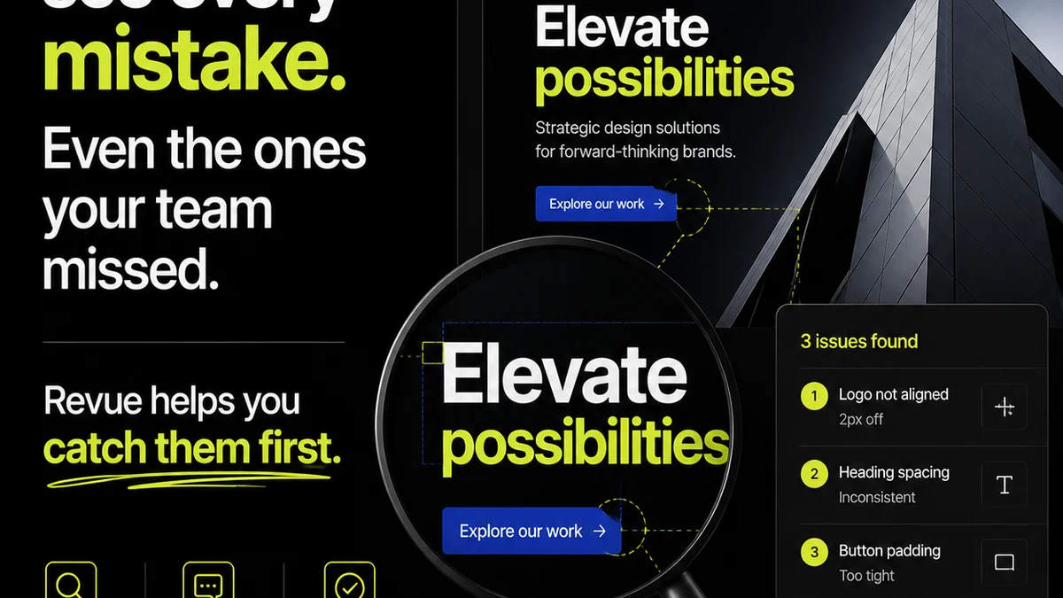
Revue provides a centralized platform to streamline this entire process.
- Centralized Feedback: All client comments, annotations, and approvals live in one place, linked directly to the design files. No more hunting through email chains.
- Revision Tracking: Clearly see every version, every change, and who approved what. This creates an irrefutable audit trail for accountability.
- Streamlined Approvals: Define clear approval workflows so stakeholders know exactly what they need to sign off on, reducing bottlenecks and misunderstandings.
- Quality Control: Use the platform to manage your internal QA process, ensuring all checklist items are addressed and signed off before final delivery to the printer.
By bringing structure to the feedback loop, Revue helps ensure that the packaging design you finalize is the packaging design the client actually wants, and that it’s production-ready.
5. Final Thought
Your packaging QA checklist isn't just a document; it's a commitment to quality. It's a shield against costly errors and a testament to your agency's professionalism.
Are you treating it as an afterthought, or as the critical gatekeeper it needs to be?
Frequently asked questions
What are the most common packaging QA mistakes?
The most common mistakes go beyond typos and incorrect colors. They include issues with font embedding, inadequate bleed and safety margins, inaccurate die-lines, poor registration of special finishes (like foil or spot UV), and non-compliance with regulatory copy. These are often missed by basic checks.
How important is a physical proof for packaging?
Extremely important. Digital proofs (PDFs) are useful for layout and copy, but they cannot accurately represent color reproduction, ink density, or the tactile feel of finishes like foil or embossing. A calibrated hard proof or even a press check is crucial for final sign-off.
What's the difference between a digital proof and a contract proof?
A digital proof is typically a PDF, useful for checking content and layout. A contract proof is a high-quality, calibrated printout designed to accurately represent the final printed output in terms of color, tone, and detail. It serves as a binding agreement between the designer and the printer regarding the final appearance.
How can I ensure regulatory compliance on packaging?
This requires a dedicated step in your QA process. Cross-reference all legal and regulatory copy (ingredients, warnings, nutritional information, country of origin, etc.) against the latest guidelines from relevant authorities (e.g., FDA, FTC). Ensure the text is legible and correctly placed according to regulations.