Hospitality presentation design is all about selling a vision. Whether it’s pitching a new hotel concept, a menu update, or a marketing campaign, the slides need to work harder than just looking good. Many think great presentation design is purely about aesthetics – stunning visuals, elegant typography, and a cohesive color palette. None of that is wrong. But it’s incomplete.
The hard truth? Effective hospitality presentation design is a strategic tool. It must communicate complex ideas simply, build trust, and ultimately, drive action from stakeholders, clients, or internal teams. It’s about clarity, persuasion, and efficiency, all wrapped in a professional package.
1. Beyond Buzzwords: Defining Hospitality Presentation Design
Presentation design in the hospitality sector is often misunderstood. It's not just about making a PowerPoint look nice. It’s about translating business objectives into a visual narrative that resonates with a specific audience, be they investors, potential guests, or hotel management.
Think about the stakes:
- Securing funding for a new resort.
- Pitching a rebranding for a restaurant chain.
- Presenting quarterly performance reviews to executives.
- Onboarding new staff with essential brand guidelines.
Each requires a different approach, but all rely on clear, compelling visuals that support the spoken word, not distract from it. The goal is to enable quick understanding and confident decision-making.
The Audience is Key
Who are you presenting to? Investors care about ROI. Operations managers care about efficiency. Marketing teams care about brand perception. Tailor your design and content to their priorities. A visually stunning deck that misses the mark on financial projections will fall flat with investors.
2. The Core Elements of Effective Hospitality Presentations
Great presentation design in hospitality hinges on a few fundamental pillars. Get these right, and your message will land with impact.
Clarity Over Clutter
Hospitality is a fast-paced industry. Decision-makers are busy. Your slides must be scannable and immediately understandable. Avoid dense blocks of text. Use bullet points, concise headings, and impactful imagery.
Brand Consistency
Every touchpoint in hospitality reinforces the brand. Your presentations are no different. Use brand colors, fonts, and logos consistently. This builds recognition and reinforces professionalism. A disjointed visual identity screams amateurish.
Visual Storytelling
People remember stories, not statistics. Weave a narrative through your presentation. Use high-quality photography and graphics that evoke the desired mood or experience. Show, don’t just tell.
Data Visualization
Numbers are crucial in hospitality – occupancy rates, revenue, customer satisfaction scores. Present data clearly using charts and graphs. Make complex data accessible and digestible. Avoid overwhelming your audience with raw spreadsheets on slides.
Readability and Accessibility
Ensure text is legible from a distance. Use sufficient contrast between text and background. Consider font sizes and styles carefully. Adhering to accessibility guidelines ensures your message reaches everyone.
Conciseness
Every slide should serve a purpose. If a slide doesn't advance the narrative or provide essential information, cut it. Respect your audience’s time.
3. Common Pitfalls in Hospitality Presentation Design
Many hospitality presentations stumble over the same avoidable mistakes. Recognizing these can save you significant time and embarrassment.
The “Data Dump” Slide
Loading a slide with too much text or unorganized data. It’s overwhelming and ineffective. Your audience will tune out.
Inconsistent Branding
Using different logos, colors, or fonts across slides. It looks unprofessional and dilutes the brand message.
Low-Quality Visuals
Pixelated images, generic stock photos, or poorly designed graphics. These detract from the message and damage credibility.
Ignoring the Audience
Presenting information in a way that doesn’t align with the audience’s interests or understanding.
Over-reliance on Templates
Using generic, uncustomized templates that fail to reflect the unique brand or message. They often look dated.
Lack of a Clear Narrative Arc
Jumping from topic to topic without a logical flow. The presentation feels disjointed and hard to follow.
4. Designing for Specific Hospitality Scenarios
The context of your presentation dictates its design. Here’s how to adapt.
Investor Pitches
Focus on financial projections, market analysis, and ROI. Use clean, professional designs with clear data visualizations. Emphasize growth potential and competitive advantages. The tone should be confident and data-driven.
Marketing & Sales Presentations
Highlighting amenities, experiences, and unique selling propositions. Use aspirational imagery and compelling copy. Showcase the lifestyle or benefit the service offers. The tone should be persuasive and engaging.
Internal Strategy & Operations
Presenting operational improvements, performance metrics, or strategic plans. Clarity and actionable insights are paramount. Use straightforward language and clear process diagrams. The tone should be direct and informative.
Event Planning & Proposals
Demonstrating venue capabilities, catering options, and event flow. Visuals should showcase the space and potential atmosphere. Clear timelines and package details are essential. The tone should be organized and inspiring.
5. Tools and Technologies for Presentation Design
While the principles are timeless, the tools evolve. Choosing the right software impacts efficiency and output quality.
Presentation Software
- Microsoft PowerPoint: The industry standard, offering robust features and widespread compatibility.
- Google Slides: Excellent for real-time collaboration and cloud-based access.
- Keynote: Known for its elegant design capabilities and user-friendly interface on Apple devices.
- Figma / Sketch: While primarily UI design tools, they can be leveraged for highly custom, sophisticated presentation graphics and layouts, especially for agencies.
Asset Management
High-quality images and brand assets are critical. Ensure you have a system for storing and accessing approved brand elements, photography, and templates. This prevents the use of outdated or off-brand materials.
Collaboration Platforms
Tools that facilitate feedback and revision are essential for teams. Centralizing communication prevents version control nightmares and speeds up the approval process.
Where Revue Fits In
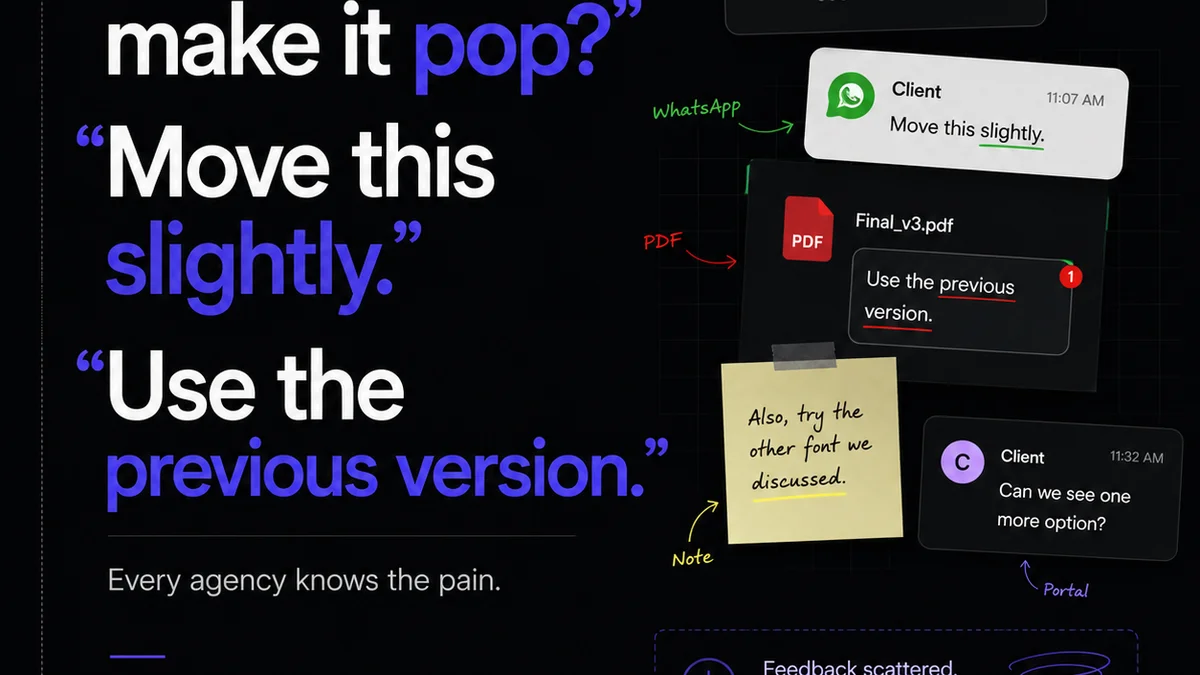
Managing the presentation design workflow, especially for agencies or large hospitality groups, can become chaotic. Feedback gets lost in email chains, revisions are unclear, and final approvals take longer than they should.
Revue helps centralize this entire process. Instead of juggling multiple documents and scattered feedback, you can manage all your client or internal review cycles in one place. This means:
- Centralized Feedback: All comments and annotations are tied directly to the specific version of the presentation being reviewed.
- Clear Revision Tracking: See exactly what changed, who requested it, and when. No more guessing what needs to be updated.
- Streamlined Approvals: Move from review to sign-off efficiently, ensuring everyone is on the same page before a critical pitch or launch.
- Quality Control: Maintain brand consistency and ensure all requirements are met before the final output.
This operational efficiency is crucial in the fast-paced hospitality world, ensuring your presentations are polished, persuasive, and delivered on time.
Final Thought
Presentation design in hospitality isn't a separate discipline; it's an integrated part of business strategy. It’s the visual handshake that sets the tone before a single word is spoken. Are your presentations building trust and driving decisions, or are they just digital decoration?
Frequently asked questions
What are the most important elements of hospitality presentation design?
The most important elements are clarity, brand consistency, visual storytelling, effective data visualization, readability, and conciseness. Each ensures your message is understood quickly and professionally.
How can I ensure brand consistency in hospitality presentations?
Use a style guide that includes approved logos, color palettes, typography, and imagery. Apply these elements consistently across all slides. Centralized asset management tools can help.
What's the biggest mistake to avoid in hospitality presentations?
The biggest mistake is often the 'data dump' – overwhelming the audience with too much text or unorganized information. Focus on presenting key points clearly and visually.
How does presentation design impact decision-making in hospitality?
Effective presentation design clarifies complex information, builds credibility, and evokes desired emotions, all of which influence stakeholder decisions. A well-designed presentation supports persuasion and confidence.
Can presentation design software like Figma be used for hospitality presentations?
Yes, advanced tools like Figma can be used to create highly customized and sophisticated presentation graphics and layouts, especially for agencies needing unique brand expressions. However, traditional tools like PowerPoint or Google Slides are often sufficient for standard needs.