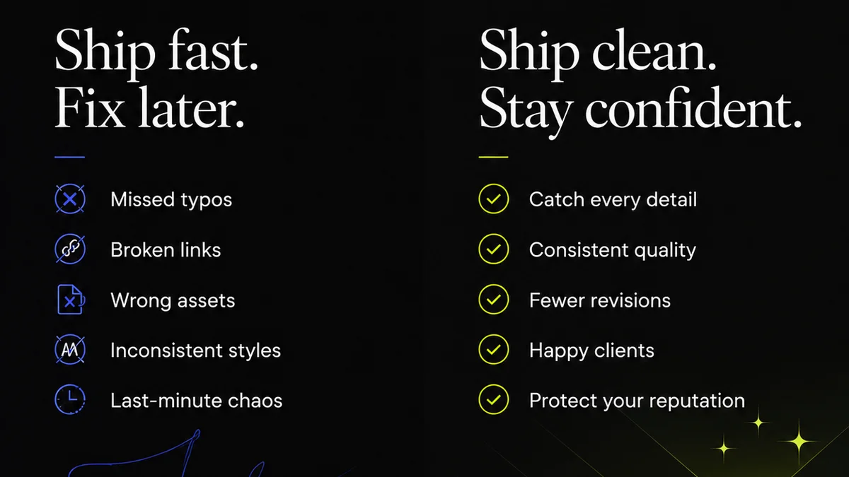
Everyone thinks presentation design is about making slides look pretty. That’s the surface-level assumption. And none of that is wrong. But it’s incomplete.
The hard truth? Great presentation design isn't just aesthetics; it's strategic communication. It’s about clarity, persuasion, and driving a specific outcome. The best services deliver far more than just a visual facelift for your decks.
1. It’s About Clarity, Not Just Color
You’ve seen them. Decks packed with bullet points, dense paragraphs, and tiny fonts. They’re a chore to get through. They obscure the message instead of revealing it.
Effective presentation design cuts through the noise. It uses visuals, hierarchy, and white space to guide the audience’s eye and mind. It simplifies complexity.
The Goal: Instant Comprehension
When an audience can grasp the core message in seconds, you’ve won half the battle. This means:
- Using strong headlines that convey the main point.
- Employing visuals (charts, icons, impactful imagery) to represent data and concepts.
- Breaking down complex information into digestible chunks.
- Ensuring a clear visual flow from one idea to the next.
This isn't about making it *look* good; it's about making it *work*.
2. Storytelling Is the Engine
A presentation, at its heart, is a story. Whether it’s a sales pitch, an internal update, or a client proposal, there’s a narrative arc. The design must support that arc.
Think about the classic story structure: introduction, rising action, climax, falling action, resolution. Your slides should mirror this. A good designer understands how to pace the reveal of information, build anticipation, and deliver a compelling conclusion.
Visual Narrative Flow
This means:
- Establishing context upfront.
- Introducing problems or opportunities.
- Presenting solutions or data points that build the case.
- Highlighting key takeaways or calls to action.
- Ending with a memorable closing statement.
A disjointed set of slides tells no story. It’s just a collection of facts. Presentation design services that excel understand this narrative imperative.
3. Persuasion Through Design
What’s the ultimate goal of most presentations? To persuade. To get a client to sign off. To get an investor to fund. To get your team to buy into a new strategy.
Design is a powerful persuasive tool. It influences perception, builds credibility, and evokes emotion. A well-designed presentation signals professionalism, attention to detail, and confidence.
The Psychology of Visuals
Consider these elements:
- Color psychology: Using colors that align with your brand and desired emotional response.
- Typography: Choosing fonts that are readable and convey the right tone.
- Layout: Creating a balanced and engaging visual structure.
- Imagery: Selecting images that resonate with the audience and reinforce the message.
These aren't superficial choices. They are calculated decisions designed to influence the audience’s reception and decision-making process.
4. Driving Action and Outcomes
The most effective presentations don't just inform; they compel action. Whether it’s a purchase, an approval, or a behavioral change, the presentation should lead the audience to a desired next step.
Presentation design services that deliver real ROI focus on this outcome. They work backward from the desired result to craft a narrative and visual journey that makes that result inevitable.
The Call to Action (CTA)
This means the design must:
- Clearly articulate what you want the audience to do.
- Make it easy for them to understand how to do it.
- Reinforce the benefits of taking that action.
- Build confidence in the presenter and the proposition.
A weak or missing CTA means the presentation has failed its primary objective.
5. Consistency and Brand Integrity
Your presentation is a brand touchpoint. Every slide, every graphic, every word reflects on your company. Inconsistency breeds doubt.
Professional presentation design ensures your decks align with your overall brand identity. This isn't just about slapping a logo on it. It's about consistent use of:
- Brand colors
- Typography
- Imagery style
- Tone of voice
- Overall visual language
This builds recognition and reinforces trust. When a client sees your presentation, they should immediately recognize your brand and its established quality.
6. Efficiency and Scalability
Creating high-quality presentations from scratch is time-consuming. For agencies and in-house teams juggling multiple clients and projects, it’s a significant drain on resources.
Leveraging presentation design services frees up your team to focus on core strategy, creative work, and client relationships. It provides access to specialized skills and tools without the overhead of hiring full-time designers dedicated solely to decks.
The ROI of Outsourcing
Consider the benefits:
- Reduced internal workload.
- Faster turnaround times.
- Access to expert design skills.
- Consistent, high-quality output.
- Scalability for high-volume needs.
It’s about optimizing your workflow and ensuring your most critical communications are handled by professionals.
Where Revue Fits In
Managing client feedback and revisions on presentations can be chaotic. Emails get lost, comments are vague, and tracking changes is a nightmare. This directly impacts the quality and speed of delivery.
Revue streamlines this entire process. It centralizes all feedback on your creative work, including presentations. You get clear, actionable comments directly on the assets.
Revision tracking becomes transparent. You can see exactly what’s been changed, approved, or rejected. This eliminates ambiguity and ensures everyone is working from the latest version.
Ultimately, Revue helps ensure the final presentation is not only visually polished but also strategically sound and free of errors – a direct result of efficient, visible, and manageable feedback loops.
Final Thought
Is your presentation design focused on impressing with flashy visuals, or is it engineered to communicate a clear message, tell a compelling story, and drive a specific outcome? The distinction is everything.
Frequently asked questions
What is the primary goal of professional presentation design?
The primary goal is not just aesthetics, but strategic communication. It aims to make complex information clear, tell a compelling story, persuade the audience, and drive a specific desired outcome or action.
How does presentation design impact brand integrity?
Professional presentation design ensures consistency in brand colors, typography, imagery, and overall visual language. This reinforces brand recognition, builds trust, and signals professionalism to the audience.
Can presentation design services improve internal team efficiency?
Yes, by outsourcing presentation creation and refinement, internal teams can focus on core strategic and creative tasks, reducing workload and freeing up valuable time. This also provides access to specialized design expertise.
What role does storytelling play in presentation design?
Storytelling is crucial. A well-designed presentation follows a narrative arc, guiding the audience through a sequence of information that builds understanding, engagement, and ultimately, persuasion. The design elements support this narrative flow.