Everyone talks about presentation design trends. You see them everywhere: minimalist slides, bold typography, and animated transitions. For the legal industry, this often translates to a confused scramble to adopt the flashiest new techniques.
None of that is wrong. But it’s incomplete.
The hard truth for legal presentations is that design isn't about looking modern; it's about communicating complex information with unwavering clarity and authority. In 2026, this means moving beyond mere aesthetics to strategic visual storytelling that builds trust and drives decisions.
1. Data Storytelling Over Data Dumping
Legal work is inherently data-rich. Briefs, case studies, financial reports – they’re all filled with numbers and facts. The old way was to project spreadsheets or dense tables. That’s a mistake.
Effective legal presentations in 2026 will prioritize making data understandable at a glance. This isn't just about charts; it's about narrative.
Visualizing Key Metrics
Instead of rows of numbers, think:
- Clear, uncluttered charts and graphs that highlight the single most important takeaway.
- Infographics that simplify complex processes or timelines.
- Strategic use of color to draw attention to critical data points.
- Minimal text on slides; the presenter explains the details.
Tools like Adobe Illustrator or even advanced features in PowerPoint and Keynote allow for custom data visualization that aligns with firm branding.
Context is King
A chart without context is just noise. Every visual element must directly support the argument being made. Ask: What decision does this data inform? What action should the audience take?
2. The Rise of Strategic Simplicity
The assumption is that complex legal matters require complex visuals. Wrong.
True sophistication in legal presentation design lies in ruthless simplification. It’s about stripping away the unnecessary to reveal the core message.
Decluttering the Canvas
This means:
- Generous use of white space.
- Limiting the number of elements on a single slide.
- Avoiding distracting backgrounds or busy patterns.
- Focusing on one idea per slide.
Think of it as visual editing. Every word, every image, every color must earn its place.
Typography as Authority
Font choice matters more than ever. In 2026, legal presentations will lean on:
- Serif fonts for body text to convey tradition and readability, especially for longer passages.
- Sans-serif fonts for headings and key takeaways to ensure modern clarity and impact.
- Consistent font hierarchies across all slides.
- Sufficient font size for readability from a distance.
Adhering to established typographic principles, like those outlined in Google's Material Design typography guidelines, can provide a solid foundation.
3. Brand Consistency as a Credibility Signal
Legal firms are brands. Their presentations should reflect that consistently.
Sloppy or inconsistent branding erodes credibility. In 2026, expect legal presentations to be meticulously aligned with firm identity.
Beyond the Logo
Brand consistency goes deeper than just slapping a logo on a slide.
- Consistent color palettes derived from the firm’s brand guide.
- Consistent use of approved fonts.
- Consistent layout structures across all presentation decks.
- Consistent tone and voice in the accompanying text.
This reinforces professionalism and makes the content feel more trustworthy.
Templated Excellence
The most efficient way to ensure this is through robust slide templates. These aren't just basic layouts; they're pre-designed frameworks that guide content creation and maintain visual integrity.
4. Accessibility as a Non-Negotiable
This isn't a trend; it's a requirement. Yet, it’s often an afterthought in legal presentations.
Forgetting accessibility means excluding potential clients, jurors, or stakeholders. In 2026, designing for everyone is paramount.
Key Accessibility Considerations
Focus on:
- Color Contrast: Ensuring text is easily readable against its background. Tools like the WCAG Contrast Checker are essential.
- Alt Text for Images: Providing descriptive text for screen readers.
- Clear, Simple Language: Avoiding jargon where possible, or defining it clearly.
- Logical Structure: Ensuring information flows predictably.
- Keyboard Navigation: For interactive elements, though less common in static presentations, it’s a principle to consider.
Designing with accessibility in mind from the start saves time and ensures your message reaches the widest possible audience.
5. The Strategic Use of Motion and Interactivity
Motion and interactivity aren't just for marketing pitches anymore. They can clarify complex legal concepts.
But there's a fine line between helpful and distracting.
Purposeful Animation
Use animation to:
- Show a sequence of events unfolding.
- Illustrate a process step-by-step.
- Reveal information gradually to control the audience's focus.
- Highlight key changes or comparisons.
Avoid gratuitous spinning logos or excessive fade-ins. The motion must serve the narrative.
Subtle Interactivity
For digital presentations or virtual meetings, subtle interactivity can engage the audience.
- Clickable tables of contents.
- Embedded, relevant external links.
- Simple polls or Q&A features (if the platform supports it).
The goal is to enhance understanding, not to create a game.
Where Revue Fits In
Managing the creation and delivery of these sophisticated presentations is a complex workflow. This is where a tool like Revue becomes indispensable.
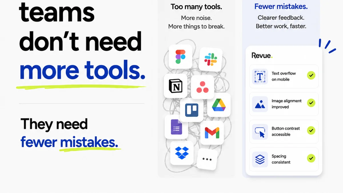
Revue helps legal teams centralize feedback on presentation drafts. Instead of scattered email chains or conflicting verbal instructions, all comments are in one place, linked to specific slides.
This visibility into revisions and approvals streamlines the entire process. Creative directors and partners can easily track changes, ensuring brand consistency and adherence to design best practices.
Furthermore, Revue facilitates quality checks. Before a critical presentation goes live, teams can ensure all legal requirements, branding guidelines, and accessibility standards have been met.
Final Thought
In 2026, legal presentations will be judged not just on their legal merit, but on their clarity, credibility, and communication power. Are your firm's presentations designed to win, or just to inform?
Frequently asked questions
How can legal presentations improve clarity in 2026?
By focusing on data storytelling over data dumping, using strategic simplicity with generous white space and clear typography, and ensuring brand consistency. Visualizing key metrics and decluttering slides are key strategies.
What is the role of accessibility in legal presentations?
Accessibility is a non-negotiable. It ensures that presentations are understandable by the widest possible audience, including those with disabilities. Key considerations include color contrast, alt text for images, and clear language.
How can animation be used effectively in legal presentations?
Animation should be used purposefully to clarify complex information, such as showing a sequence of events, illustrating a process step-by-step, or revealing information gradually to control audience focus. Avoid gratuitous or distracting animations.
Why is brand consistency important for legal presentations?
Consistent branding reinforces professionalism and builds credibility. It goes beyond just the logo to include consistent color palettes, fonts, layout structures, and tone of voice, making the content feel more trustworthy.