Everyone assumes great print design is about a killer concept and a beautiful final image. None of that is wrong. But it’s incomplete.
The hard truth? Flawless execution is where print design wins or loses. And execution relies on process. Specifically, a robust print design checklist.
1. The Brief: Beyond Pretty Pictures
Your brief is the bedrock. Too often, it’s a wish list of aesthetics without the operational details.
Information is King
What information MUST be in every print brief?
- Clear project objective: What is this piece trying to achieve?
- Target audience: Who are we talking to?
- Key message(s): What absolutely needs to be communicated?
- Mandatory elements: Logos, taglines, legal disclaimers, URLs, social handles.
- Brand guidelines: Specifics on color, typography, imagery, tone of voice.
- Call to action (CTA): What should the reader do next?
- Dimensions and format: Specific size, bleed, trim, fold, binding, paper stock.
- Quantity and delivery date: Be realistic.
- Budget: Crucial for material and finishing choices.
Don’t assume designers know. Spell it out.
The “Why” Behind the “What”
A good brief explains the strategic intent. Why this message? Why this audience? Why this format?
This context empowers designers to make better creative decisions, not just follow instructions blindly.
2. Design Execution: The Devil's in the Details
This is where most projects stumble. It's not about the big idea; it's about the tiny details that make the idea work in print.
Typography Matters
Print typography is a different beast than digital. Consider:
- Legibility: Is the font readable at the intended size and distance?
- Hierarchy: Is it clear what to read first, second, and third?
- Kerning and Tracking: Are letter and word spacing consistent and pleasing?
- Line Length: Too long or too short, and readability suffers.
- Font Licensing: Are you legally allowed to use the font for commercial print?
Don’t let beautiful fonts become unreadable walls of text.
Color Accuracy: CMYK vs. RGB
This is a classic pitfall. Digital screens use RGB (Red, Green, Blue). Print uses CMYK (Cyan, Magenta, Yellow, Black).
Designing in RGB and converting to CMYK often results in dull, muddy colors. Always design and proof in CMYK for print projects.
Image Resolution and Format
Low-res images are print killers. For offset or high-quality digital printing, aim for:
- 300 DPI (dots per inch) at the final print size.
- Use CMYK-native image files where possible.
- Avoid JPGs for critical elements; prefer TIFF or EPS.
Check every image. Embed, don’t link, if your software allows.
Bleed and Trim: The Printer’s Playground
Printers need extra space – the bleed – to ensure edge-to-edge color or images without white slivers after trimming.
- Standard bleed is usually 1/8 inch (3mm) on all sides.
- Keep critical text and graphics *inside* the safe area (well away from the trim edge).
Confirm bleed requirements with your printer.
3. Pre-Press and Production: The Gatekeepers
You’ve got a great design. Now, how do you ensure it prints correctly? This stage is non-negotiable.
File Setup is Crucial
Your print-ready file needs to be perfect:
- Correct color mode (CMYK).
- Embedded fonts (or outlined, if specified by printer).
- Correct bleed and trim marks (if required).
- Flattened layers (often preferred by printers).
- Convert spot colors to process or ensure the printer can handle them.
Ask your printer for their specific file submission guidelines. Every printer is slightly different.
Proofing: The Last Line of Defense
Never skip proofing. But what kind of proof?
- Digital Proof (PDF): Quick check for layout, typos, and basic content. Not color accurate.
- Contract Proof: A high-quality, color-accurate printout. Essential for checking color, trapping, and overall appearance.
- Press Check: Attending the actual print run. Usually reserved for high-volume or critical projects.
Review proofs meticulously. Check every word, every number, every color.
Finishing Touches
What happens after printing?
- Folding, scoring, die-cutting.
- Binding (saddle-stitch, perfect bind, spiral).
- Laminating or coating (matte, gloss, UV).
- Embossing, foil stamping.
Ensure these are clearly specified in the brief and accounted for in the budget and timeline.
4. Where Revue Fits In
Managing print projects involves multiple stakeholders, endless feedback loops, and critical approvals. It’s easy for details to get lost.
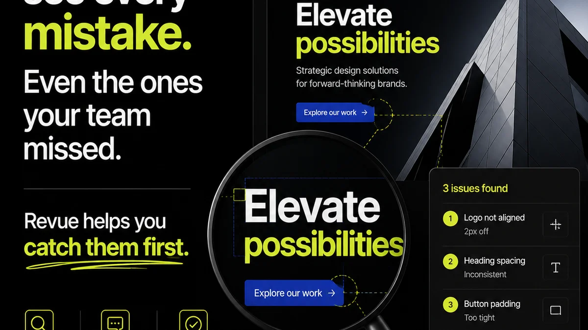
Revue centralizes client feedback on design assets, making it easy to track revisions and approvals.
You can manage versions, see who approved what, and ensure all feedback is addressed before files go to print.
This visibility reduces errors and speeds up the production cycle.
5. Final Thought
Print isn't dead. It's just different. It demands a level of precision that digital often glosses over.
Is your team treating print design as an afterthought, or as a critical discipline requiring its own rigorous process?
Frequently asked questions
What's the most common mistake in print design files?
The most common mistake is incorrect color mode (using RGB instead of CMYK) or insufficient image resolution (DPI). These lead to dull colors and pixelated images when printed.
How much bleed do I need for print?
A standard bleed is typically 1/8 inch (3mm) on all sides. However, always confirm the exact bleed requirements with your specific printer, as they can vary.
What is the difference between a digital proof and a contract proof?
A digital proof (PDF) is good for checking layout, content, and typos. A contract proof is a high-quality, color-accurate printout essential for verifying colors, trapping, and the overall look and feel before the final print run.
Should I outline fonts or embed them for print?
It depends on the printer's preference. Embedding fonts is generally preferred as it keeps text editable. However, some printers may request outlined fonts to avoid any font compatibility issues. Always check with your printer first.