Print design is dead. Long live print design. You hear it all the time. Digital is king, screens are everything, and the printed page is a relic. None of that is wrong. But it’s incomplete.
The real truth? Print design isn't just alive; it's a crucial, often high-stakes, part of the creative ecosystem. And mastering it requires a different skillset and workflow than digital-only projects. It’s not about pixels. It’s about physical reality.
1. The Core Principles of Print Design
Understanding the Medium
Print design deals with tangible materials. Ink on paper. Embossing on cardstock. The tactile experience is paramount. This means considering factors invisible on a screen: paper weight, texture, finish, and how light interacts with the surface.
Unlike digital where millions of colors are possible, print has limitations. Color profiles, ink types, and the printing process itself dictate the final output. What you see on your monitor is rarely an exact match for what comes off the press.
Legibility and Readability
On screen, users can zoom. They can adjust brightness. In print, they can’t. This places a heavier burden on the designer to ensure text is clear and comfortable to read at intended sizes. Font choice, leading (line spacing), kerning (space between characters), and line length are critical.
Think about where the print piece will be viewed. A brochure held at arm's length requires different typographic considerations than a poster viewed from across a room.
Hierarchy and Flow
Every element on a printed page must serve a purpose. Visual hierarchy guides the reader’s eye. This is achieved through size, color, contrast, and placement. Without a clear hierarchy, a design becomes a jumbled mess.
The flow should be intuitive. Where do you want the reader to look first? Second? What action should they take? Print demands a deliberate, structured approach to information delivery.
2. Essential Print Design Software and Tools
While many design tools exist, a few stand out for professional print work. These aren't just for pretty layouts; they offer the precision and control needed for pre-press accuracy.
Vector Graphics for Scalability
Vector software like Adobe Illustrator is indispensable. Vector graphics are resolution-independent, meaning they can be scaled infinitely without losing quality. Logos, illustrations, and complex typography should always be created as vectors.
This is crucial for print because your design might be printed at vastly different sizes – from a business card to a billboard. Vectors ensure crisp lines at any scale.
Raster Graphics for Detail and Photography
For photographic images and complex textures, raster graphics software like Adobe Photoshop is the standard. Understanding resolution (PPI/DPI) is key here. Images for print need to be high-resolution (typically 300 DPI at the intended print size) to avoid pixelation.
Color correction and retouching are also primary functions of raster software, ensuring images look their best before hitting the press.
Layout and DTP Software
For multi-page documents like brochures, magazines, or books, Desktop Publishing (DTP) software is essential. Adobe InDesign is the industry standard. It allows for precise control over typography, image placement, and master pages, streamlining the creation of complex layouts.
InDesign bridges the gap between Illustrator and Photoshop, allowing you to import vector and raster elements into a structured page layout. It's where the final print-ready file is typically assembled.
3. The Print Design Workflow: From Concept to Press
The journey from a digital concept to a physical print piece involves distinct stages, each with its own challenges and considerations. Rushing through these steps is a fast track to costly errors.
Briefing and Concept Development
Start with a clear brief. Understand the client's goals, target audience, budget, and desired outcome. For print, this *must* include the final output specifications: size, quantity, paper type, finishing, and delivery date.
A strong concept considers the tactile nature of print. How can the physical form enhance the message? Think about folds, die-cuts, or special inks.
Design and Mockups
Create the design using the appropriate software. Pay meticulous attention to bleed, trim marks, and safe zones. Mockups are vital – not just digital ones, but physical proofs if budget allows. This is where you catch layout issues, color shifts, or typographic problems.
This stage is also where you confirm printer specifications. Using the correct color modes (CMYK for print, not RGB) and resolution is non-negotiable.
Pre-press and File Preparation
This is the most critical phase for avoiding print errors. It involves:
- Ensuring all fonts are embedded or outlined.
- Checking image resolution and color modes.
- Verifying bleed and trim settings.
- Flattening transparency where necessary.
- Creating print-ready PDFs with specific printer guidelines.
Many designers underestimate the technicalities of pre-press. A poorly prepared file can lead to:
- Incorrect colors.
- Text being cut off.
- Images appearing blurry.
- The entire print run being rejected.
Printing and Production
Work closely with your chosen print vendor. Understand their capabilities and file requirements. Different printing methods (offset, digital, screen printing) have unique characteristics.
Color matching is often a point of contention. Requesting a calibrated proof (like a contract proof) can mitigate surprises. This is a physical, color-accurate representation of your final print job.
Finishing and Delivery
Consider post-press operations: folding, binding, laminating, die-cutting, foil stamping. These add significant value but also complexity and cost. Ensure these are factored into the design and brief from the start.
Final delivery is the moment of truth. Inspect the finished product. Does it match the approved proof? Does it meet the client's expectations? A successful print project leaves a lasting physical impression.
4. Common Print Design Pitfalls (and How to Avoid Them)
Print design has unique failure points that digital design largely sidesteps. Awareness is the first step to prevention.
Color Mismanagement
The RGB vs. CMYK battle is eternal. Designing in RGB and expecting a perfect CMYK conversion is a recipe for disappointment. Colors shift dramatically between the two gamuts. Always design in CMYK or be prepared for significant color correction during pre-press.
Even within CMYK, rich black settings are important for deep blacks, but overprinting can cause issues. Consult your printer on their preferred black build.
Low-Resolution Images
Using web-optimized images (72 DPI) in print is a cardinal sin. They will appear pixelated and unprofessional. Always source or create images at the required print resolution (usually 300 DPI at 100% scale).
If you only have a low-res image, it's often better to leave it out or create a vector graphic if possible, rather than using a blurry photo.
Ignoring Bleed and Trim
Bleed is the extra image or color that extends beyond the trim edge of the page. It ensures that when the paper is cut, there are no unprinted white edges. Forgetting bleed or not extending it sufficiently means unwanted white borders will appear after trimming.
Trim marks indicate where the page should be cut. Safe zones indicate areas where critical text or graphics should not be placed, to avoid being cut off.
Font Issues
Incomplete font sets or incorrect embedding can cause fonts to substitute with default ones, ruining the design. Always outline text for logos or critical headings if there's any doubt, but be aware this makes the text uneditable. For body text, embedding is preferred.
Check that all necessary glyphs (special characters, ligatures) are available in the font file.
File Format Errors
Submitting a native InDesign file or a Word document is rarely acceptable for professional printing. The standard is a high-quality, print-ready PDF, often with specific settings dictated by the printer (e.g., PDF/X-1a or PDF/X-4).
Always ask your printer for their specific pre-press checklist and PDF export settings.
5. Where Revue Fits In
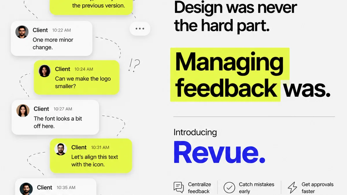
Managing print projects involves the same core challenges as digital: clear communication, centralized feedback, and version control. This is where a tool like Revue becomes invaluable, even for print.
Instead of scattered email chains and lost messages about specific design elements, all feedback on mockups, proofs, and even final designs can be housed in one place. Clients can annotate directly on the visual, and revisions are tracked.
This visibility is crucial for print. When a client approves a specific version of a brochure proof, that record is clear. It minimizes ambiguity about what exactly was signed off, preventing disputes later about color, copy, or layout changes.
Revue helps ensure that the final approved file sent to the printer is the *correct* one, based on a clear, documented history of feedback and approvals. It adds a layer of accountability and organization to the often-complex print production cycle.
6. Final Thought
Print design isn't just about aesthetics; it's about materiality, precision, and a deep understanding of production processes. It demands a different kind of rigor than screen-based design.
In a world saturated with fleeting digital content, a well-executed print piece offers a tangible, lasting connection. Are you giving your print projects the focused attention they deserve?
Frequently asked questions
Is print design still relevant in a digital age?
Absolutely. While digital is dominant, print design offers a unique tactile experience and perceived permanence that digital cannot replicate. Many brands still rely on print for high-impact materials like brochures, packaging, and direct mail.
What is the biggest difference between print and digital design?
The core difference lies in the medium. Digital design deals with pixels and screens (RGB color, variable resolution), while print design deals with physical materials and ink (CMYK color, fixed resolution like 300 DPI). Print also involves physical limitations like paper texture, ink types, and finishing processes.
What does 'bleed' mean in print design?
Bleed is the extra margin of design or image that extends beyond the trim edge of the page. It ensures that when the printer cuts the paper to its final size, there are no unprinted white edges, resulting in a clean, professional finish.
How do I ensure accurate colors in print?
Design in CMYK color mode from the start. Use a calibrated monitor. Request a physical proof (like a contract proof) from your printer before the full run. Understand that CMYK has a smaller color gamut than RGB, so some vibrant screen colors may not be reproducible.
What is the most common mistake in print file preparation?
Using low-resolution images (like web images) and not including adequate bleed are two of the most common and costly mistakes. Failing to provide print-ready PDF files with the correct settings specified by the printer is also a frequent issue.