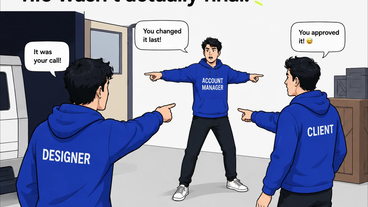
Most agencies think print design is simple: get the specs, hit the bleed, and send it off. It’s a necessary evil, a checkbox to tick on the way to the digital real estate.
None of that is wrong. But it’s incomplete.
The hard truth? Sloppy print design isn't just an aesthetic problem. It’s a direct drain on your clients' budgets and a hidden cost to your agency’s reputation. Every miscalculation, every overlooked detail, translates into wasted printing dollars, missed opportunities, and frustrated clients.
1. The Overlooked Specs Sheet
You’ve got the dimensions. You’ve got the color mode (CMYK, obviously). But do you have the *full* picture?
This is where print design mistakes start to bleed into real money. It’s not just about getting the file right; it’s about understanding the entire production chain.
Bleed and Trim Are Not Suggestions
The bleed is the area that gets trimmed off. It ensures color or images extend to the very edge of the finished piece. No bleed? You get ugly white slivers after trimming. That means a reprint. That means a client’s budget takes a hit.
The trim line is where the paper is cut. If your critical text or logos are too close to this line, they risk being chopped off. Another reprint. Another budget buster.
Resolution Matters (Even for Print)
You wouldn't use a tiny web graphic for a billboard, would you? Same principle applies to print. Low-resolution images (typically below 300 DPI at the intended print size) will appear pixelated and fuzzy.
Clients notice. They paid for professional quality. Fuzzy images scream amateur hour and devalue their brand.
Color Modes: CMYK vs. RGB
This is elementary, but it’s astonishing how often it’s missed. Digital screens use RGB (Red, Green, Blue) to display color. Printers use CMYK (Cyan, Magenta, Yellow, Black). Sending an RGB file to print means colors will shift, often dramatically. Bright, vibrant blues might turn muddy. Reds might lose their punch. This isn't a minor tweak; it’s a fundamental color mismatch that often requires a full reprint.
2. Font Follies and Typographic Tragedies
Typography is the backbone of good design. In print, it’s also a potential money pit.
Font Licensing Nightmares
Did you use a fancy font downloaded from a free site? Is it licensed for commercial print use? Many free fonts come with restrictive licenses that prohibit their use in anything other than personal projects. Using an unlicensed font in client collateral can lead to hefty fines and legal trouble for both your agency and the client.
Always verify font licenses. If in doubt, stick to reputable font foundries or choose fonts with clear commercial licenses.
Font Substitution Shenanigans
When a document is sent to a printer without the fonts embedded or outlined, the printer’s system will substitute them with whatever it has available. The results are rarely pretty. Spacing changes, line breaks shift, and the entire layout can be ruined.
This isn't just an inconvenience; it’s a costly error. The client expected their carefully crafted message to look exactly as intended. Font substitution guarantees it won’t.
Legibility and Hierarchy Breakdown
In print, especially for marketing materials, text needs to be easily readable. Tiny fonts, poor contrast (light gray text on a white background), or a lack of clear typographic hierarchy make information inaccessible.
If your client’s customers can’t read the offer, the contact details, or the call to action, the print piece fails. That’s wasted printing costs and zero return on investment for the client.
3. Material Miscalculations
The paper stock, the finishing, the folds – these aren’t afterthoughts. They are critical components that impact both cost and perception.
Choosing the Wrong Paper Weight
Using flimsy, lightweight paper for a business card or brochure makes it feel cheap and disposable. Conversely, using excessively thick paper for something like a flyer can drive up printing costs unnecessarily.
The paper choice needs to align with the brand, the longevity of the piece, and the budget. Getting this wrong means either a cheap-looking product or an over-inflated bill.
Ignoring Finishing Effects
Lamination, spot UV, embossing, foil stamping – these can elevate a design. But they add cost. If a client doesn’t understand the impact of these finishes on the final price, or if they’re specified without a clear strategic purpose, you’re adding expense for little gain.
This leads to sticker shock when the quote comes back, or a finished product that doesn’t justify the added cost.
Fold Complexity and Mailing Issues
Designing a complex fold for a brochure sounds creative. But if it makes the piece difficult to mail, too bulky for standard envelopes, or prone to damage, it’s a problem. Printers charge extra for complex folds, and mailing services might have surcharges.
The practicalities of distribution and mailing need to be factored in early, not as an afterthought.
4. The Proofing Process Pitfalls
This is perhaps the most common and costly mistake. Skipping, rushing, or misunderstanding the proofing stage guarantees errors will make it to print.
Insufficient Proofing Rounds
Think you only need one round of proofing? Think again. Typos, layout errors, color shifts, and even incorrect pricing can slip through. Each proofing round is an opportunity to catch these before they become expensive mistakes.
Client Misinterpretation of Proofs
Clients often don’t understand what they’re looking at in a digital proof. They might approve something based on how it looks on their specific screen, not how it will print. Or they might miss critical errors because they’re focused on the wrong details.
Your role is to guide them. Clearly communicate what to look for: typos, correct product names, accurate pricing, and adherence to brand guidelines.
Lack of Final Sign-Off
A digital proof is not the final word. A physical press check is often necessary for critical jobs to ensure color accuracy and overall quality. If a client balks at the cost of a press check, explain the risk. A mistake caught on press is far cheaper than a full reprint.
Where Revue Fits In
Managing print projects, especially with multiple stakeholders and revision rounds, can be chaotic. This chaos is fertile ground for the kinds of mistakes we’ve discussed.
Revue is built to bring order to that chaos. By centralizing all client feedback, revisions, and approvals in one place, you eliminate the guesswork and the ‘he said, she said’ that leads to errors.
- Centralized Feedback: All comments on mockups, proofs, and final files live in one spot. No more digging through endless email chains.
- Version Control: Track every revision, see who approved what, and when. This clear audit trail prevents costly mix-ups.
- Quality Assurance: Ensure all necessary checks – specs, bleeds, fonts, color modes – are completed before final handover.
When feedback is clear, tracked, and approved systematically, the chances of costly print errors plummet. Your clients get what they expect, on budget.
Final Thought
Print isn't dead. It’s just unforgiving. The tangible nature of print means mistakes are immediately visible and expensive. Are you treating your print projects with the rigor they demand, or are you letting avoidable errors chip away at your clients’ budgets and your agency’s bottom line?
Frequently asked questions
What are the most common print design mistakes?
The most common print design mistakes include incorrect file specs (bleed, trim), low-resolution images, wrong color modes (RGB instead of CMYK), font licensing issues, font substitution, poor legibility, choosing the wrong paper, ignoring finishing costs, and inadequate proofing.
How does RGB vs. CMYK affect print costs?
Sending an RGB file to a CMYK printer causes colors to shift unpredictably. This often results in the client rejecting the print job, necessitating a costly reprint of the entire batch.
Why is font licensing important for print design?
Many fonts, especially free ones, have licenses that restrict their commercial use in printed materials. Using an unlicensed font can lead to significant fines for both the agency and the client, turning a design project into a legal and financial headache.
How can proofing prevent print design mistakes?
Thorough proofing, including digital reviews and potentially physical press checks, is crucial for catching typos, layout errors, color inaccuracies, and other mistakes before the final print run. Catching errors during proofing prevents expensive reprints.