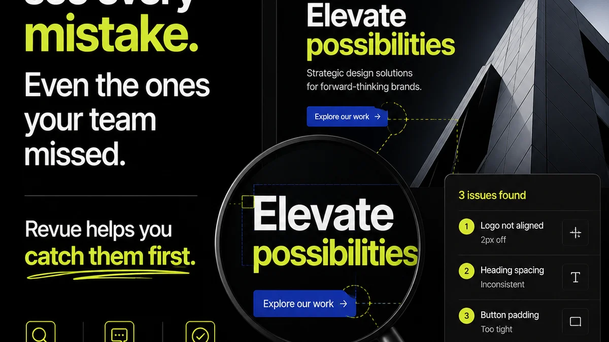
Everyone thinks print QA is just about spotting typos and misaligned logos on the final proof. That’s not wrong. But it’s incomplete.
The hard truth? Effective print quality assurance isn’t a last-minute scramble. It’s a deeply embedded, proactive process that starts long before the PDF hits the printer.
1. It Starts with the Brief, Not the Proof
You can’t catch what wasn’t defined. A sloppy brief is a guaranteed path to print problems. This isn’t just about client whims; it’s about technical specs and production realities.
Defining Deliverables Clearly
What exactly is being printed? Brochures? Packaging? Large format signage? Each has unique requirements.
- Format: Die-cut, saddle-stitched, perfect-bound?
- Size: Finished trim size, bleed, safe zones.
- Color: CMYK (specify profile), Pantone, spot colors.
- Finishes: Varnish, spot UV, foil stamping, embossing.
- Paper: Weight (gsm/lb), coating (matte, gloss, silk), texture.
If the brief is vague, the design team makes assumptions. The production team makes assumptions. Assumptions are where errors hide.
Setting Production Expectations
Did the client mention a specific printer? What are their capabilities? What’s the turnaround time?
Knowing the printer’s limitations upfront prevents last-minute compromises. It dictates design choices, file preparation, and even the feasibility of certain finishes.
2. Design for Production, Not Just Pixels
Designers often work in RGB, on screen. Print is CMYK, on paper. These are fundamentally different worlds. Bridging that gap is crucial for print QA.
Color Management is Non-Negotiable
RGB has a wider gamut than CMYK. Colors that look vibrant on screen can appear dull or shift dramatically when converted. Relying on screen previews alone is a recipe for disappointment.
- Use CMYK profiles consistently throughout the design process.
- Understand color profiles like SWOP, GRACoL, or FOGRA.
- Educate designers on how specific CMYK builds translate to visual appearance.
- Identify critical brand colors that require specific Pantone matching.
This isn’t about limiting creativity; it’s about managing expectations and ensuring brand consistency across all media.
Typography and Layout in Print
What works for web typography doesn’t always translate directly to print. Small text sizes, tight leading, and complex layouts can become illegible or create printing issues.
- Minimum font sizes: Define safe limits for body copy and fine print.
- Line weights: Thin lines can disappear or fill in during printing.
- Rich black vs. 100% black: Understand the difference for solid blacks and how to build them for deep, consistent coverage without excessive ink.
- Trapping: Overlapping edges of adjacent colors to prevent unprinted gaps. This is often handled by the printer, but understanding the concept helps flag potential issues.
These are technical considerations that impact readability and print quality. They need to be part of the design brief and review process.
3. File Preparation: The Devil is in the Details
This is where many print projects stumble. Even the most beautiful design can be ruined by improperly prepared files.
Bleed, Trim, and Safe Areas
This is foundational. If your design elements don’t extend into the bleed area, you risk white edges showing up after trimming. Conversely, critical text or logos too close to the trim edge can be cut off.
- Bleed: Extend background colors and images 3mm (or more, depending on printer specs) beyond the trim edge.
- Trim: The final size of the piece after cutting.
- Safe Area: The internal margin where all essential content should reside, well away from the trim edge.
Visualizing these in the design software is essential. Marking them clearly on proofs for client review is even better.
Resolution and Vector vs. Raster
Low-resolution images will look pixelated when printed. Vector graphics, on the other hand, are resolution-independent and scale perfectly.
- Image resolution: Ensure all placed images are at least 300 DPI at their intended print size.
- Logos and graphics: Always use vector versions (AI, EPS, SVG) whenever possible.
- Text as paths: Sometimes fonts need to be outlined to ensure they render correctly if the printer doesn't have the specific font file. Understand the implications – text becomes uneditable.
Color Modes and File Formats
As mentioned, CMYK is the standard for print. The correct file format also matters.
- PDF/X: This is the industry standard for print-ready files. Specific versions like PDF/X-1a or PDF/X-4 have different requirements regarding color spaces and embedded elements.
- Embed Fonts: Ensure all fonts are embedded within the PDF.
- Include Bleed and Crop Marks: These are essential for the printer.
Many design tools have presets for creating print-ready PDFs. Using them correctly is a key part of QA.
4. The Proofing Process: More Than Just a Look
This is where many agencies focus their entire print QA effort. Proofing is vital, but it’s the *culmination* of good process, not the start.
Types of Proofs and Their Purpose
Each proofing method offers different levels of accuracy and cost.
- Soft Proofs (On-screen PDF): Good for checking layout, copy, and general content. Limited for color accuracy.
- Contract Proofs (Color-Accurate Print): These are calibrated prints that simulate the final output as closely as possible. Essential for checking color, especially for critical brand elements.
- Press Proofs (On the actual press): The most accurate, but also the most expensive and time-consuming. Usually reserved for very high-stakes projects.
The choice of proof depends on the project's budget, complexity, and color criticality.
What to Actually Check on a Proof
When you have that proof in hand (or on screen, if it’s a contract proof), what’s the checklist?
- Copy: Every word, punctuation, spelling.
- Layout: Alignment, spacing, margins, image placement.
- Color: Brand colors, gradients, overall tone. Does it match expectations?
- Finishes: Are spot UV areas correctly indicated? Is foil placement accurate?
- Technical Specs: Bleed, trim lines, safe areas (if shown).
- Consistency: Does it match previous approved versions?
This requires a systematic approach. A fresh pair of eyes, ideally someone not involved in the design, can be invaluable.
5. Where Revue Fits In
Managing client feedback and internal reviews for print projects can become chaotic. Tracking revisions, approvals, and ensuring everyone is working from the latest version is a constant challenge.
Revue helps centralize this entire process.
Instead of endless email chains and scattered file versions, you can manage all feedback directly on the artwork. Internal teams can collaborate, and clients can provide clear, contextual comments.
This visibility is key to proactive QA. It means issues are flagged earlier, revisions are tracked meticulously, and the final approval carries more weight because the process leading up to it was transparent and controlled.
Final Thought
Print QA isn't a gatekeeper at the end of the line. It's a continuous thread woven through the entire project lifecycle, from the initial client brief to the final file handoff. Are you building quality in, or just checking for flaws at the eleventh hour?
Frequently asked questions
What is the most common mistake in print QA?
The most common mistake is treating print QA as a final, last-minute check rather than an integrated process. This leads to missed errors that could have been caught much earlier in the design or file preparation stages.
How important is color management in print QA?
Color management is critical. Designs created in RGB can look significantly different when converted to CMYK for print. Proper color profiles and understanding the limitations of CMYK are essential for accurate color reproduction and brand consistency.
What is bleed in print design?
Bleed is the extra area of design (usually 3mm or more) that extends beyond the trim edge of the page. It ensures that when the document is cut to its final size, there are no unprinted white edges if the trimming is slightly off.
What is the difference between a soft proof and a contract proof?
A soft proof is a digital preview of the artwork on screen, useful for checking content and layout but not color accuracy. A contract proof is a color-calibrated printout designed to simulate the final printed output as closely as possible, making it essential for verifying colors.