You think building print-ready artwork is straightforward. Just export a PDF at 300 DPI with bleeds, right? None of that is wrong. But it’s incomplete.
The hard truth? The real challenge isn't the final export. It's the messy, iterative process leading up to it. Getting print artwork right means mastering color, resolution, and file structure long before you hit 'Save As'.
For US creative teams, this means understanding specific market standards and using tools that streamline the entire process, not just the last five minutes. Let's cut through the noise and look at what actually works.
1. Mastering Color Management
Color is where print projects go to die. RGB on screen is not CMYK on paper. The gap is vast, and your tools need to bridge it.
Understanding Color Spaces
Every designer knows RGB for screens. But print demands CMYK (Cyan, Magenta, Yellow, Key/Black). Different CMYK profiles exist, too. For US print, SWOP (Specifications for Web Offset Publications) is common. Fogra is more European. Your software needs to handle these profiles correctly.
Color Calibration
Your monitor is a liar. It shows you RGB. Your printer sees CMYK. Without calibrated monitors and a solid understanding of color profiles, you’re flying blind. This isn't a software feature; it's a hardware and workflow necessity.
Tools for Color Accuracy
- Adobe Photoshop: The king for pixel-based work. Its color management engine is robust. You can assign and convert color profiles, simulate CMYK output, and use separation settings. Essential for photo editing and complex raster graphics.
- Adobe Illustrator: The go-to for vector graphics. It also has strong color management. Crucial for logos, text, and line art that need to remain sharp at any size. Illustrator's ability to work with spot colors (like Pantone) is vital for branding.
- Adobe InDesign: The layout powerhouse. It ties everything together. InDesign is built for print documents, handling multiple pages, text, and images. Its preflight checks are invaluable for catching color issues before export.
These Adobe Creative Cloud apps are the industry standard for a reason. They offer the granular control needed for professional print output.
2. Resolution and Vector vs. Raster
Print is unforgiving. Low resolution means blurry images. Raster graphics have a fixed resolution; vectors do not.
When Resolution Matters
For raster images (like photos), 300 DPI (dots per inch) is the standard for high-quality print. Anything less, and you'll see pixelation. This applies to images placed in your layouts. Ensure your source images meet this requirement. Upscaling a low-res image is a recipe for disaster.
The Power of Vectors
Vector graphics, created in programs like Illustrator, are made of mathematical paths. They can be scaled infinitely without losing quality. Logos, icons, and typography should ideally be in vector format for print. This guarantees sharpness, whether it's on a business card or a billboard.
Checking Your Work
- Raster Image Check: In Photoshop or InDesign, check the effective PPI (Pixels Per Inch) of placed images. If it drops below 300 PPI at its final print size, it's problematic.
- Vector Conversion: Ensure logos and critical branding elements are provided or converted to vector formats (AI, EPS, SVG).
This distinction is fundamental. Mixing raster and vector elements requires careful management of both.
3. Bleeds, Margins, and Trim
This is where many amateur files fail. The printer needs extra space to account for cutting.
What is a Bleed?
A bleed is an extra area of your design that extends beyond the trim edge of the page. This ensures that when the page is cut, no white edges appear. A standard bleed is typically 0.125 inches (3mm) in the US.
Margins and Safety Lines
Margins, or safe areas, are the space inside the trim edge where you keep critical content. Text, logos, and important graphics should be kept within this safe zone to avoid being cut off during trimming. A common safety margin is 0.125 inches (3mm) from the trim edge.
Understanding Trim and Fold Lines
The trim line is the final edge of the printed piece. Fold lines indicate where the paper will be folded. Your design software should allow you to visualize these guides. Printers will often provide templates or specifications.
Common Pitfalls
- Forgetting to add bleeds in the document setup.
- Placing important content too close to the trim edge.
- Not extending background colors or images fully into the bleed area.
- Assuming a standard bleed size without checking printer specs.
Precision here is non-negotiable. It directly impacts the final look and professionalism of the printed piece.
4. File Formats and Export Settings
The final file is your handshake with the printer. Make it a firm one.
The PDF Standard
For most commercial printing, PDF (Portable Document Format) is the universal standard. It embeds fonts, images, and color information, ensuring the file looks the same everywhere. High-quality print presets in design software are designed to create press-ready PDFs.
Key PDF Export Settings
- PDF/X Standards: PDF/X-1a and PDF/X-4 are common standards for print. PDF/X-4 is generally preferred as it supports transparency and newer color features.
- Marks and Bleeds: Ensure crop marks, bleed marks, and the document's bleed settings are included in the export.
- Color Conversion: Choose the correct CMYK profile for your region or printer (e.g., SWOP Coated). Embed the profile.
- Font Embedding: Ensure all fonts are fully embedded.
- Downsampling: Avoid aggressive downsampling of images. For 300 DPI source images, aim to keep them at or near that resolution.
When to Use Other Formats
While PDF is king, printers might occasionally request:
- AI (Adobe Illustrator): For vector-only artwork, especially logos or single-page designs.
- EPS (Encapsulated PostScript): An older vector format, still sometimes used, but PDF is generally better.
Always confirm the printer's preferred format and specifications.
5. Preflighting Your Files
Preflighting is the final quality control check. It’s your last chance to catch errors before sending the file to print.
What is Preflight?
Preflighting is a process of checking artwork files for potential printing problems. This includes missing fonts, incorrect color modes, low-resolution images, and improper bleed settings.
Built-in Preflight Tools
- Adobe Acrobat Pro: Has a powerful Preflight tool that can analyze PDFs for a wide range of print-related issues and even fix some of them.
- Adobe InDesign: Includes a robust preflight engine that can be customized to flag specific problems as you design. You can set it to constantly monitor your document.
Using these tools religiously saves time, money, and reputational damage. A single error can lead to a costly reprint.
Where Revue Fits In
The journey to print-ready artwork is rarely linear. It involves feedback, revisions, and approvals. This is where a centralized platform like Revue becomes critical.
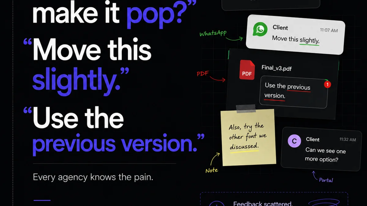
Imagine multiple stakeholders reviewing proofs. Email chains get lost. Version control becomes a nightmare. Did everyone see the *latest* version? Was the feedback from the client's marketing manager incorporated, or was it from the junior designer?
Revue centralizes all client feedback directly on the artwork. You get clear revision history, ensuring everyone is working from and approving the correct version. This visibility eliminates guesswork and reduces errors that lead to print problems.
Automated approval workflows mean you know exactly when a piece is signed off. This clarity streamlines the handoff to print, ensuring the file you send is the file that was approved.
Final Thought
The best tools for print-ready artwork aren't just software features. They are integrated into a workflow that prioritizes accuracy, clarity, and rigorous checking at every stage. Are you treating print preparation as an afterthought, or as the critical final step it is?
Frequently asked questions
What's the most common mistake US designers make with print files?
The most common mistake is not accounting for the bleed and trim. Designs often have critical elements too close to the edge, or background elements that don't extend into the bleed area, leading to cut-off content or white borders after trimming.
Is 300 DPI always necessary for print?
For most high-quality commercial printing, yes, 300 DPI is the standard for raster images at their final output size. Lower resolutions might be acceptable for very large format prints viewed from a distance, but for standard brochures, flyers, or packaging, stick to 300 DPI.
What is the difference between CMYK and RGB for print?
RGB (Red, Green, Blue) is a color model used for digital displays (screens). CMYK (Cyan, Magenta, Yellow, Key/Black) is a subtractive color model used for printing. Colors appear differently in CMYK, and direct conversion isn't always perfect, requiring careful color management.
Which PDF standard is best for US printers?
PDF/X-4 is generally the preferred standard for US printers. It supports modern features like transparency and layers while ensuring all necessary elements (fonts, images, color profiles) are embedded correctly for reliable output. PDF/X-1a is an older but still common alternative.