Everyone thinks publication design is about making things look pretty. That’s not wrong. But it’s incomplete.
The hard truth? Great publication design, whether for print or digital, is a masterclass in operational efficiency. It’s about clear communication, streamlined workflows, and delivering client projects on time and on budget. Aesthetics are the outcome, not the sole objective.
1. The Information Hierarchy Problem
Before a single pixel is placed or a page is laid out, there’s a fundamental question: What’s most important? This isn't a design question; it's an information architecture one.
Too often, design teams dive into InDesign or Figma assuming the content structure is already solved. It rarely is.
Content First, Always
The content dictates the design, not the other way around. If your client sends a dense block of text without any clear headings or subheadings, your job becomes exponentially harder. You’re not just designing; you’re structuring raw data.
- Identify primary calls to action.
- Determine the key takeaways for the reader.
- Map out the flow of information logically.
- Understand the target audience's reading habits.
This upfront work prevents endless rounds of “Can we make this bigger?” or “Move this here.” It forces clarity on what needs to be seen and understood first.
Visual Hierarchy as a Tool
Once the information is structured, visual hierarchy comes into play. This is where design truly shines, guiding the reader’s eye through the content.
Think of it like signposting a busy highway. The largest signs tell you the main destination, smaller ones offer intermediate routes, and the smallest confirm your current location.
- Typography: Font choices, sizes, weights, and leading establish distinct levels of importance.
- Color: Used strategically for emphasis, branding, or to differentiate sections.
- Spacing: Generous white space improves readability and reduces cognitive load.
- Imagery: Photos and graphics should support the text, not compete with it.
This isn't about decoration. It's about making complex information digestible and accessible. Publication design best practices demand this level of thoughtful structure.
2. The Print vs. Digital Divide (and Convergence)
For years, publication design meant print: brochures, annual reports, magazines. Then digital exploded, and suddenly we had PDFs, web pages, and interactive documents.
The assumption is they are entirely separate disciplines. They aren't.
Shared Principles, Different Constraints
The core principles of good publication design remain constant: clarity, hierarchy, consistency, and readability. What changes are the constraints and delivery mechanisms.
- Print: Fixed dimensions, CMYK color, resolution limitations, physical production costs.
- Digital: Responsive design, screen resolutions, RGB color, accessibility standards, interactive elements, bandwidth.
A common mistake is treating a digital publication (like a PDF for download) as merely a digital version of a print piece. This often results in a poor user experience on screen.
Designing for the Medium
Responsive design is key for web-based publications. Content needs to adapt fluidly across devices. For fixed documents like PDFs, consider the intended viewing environment.
Will it be printed? Viewed on a large monitor? Or a small phone screen? Each scenario requires different considerations for layout, font size, and image handling.
The convergence means designers need a broader skillset. Understanding both print production and digital best practices is no longer optional. It’s essential for effective publication design.
3. Workflow is King
The most beautifully designed publication can fail if the workflow is broken. This is where agencies and creative teams often struggle.
A common assumption is that the design phase is the most critical. In reality, the entire process, from brief to final delivery, is where success or failure is determined.
The Chaos of Feedback
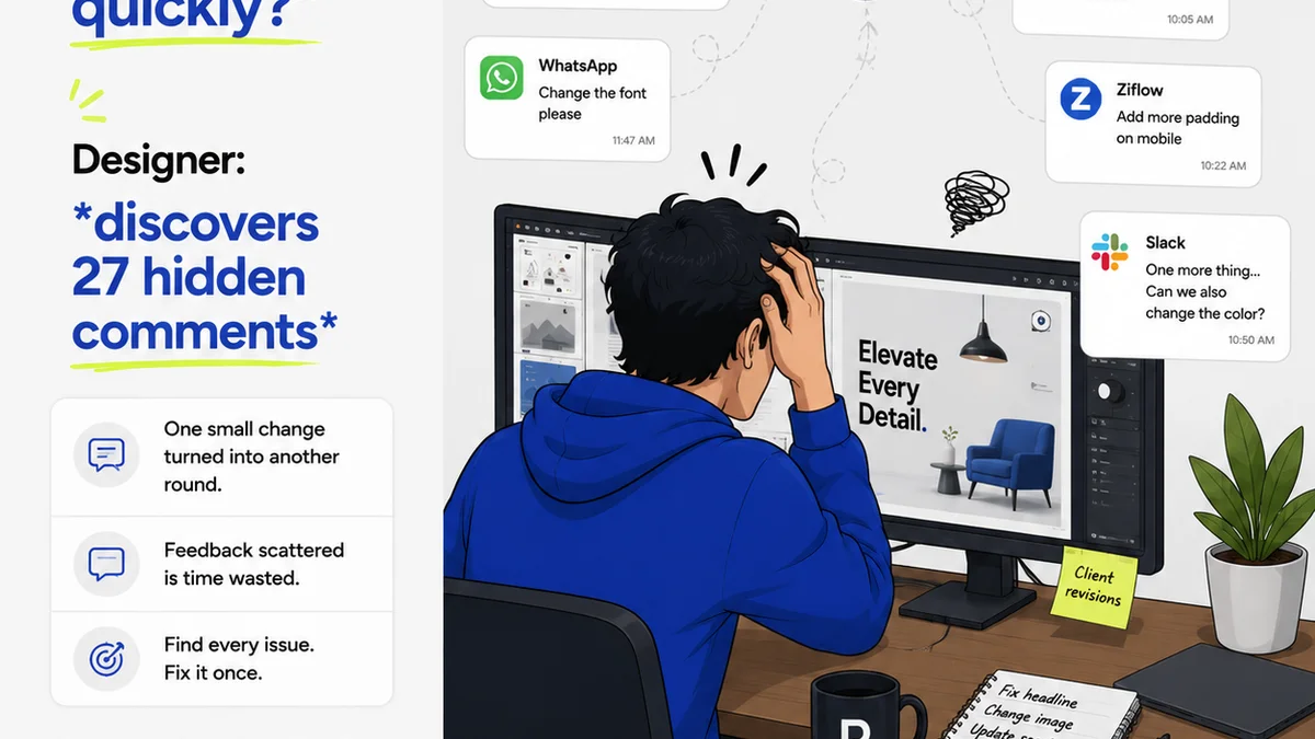
Client feedback is notorious for being vague, contradictory, or simply late. Managing this is a core operational challenge in publication design.
- Unclear feedback leads to rework.
- Delayed feedback bottlenecks the entire project.
- Lack of a central repository means feedback gets lost.
- Multiple stakeholders providing conflicting input creates confusion.
This isn't just an annoyance; it directly impacts timelines and profitability. Without a system, version control becomes a nightmare.
Revision Management Nightmare
Tracking revisions manually is a recipe for disaster. Who approved what? Which version is the latest? Did that last-minute change make it into the final file?
These aren't design problems, but they cripple design output. The operational side of publication design demands rigorous process.
- Ensure clear sign-off points.
- Document all feedback and changes meticulously.
- Maintain clear version control.
- Automate where possible to reduce human error.
This operational rigor is the bedrock of consistent, high-quality publication design output. It frees up creative energy for the actual design work.
Where Revue Fits In
Managing the complexities of publication design, especially with multiple stakeholders and revisions, requires a central hub. This is precisely why tools like Revue exist for creative teams.
Revue provides a single source of truth for client feedback and project status. Instead of chasing emails or deciphering Slack messages, all communication and approvals live in one place.
- Centralized Feedback: Streamline comments and markups directly on creative assets. No more lost feedback.
- Revision Visibility: Track every change, who made it, and when. Maintain clear version history.
- Approval Tracking: Formalize the approval process, ensuring everyone is aligned before final output.
- Quality Checks: Integrate final review steps seamlessly into the workflow, reducing errors before delivery.
By centralizing these critical operational aspects, Revue helps creative teams execute publication design projects more efficiently and with greater confidence. It tackles the workflow chaos so designers can focus on delivering exceptional creative work.
4. Accessibility: The Unspoken Requirement
We often talk about publication design in terms of visual appeal and brand consistency. But what about usability for everyone?
The assumption is that accessibility is a niche concern, or something tacked on at the end. It’s not.
Designing for Inclusivity
Accessible design means creating publications that can be perceived, understood, navigated, and interacted with by people with a wide range of abilities and disabilities. This includes visual, auditory, motor, and cognitive impairments.
Key considerations include:
- Color Contrast: Ensuring text is easily readable against its background. WCAG guidelines provide specific ratios.
- Font Legibility: Choosing clear, readable typefaces and providing adequate font sizes.
- Logical Structure: Using proper heading structures (H1, H2, H3, etc.) and semantic markup for screen readers.
- Alt Text for Images: Providing descriptive text alternatives for visual content.
- Keyboard Navigation: Ensuring all interactive elements can be accessed via keyboard.
Adhering to standards like the Web Content Accessibility Guidelines (WCAG) is crucial, especially for digital publications.
The Business Case for Accessibility
Beyond ethical considerations, accessible design broadens your audience and can improve SEO. Many accessibility features benefit all users, not just those with disabilities.
Ignoring accessibility is not just poor practice; it can lead to legal challenges and alienate potential clients or customers. It’s an integral part of thoughtful, professional publication design.
5. Consistency Across Touchpoints
A publication doesn’t exist in a vacuum. It’s part of a larger brand ecosystem. Maintaining consistency is paramount.
The challenge isn't just about replicating a logo. It's about extending the brand's visual language and tone of voice across every element.
Brand Guidelines Are Your Compass
Strong brand guidelines are essential. They define the rules of engagement for visual identity.
- Logo usage (clear space, minimum size, variations).
- Color palettes (primary, secondary, accent colors).
- Typography (primary and secondary fonts, hierarchy rules).
- Imagery style (photography, illustration).
- Tone of voice.
When these guidelines are vague or non-existent, designers are left guessing. This inevitably leads to inconsistent outputs.
The Ripple Effect of Inconsistency
An inconsistent publication erodes brand trust. If a brochure looks and feels different from the website, or social media posts, it signals a lack of professionalism and attention to detail.
This is where robust design systems and clear project briefs become invaluable. They ensure that every piece of collateral, from a business card to a multi-page report, feels like it belongs to the same brand.
Final Thought
Publication design is a discipline that blends artistry with rigorous operational discipline. It’s about solving problems through visual communication, efficiently and effectively.
The next time you look at a beautifully designed annual report or a slick digital brochure, don't just admire the aesthetics. Consider the underlying structure, the workflow, the accessibility considerations, and the brand consistency that made it possible.
Are you treating publication design as just a visual exercise, or as a strategic operational function?
Frequently asked questions
What is the most important principle in publication design?
While aesthetics are important, the most crucial principle is information hierarchy. Clearly defining what's most important and guiding the reader's eye through the content ensures effective communication and usability.
How does digital publication design differ from print?
Digital publication design must account for responsive layouts, screen resolutions, and interactive elements, whereas print design is constrained by fixed dimensions, CMYK color, and physical production. However, core principles like clarity and hierarchy remain consistent.
Why is workflow management critical for publication design projects?
Broken workflows lead to delays, miscommunication, and rework, directly impacting project profitability and client satisfaction. Efficient workflow management, including clear feedback and revision tracking, is essential for delivering high-quality work consistently.
What are the key considerations for accessible publication design?
Key considerations include sufficient color contrast, legible typography, logical content structure (using headings), alternative text for images, and ensuring keyboard navigability. Adhering to WCAG guidelines is essential for digital publications.