Everyone assumes publication design is about making things look pretty. That good typography and a pleasing color palette are the whole story. None of that is wrong. But it’s incomplete.
The hard truth is that effective publication design for marketing teams is a complex interplay of aesthetics, brand consistency, technical execution, and strategic communication. It’s about more than just looking good; it’s about performing well.
1. Brand Foundation: The Unshakeable Core
Before a single pixel is placed, the brand’s DNA must be crystal clear. This isn't just about the logo.
Visual Identity Elements
This includes:
- Primary and secondary color palettes (with HEX, RGB, and CMYK values).
- Typography hierarchy: defining headings, subheadings, body text, captions, and call-to-actions with specific font families, weights, sizes, and line heights.
- Logo usage guidelines: clear space, minimum size, acceptable variations, and what *not* to do.
- Imagery style: photography or illustration guidelines, tone, subject matter, and composition.
- Iconography style.
- Brand voice and tone: how the written word supports the visual identity.
This foundation prevents creative drift and ensures every piece feels like it’s from the same family.
Brand Guidelines Documentation
Are your brand guidelines easily accessible and comprehensive? A messy or incomplete document is worse than no document at all. It breeds confusion, not consistency.
This is the single source of truth. If it's not clear, your publications won't be either.
2. Content Strategy & Structure: The Blueprint
Design doesn't happen in a vacuum. It serves the content and the strategic goal.
Audience & Objective Alignment
Who are you trying to reach with this publication? What do you want them to do or understand after engaging with it?
Every design decision should tie back to these questions. A brochure for C-suite executives will look and feel vastly different from a flyer for a local event.
Content Hierarchy and Flow
Understand the narrative. What’s the most important message? How do you guide the reader’s eye through the information logically?
This involves mapping out the user journey through the publication, ensuring key takeaways are prominent and supporting details are accessible but not overwhelming.
Copywriting and Visual Integration
Design and copy must work in tandem. Is the copy concise and impactful? Does it leave room for visuals, or is it crammed in? Are headlines compelling?
Avoid the trap of designing first and then trying to jam copy into rigid layouts. Plan for the words and the pictures together.
3. Layout & Composition: The Visual Architecture
This is where aesthetics meet function. Good layout guides the eye and makes information digestible.
Grid Systems
A robust grid system is the backbone of any well-structured publication. It ensures consistency, alignment, and visual harmony across pages.
Are you using a grid? Is it appropriate for the content and the intended medium (print vs. digital)?
Whitespace (Negative Space)
Often undervalued, whitespace is crucial. It reduces clutter, improves readability, and gives design elements room to breathe. It’s not empty space; it’s active space.
Don’t be afraid of it. Use it strategically to highlight key information and improve focus.
Visual Hierarchy
This is how you tell the reader what’s most important. Use size, color, placement, and contrast to guide attention.
- Prominent headlines.
- Clear calls-to-action.
- Distinguished subheadings.
- Readable body text.
- Contextual imagery.
Consistency Across Spreads
Ensure elements like headers, footers, page numbers, and margins are consistent. This builds trust and professionalism.
Every page should feel like it belongs to the same document.
4. Typography: The Voice of the Text
Type is more than just letters; it's a carrier of tone and readability.
Legibility and Readability
Can people actually read your text comfortably for extended periods? This involves font choice, size, line spacing (leading), and line length (measure).
- Font Choice: Serif for print body text? Sans-serif for digital? Consider the context.
- Font Size: Too small is a non-starter. Too large wastes space and can feel amateurish.
- Line Spacing: Generally, 120-150% of font size for body copy is a good starting point.
- Line Length: Aim for 45-75 characters per line for optimal reading speed.
Typographic Hierarchy
Reinforce the content structure with distinct typographic styles for different levels of information. This builds on the layout hierarchy.
Headings, subheadings, body copy, captions, pull quotes – they all need their own clear style.
Kerning and Tracking
While often automated, fine-tuning letter spacing (kerning for pairs, tracking for groups) can polish headlines and important text, especially at large sizes.
This is a detail that separates professional work from amateur attempts.
5. Color Usage: Emotion and Emphasis
Color evokes emotion, guides attention, and reinforces brand identity.
Brand Color Application
Are you adhering to the defined brand palette? Using brand colors consistently builds recognition.
Don't go rogue. Stick to the approved colors, understanding their intended impact.
Accessibility Considerations
Contrast is key. Ensure sufficient contrast between text and background colors for readability, especially for users with visual impairments. Tools like the WCAG contrast checker are essential.
This isn't optional; it's essential for reaching everyone.
Strategic Use of Color
Use color purposefully. Highlight calls-to-action, differentiate sections, or draw attention to key data points.
Color should serve a function, not just fill space.
6. Imagery and Graphics: Visual Storytelling
Visuals break up text, illustrate concepts, and evoke emotion.
Image Quality and Relevance
Are your images high-resolution and sharp? Do they directly support the content and align with the brand's visual style?
Low-quality or irrelevant images undermine credibility.
Consistency in Style
Whether photography or illustration, maintain a consistent aesthetic. Mismatched styles create a disjointed feel.
This ties back to your brand guidelines.
Infographics and Data Visualization
When presenting data, use clear, well-designed infographics or charts. Avoid overly complex or misleading visualizations.
Data should be easier to understand, not harder.
7. Technical Execution: The Final Polish
This is where many marketing publications fall short. The design might look good on screen, but does it print correctly? Does it load quickly online?
File Preparation for Print
- Correct color mode (CMYK for print, RGB for digital).
- Bleed and trim marks set correctly.
- High-resolution images (300 DPI typically).
- Embed fonts, don't outline unless absolutely necessary and checked.
- PDF export settings optimized for commercial printing.
File Preparation for Digital
- Optimize image file sizes for web loading speed.
- Use appropriate file formats (JPEG, PNG, SVG, GIF).
- Ensure responsiveness for different screen sizes if it's a web-based publication.
- Consider accessibility standards for digital documents (e.g., tagged PDFs).
Proofreading and Quality Assurance
This is non-negotiable. Typos, grammatical errors, and layout glitches kill professionalism.
Multiple sets of eyes are better than one. Use a checklist.
8. Where Revue Fits In
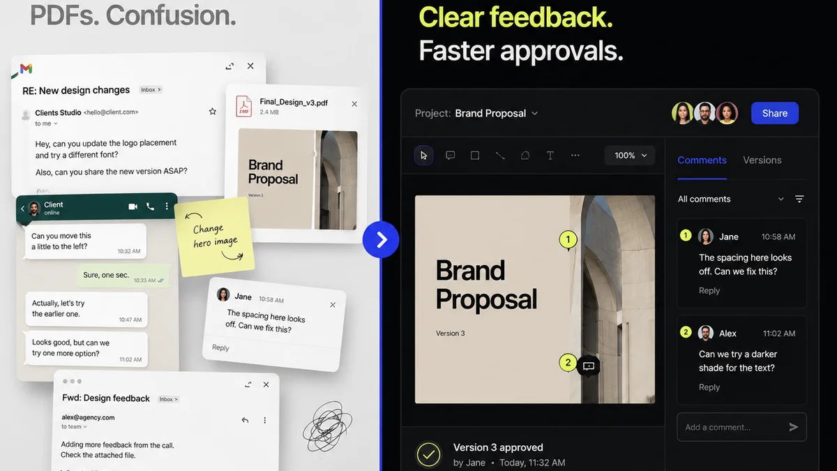
Managing the creation and approval of marketing publications involves many moving parts. Feedback can get lost in email chains, and revisions can become a tangled mess.
Revue streamlines this entire process. Centralized client feedback means everyone sees the same comments, reducing misinterpretation. Revision tracking provides a clear history of changes, making approvals straightforward. Quality checks become more robust when the entire team has visibility into the latest version and all past feedback.
This ensures that the technical execution phase, the last mile of your publication design, is smooth and error-free, reflecting the careful planning that came before.
9. Final Thought
Publication design for marketing is a discipline that demands both creative flair and rigorous operational discipline. It's about building trust, communicating clearly, and achieving business objectives.
Are you designing for impact, or just for show?
Frequently asked questions
What is the most critical element of publication design for marketing?
While aesthetics are important, the most critical element is ensuring the design effectively communicates the intended message to the target audience and aligns with the brand's strategic objectives. This involves clear hierarchy, readability, and a cohesive brand experience.
How can I ensure brand consistency across all marketing publications?
Establish comprehensive brand guidelines that detail visual identity elements (logos, colors, typography) and voice. Use these guidelines rigorously, and consider using templates or design systems to maintain consistency. Centralized feedback tools can also help ensure everyone adheres to the brand.
What are the key differences between print and digital publication design?
Print design requires consideration of CMYK color, bleed, trim, and resolution (DPI), with a focus on physical layout and paper stock. Digital design focuses on RGB color, screen resolution, file optimization for loading speed, interactivity, and responsiveness across various devices.
How important is proofreading in the publication design process?
Proofreading is absolutely critical. Typos, grammatical errors, and layout mistakes can severely damage credibility and professionalism. It's essential to have multiple rounds of proofreading by different individuals before publication.
What is the role of whitespace in publication design?
Whitespace, or negative space, is crucial for improving readability, reducing clutter, and creating a sense of balance and sophistication. It helps guide the reader's eye and emphasizes key content elements by giving them room to breathe.