Most people think publication design is just about making things look pretty. Lay out some text, drop in some images, pick a nice font. Done.
None of that is wrong. But it’s incomplete.
The hard truth? Great publication design isn't about decoration; it's about communication. It's the invisible architecture that guides the reader, clarifies complex information, and builds trust. Whether it's a magazine, a report, an ebook, or a website, effective design ensures your message lands, not just gets seen.
1. The Foundation: Clarity and Hierarchy
Before you even think about fonts, you need a plan. Publication design hinges on two core principles: clarity and hierarchy.
Clarity First
Your reader shouldn't have to work to understand your content. Design choices must serve the message, not compete with it. This means:
- Legible typography
- Sufficient white space
- Clear visual cues for navigation
- Uncluttered layouts
If a reader stumbles, it's a design flaw.
Establishing Hierarchy
Hierarchy tells the reader what's most important. What should they read first? What's secondary? What's supporting detail?
Use these tools to build it:
- Size: Headlines bigger than subheads, subheads bigger than body text.
- Weight: Bold text for emphasis.
- Color: Use sparingly for calls to action or key elements.
- Placement: Top of the page, center of attention.
- White Space: Generous spacing around important elements draws the eye.
A strong hierarchy makes content scannable and digestible, especially in dense publications.
2. Grids: The Unsung Hero of Layout
Forget freeform layouts. Professional publication design relies on a robust grid system. Think of it as the underlying structure that keeps everything aligned and consistent.
Why Grids Matter
A good grid provides:
- Consistency: Elements align across pages, creating a cohesive whole.
- Order: It dictates where content can and cannot go, preventing visual chaos.
- Efficiency: Designers know where elements will fit, speeding up the layout process.
- Readability: Consistent column widths and margins improve the reading flow.
Types of Grids
Common grids include:
- Manuscript Grid: Primarily for text-heavy documents like books. A single, wide column.
- Column Grid: Divides the page into vertical columns. Standard for magazines and newspapers.
- Modular Grid: Uses both horizontal and vertical divisions, creating modules for precise placement of text and images. Ideal for complex layouts.
Even a simple 2- or 3-column grid provides immense structure.
The key is to define your grid early and stick to it. This discipline is what separates amateur layouts from professional ones.
3. Typography: More Than Just Pretty Letters
Typography is the voice of your publication. It conveys tone, guides the eye, and impacts comprehension.
Choosing Your Typefaces
Select typefaces that:
- Match the Tone: Serif fonts often feel traditional and authoritative (good for reports). Sans-serif fonts can feel modern and clean (good for websites).
- Are Legible: Especially for body text, prioritize readability over style. Test at small sizes.
- Work Together: Limit yourself to 2-3 font families. Use one for headlines, another for body text, and perhaps a third for accents.
Typographic Hierarchy in Practice
Beyond basic size and weight, refine your typography:
- Leading (Line Spacing): Crucial for readability. Too tight, and text feels cramped. Too loose, and the eye loses its place. Aim for 120-150% of the font size.
- Tracking (Letter Spacing): Adjusting space between all letters in a word or line. Use cautiously for display text.
- Kerning: Adjusting space between specific letter pairs (like 'AV'). Most software does this automatically, but check for egregious errors.
- Hyphenation and Justification: Justified text can create rivers of white space if leading and hyphenation aren't managed well. Ragged right is often safer.
Good typography is invisible. Bad typography is distracting.
4. Imagery and Graphics: Supporting the Narrative
Visuals aren't just filler. They should enhance understanding and engage the reader.
Image Selection
Ask yourself:
- Does this image add value or context?
- Is it high quality and appropriately sized?
- Does it align with the publication's tone?
- Is it placed thoughtfully within the layout?
Avoid generic stock photos that say nothing. Seek images that tell a story or illustrate a point effectively.
Data Visualization
Charts, graphs, and infographics can make complex data accessible. Ensure they are:
- Accurate: Misrepresenting data is worse than not presenting it.
- Clear: Use appropriate chart types. Label axes clearly. Don't overcrowd.
- Aesthetically Consistent: Use your publication's color palette and fonts.
A well-designed chart can communicate more than pages of text.
5. Color and Branding
Color sets the mood and reinforces identity. Use it strategically.
Brand Consistency
If the publication is for a specific brand, adhere to its color guidelines. This builds recognition and trust.
Color Psychology
Understand how colors evoke different emotions. Use this knowledge to create the desired atmosphere.
Accessibility
Crucially, ensure sufficient color contrast between text and background. Poor contrast makes content inaccessible to many readers, especially those with visual impairments. Aim for WCAG AA standards at a minimum. Tools like WebAIM's Contrast Checker can help.
Don't let color choices become a barrier to understanding.
6. The Digital Dimension: Adapting for Screens
Publication design isn't just print anymore. Digital formats present unique challenges and opportunities.
Responsive Design
Content must adapt to various screen sizes – desktops, tablets, phones. This requires flexible grids and adaptable layouts.
Interactivity
Digital allows for interactive elements: clickable links, embedded videos, accordions, animations. Use these to enhance engagement, but don't overdo it.
Performance
Optimize images and assets for fast loading times. A slow-loading publication frustrates readers.
Digital design demands a different skillset, but the core principles of clarity, hierarchy, and usability remain paramount.
Where Revue Fits In
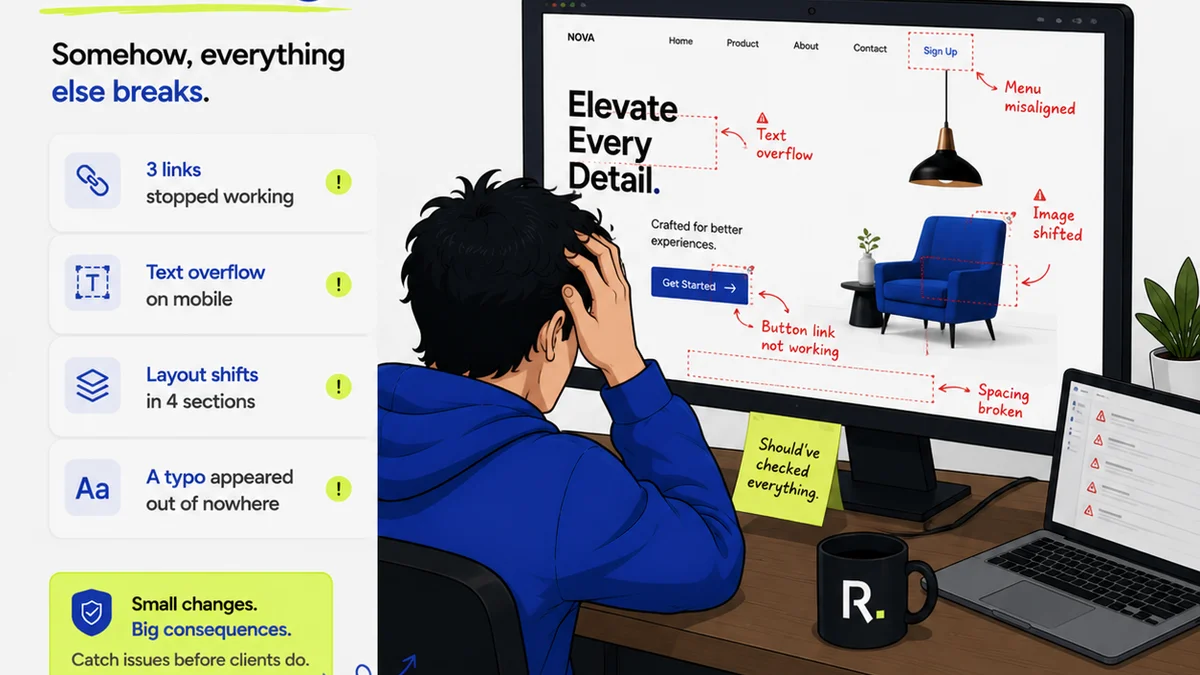
Managing the feedback and revision process for publication design projects can become chaotic. Scattered feedback across emails, Slack messages, and random documents leads to missed instructions and version control nightmares.
Revue centralizes this entire workflow.
- Centralized Feedback: All client comments and stakeholder input live in one place, tied directly to the creative asset. No more hunting for that crucial note buried in an email chain.
- Revision Tracking: Clearly see what changes have been made, by whom, and when. This visibility is essential for accountability and project history.
- Approval Workflow: Streamline the sign-off process. Ensure all necessary parties have reviewed and approved the final design before publication.
- Quality Assurance: Use Revue to conduct final checks, ensuring all feedback has been addressed and the design meets project requirements and brand standards.
This structured approach minimizes errors and ensures the final publication is polished and ready for its audience.
Final Thought
Publication design is a discipline. It requires understanding structure, type, imagery, and user behavior. It's about making information accessible and engaging.
Are you designing to communicate, or just to decorate?
Frequently asked questions
What are the most important elements of publication design?
The most important elements are clarity and hierarchy. Clarity ensures the reader understands the content easily, while hierarchy guides their attention to the most critical information first. Effective typography, consistent grids, and thoughtful use of imagery and color all support these core principles.
How do I choose the right fonts for a publication?
Select fonts that match the tone and purpose of your publication. Consider readability, especially for body text. Limit yourself to 2-3 font families – typically one for headlines, one for body copy, and potentially a third for accents. Always test your chosen fonts at various sizes.
What is a grid system in publication design?
A grid system is an underlying structure of intersecting lines that helps organize content on a page. It provides consistency, order, and alignment, making layouts look professional and readable. Common types include manuscript, column, and modular grids.
How does publication design differ for print versus digital?
While core principles of clarity and hierarchy remain, digital publication design must account for responsiveness across devices, interactivity, and performance (loading speed). Print design focuses on fixed layouts, tactile qualities, and resolution for physical reproduction.