Everyone knows good publication design matters. It makes your brand look professional. It helps readers understand complex information. It’s the first impression, the visual handshake. None of that is wrong. But it’s incomplete.
The deeper truth? Publication design mistakes aren't just aesthetic blunders. They are operational inefficiencies that drain resources, create confusion, and ultimately, cost your business real money. Think beyond the layout – think workflow, clarity, and ROI.
1. Poor Information Architecture
This is the bedrock. If your publication’s structure is confusing, everything built on top of it is unstable. Readers get lost. Key messages are buried. Your intended narrative falls apart before it even starts.
The Symptoms
- Readers can’t find what they’re looking for.
- Key data or calls-to-action are missed.
- Navigation within the document is a struggle.
- Content sections feel disconnected or out of order.
This isn't just annoying for the reader; it’s a failure of communication. A missed CTA means a lost lead. A buried data point means a missed opportunity for insight. The time spent searching for information is time not spent engaging with your core message.
The Cost
Lost engagement. Reduced conversion rates. Increased support requests. Wasted design and editorial time trying to fix a fundamentally flawed structure.
2. Inconsistent Branding and Visual Language
Brand consistency isn't a suggestion; it's a performance requirement. When your publication’s visual elements – logos, colors, typography, imagery style – are all over the place, it erodes trust and dilutes your message.
Think of it like a stuttering conversation. Every time the visual language shifts without reason, the reader’s cognitive load increases. They’re working harder to process what they’re seeing, which distracts from what they’re reading.
The Impact
- Weakened brand recognition.
- Perception of unprofessionalism or disorganization.
- Reduced credibility and authority.
- Reader fatigue and disengagement.
A report that looks like it was cobbled together from different sources feels less authoritative. Marketing collateral that doesn't align visually with the main brand feels less trustworthy. This inconsistency creates friction and doubt, directly impacting how seriously your audience takes your content.
3. Overly Complex or Unclear Visualizations
Data visualization is supposed to simplify. Charts, graphs, infographics – they exist to make complex data digestible. When they do the opposite, they’re not just ineffective; they’re actively harmful.
A chart that requires a decoder ring to understand is worse than no chart at all. It suggests you either don't understand the data yourself or you don't respect the reader's time enough to present it clearly.
Common Culprits
- Too much information crammed into one chart.
- Misleading axes or scales.
- Poor color contrast or inappropriate chart types.
- Lack of clear labels or annotations.
- Ignoring accessibility standards for color blindness.
The goal is clarity. When visualizations obscure rather than illuminate, your audience gives up. They miss the insights, and your carefully gathered data becomes useless noise. This is a direct waste of research and analysis effort.
4. Neglecting Accessibility
This used to be a niche concern. Now, it’s a fundamental requirement for any professional publication. Designing without accessibility in mind isn't just an oversight; it's a barrier that excludes a significant portion of your audience.
Accessibility isn't just about compliance; it's about reaching everyone. It’s about ensuring your message isn’t blocked by poor contrast, unreadable fonts, or non-descriptive alt text.
Key Areas to Address
- Color Contrast: Ensuring text is readable against backgrounds (WCAG AA requires 4.5:1 for normal text).
- Typography: Choosing legible fonts and appropriate sizes.
- Structure: Using proper headings and semantic markup for screen readers.
- Alternative Text: Providing descriptions for images and charts.
- Interactive Elements: Ensuring buttons and links are clearly identifiable and operable.
Excluding people costs you. It means missed customers, lower engagement, and potential legal issues. Designing inclusively expands your reach and demonstrates a commitment to serving all users.
5. Inefficient Revision and Approval Workflows
This is where operational costs skyrocket. A clunky, manual, or unclear feedback process turns a design project into a drawn-out, expensive slog.
Waiting for emails to be forwarded, hunting for the latest PDF version, deciphering vague comments – this is where budgets go to die. Time spent on administrative overhead is time not spent on creative problem-solving or client strategy.
Signs of Trouble
- Endless email chains with conflicting feedback.
- Difficulty tracking who approved what and when.
- Multiple versions of the same file floating around.
- Uncertainty about the final, approved asset.
- Last-minute changes causing significant rework.
These aren't just minor annoyances. They represent hours of billable time lost, frustrated team members, and potentially delayed project launches. The cost of managing these chaotic workflows is substantial.
Where Revue Fits In
The common thread in these costly mistakes is a lack of clear, centralized control over the creative process. Publication design, like any complex project, thrives on streamlined workflows and unambiguous communication.
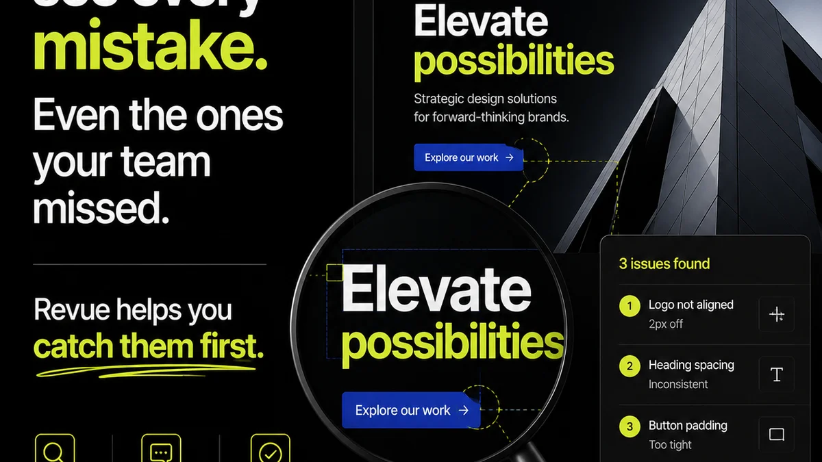
Revue is built to tackle these exact operational challenges. It provides a single source of truth for creative assets, centralizing all client feedback and revision history in one place. This eliminates the ambiguity of scattered emails and version control nightmares.
With clear annotation tools and a transparent approval process, teams can:
- Capture precise feedback directly on the design.
- Track every revision and every approval decision.
- Reduce the back-and-forth that drains time and budget.
- Ensure the final output meets all quality and branding standards before delivery.
By bringing order to the chaos of creative feedback and approvals, Revue helps agencies and in-house teams avoid the costly inefficiencies that plague traditional workflows. It’s about making the process as sharp as the final design.
Final Thought
Publication design is more than just pixels on a screen. It’s a strategic tool that, when executed poorly, actively undermines your business goals. Are you treating design as a cost center or a revenue driver? The difference lies in understanding and mitigating these hidden operational costs.
Frequently asked questions
What is information architecture in publication design?
Information architecture (IA) refers to the organization, structure, and labeling of content within a publication to help users find information and complete tasks. Good IA makes navigation intuitive, while poor IA leads to confusion and frustration.
How does inconsistent branding cost money?
Inconsistent branding erodes trust and recognition, making your business appear unprofessional. This can lead to missed opportunities, reduced customer loyalty, and increased marketing costs trying to re-establish a coherent brand image.
Why is accessibility important in publication design?
Accessibility ensures that people with disabilities can perceive, understand, navigate, and interact with your publication. Neglecting it excludes potential customers, limits reach, and can lead to legal non-compliance.
How can a design tool like Revue help with revision costs?
Revue centralizes feedback and approvals, creating a clear audit trail. This reduces time wasted on email chains, version control issues, and deciphering vague comments, thereby cutting down on costly rework and administrative overhead.