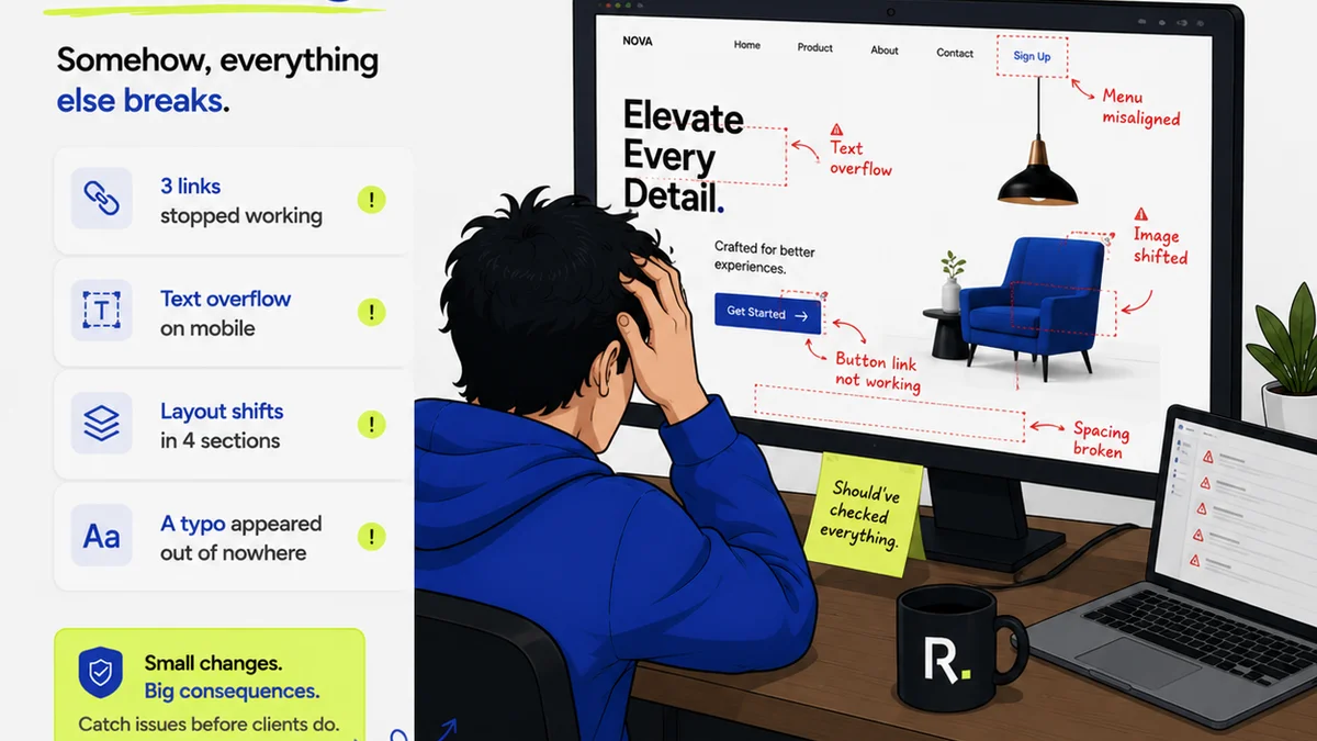
Everyone talks about SaaS UX. They show you beautiful interfaces, sleek animations, and minimalist design systems. None of that is wrong. But it’s incomplete.
The hard truth? A stunning UI is useless if the underlying workflow is a mess. Great SaaS UX is about reducing friction, clarifying communication, and driving efficiency for your users. It’s about the entire experience, not just the pixels.
1. Understanding Your User's Actual Workflow
You can have the most intuitive button placement, but if it doesn’t align with how your user actually works, it’s a failure. We often assume users will adapt to our software’s logic. The reality is, software must adapt to the user’s reality.
This means digging deep. Don’t just ask users what they want; observe them. Map out their existing processes, pain points, and workarounds. Where are the bottlenecks? What takes too long? What causes frustration?
User Journey Mapping
Create detailed user journey maps. These aren’t just for marketing. They are operational blueprints.
- Identify touchpoints: Every interaction a user has with your product.
- Map emotions: Where are users happy, frustrated, or confused?
- Note context: What else is happening around them? What other tools are they using?
Contextual Inquiry
Spend time with users in their environment. Watch them use your product (or their current solution). This provides invaluable insights that surveys and interviews often miss. You see the real-time struggles.
2. Simplifying Complex Tasks
SaaS tools are often built to solve complex problems. The challenge is to present that complexity in a digestible way. Overwhelming users with options or steps is a surefire way to kill adoption.
Think about common agency tasks: managing client feedback, tracking revisions, getting approvals. These are inherently complex. Your UX should simplify, not complicate.
Progressive Disclosure
Don't show users everything at once. Reveal information and options as they are needed. This keeps the interface clean and focused.
For example, advanced settings should be hidden by default. Only show them when a user explicitly seeks them out.
Clear Calls to Action (CTAs)
Every screen should have a primary action. Make it obvious what the user should do next. Ambiguity leads to inaction or errors.
Use strong verbs and clear, concise labels. Contrast CTAs with secondary actions.
Chunking Information
Break down long forms or complex data sets into smaller, manageable chunks. Users can process information more effectively when it’s presented in smaller pieces.
- Use accordions or tabs.
- Employ step-by-step wizards for multi-stage processes.
- Group related fields logically.
3. Enabling Seamless Collaboration
Most SaaS is used in a team or client context. UX must account for multiple users, roles, and permissions. Friction here grinds projects to a halt.
Consider how users collaborate. How do they share information? How do they provide input? How are decisions made and recorded?
Granular Permissions
Allow administrators to control who can see and do what. This is crucial for security and workflow integrity. Different roles (e.g., client, designer, project manager) need different access levels.
Clear Communication Channels
Integrate communication directly into the workflow. Avoid forcing users to switch between tools for simple comments or questions. Centralized communication reduces misunderstandings.
Think about real-time notifications and threaded discussions tied to specific assets or tasks.
Visibility into Status
Users need to know where things stand. Who is responsible for the next step? What is the current status of a task or approval? Lack of visibility breeds anxiety and delays.
- Use clear status indicators (e.g.,
Frequently asked questions
What is the difference between UI and UX in SaaS?
UI (User Interface) is the look and feel – the visual elements users interact with. UX (User Experience) is the overall feeling and effectiveness of the interaction, encompassing usability, accessibility, and the entire user journey.
How can I improve the UX of my existing SaaS product?
Start by deeply understanding your users' actual workflows through observation and contextual inquiry. Identify friction points, simplify complex tasks using techniques like progressive disclosure, and ensure seamless collaboration features are robust.
Why is user workflow so important in SaaS UX?
SaaS products are tools designed to integrate into users' daily work. If the software's logic doesn't align with their existing workflow, it creates friction, reduces efficiency, and hinders adoption, regardless of how good the interface looks.
What are the key elements of good SaaS collaboration UX?
Key elements include granular permissions, clear in-app communication channels, and high visibility into task and approval statuses. The goal is to keep users within the product and informed, reducing the need to switch contexts.