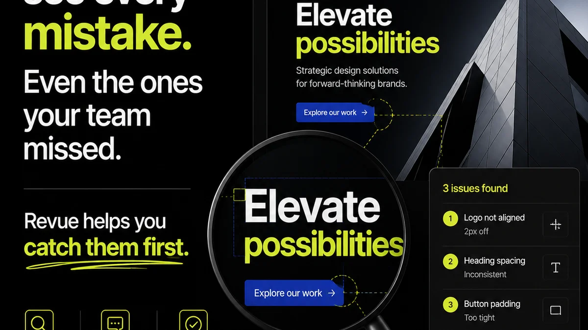
Everyone thinks typography QA is about checking kerning, line breaks, and hyphenation. None of that is wrong. But it’s incomplete.
The hard truth? Typography QA is about brand integrity, user experience, and ultimately, client trust. It's not a final coat of paint; it's structural integrity.
1. The Brand Foundation: Typography as Identity
Your client’s brand isn't just a logo. It's a feeling, a voice, a promise. Typography is one of the most potent carriers of that identity.
When type is off, the brand feels off. It’s subtle, but clients feel it. They might not articulate it, but a misaligned headline or a poorly chosen font weight erodes confidence.
Brand Consistency Across Touchpoints
Think about where typography lives: websites, apps, presentations, print collateral, social media graphics. Each requires specific typographic treatments, but the core brand DNA must remain consistent.
- Ensuring the correct font families are used.
- Verifying font weights and styles align with brand guidelines.
- Checking hierarchy and typographic scale is consistent across similar elements.
- Confirming proper display of special characters or ligatures.
This isn't just about aesthetics. It's about reinforcing recognition and trust. Every typographic decision is a brand decision.
2. User Experience: Readability and Accessibility First
Beyond brand, typography is the engine of communication. If users can't read it, it doesn't matter how beautiful it looks.
This is where the rubber meets the road. Bad typography frustrates users, drives them away, and can even exclude people.
Legibility vs. Readability
These terms are often confused, but they’re distinct. Legibility is about distinguishing one character from another. Readability is about how easily text can be scanned and understood in blocks.
Legibility factors:
- X-height: Taller x-heights generally improve legibility.
- Apertures: Open counters (like in 'c' or 'e') help distinguish letters.
- Stroke contrast: Extreme contrast can be hard to read at small sizes.
- Character shape: Distinct shapes for similar letters (like 'i' and 'l' or '0' and 'O') are crucial.
Readability factors:
- Line length: Too long or too short breaks the reading flow. Generally 45-75 characters per line is a good range.
- Line spacing (leading): Too tight, and it’s a wall of text. Too loose, and the eye jumps.
- Word spacing: Consistent and appropriate spacing aids smooth reading.
- Font choice: Some fonts are simply better suited for body copy than others.
Your typography QA needs to scrutinize these elements, especially at smaller screen sizes and for users with visual impairments.
Accessibility Considerations
Typography is a cornerstone of digital accessibility. Are you meeting the standards?
WCAG guidelines provide clear benchmarks. For example, contrast ratios are critical for ensuring text is visible against its background.
- Contrast: Ensure sufficient contrast between text and background. WCAG AA requires 4.5:1 for normal text and 3:1 for large text. Tools like the WebAIM Contrast Checker are invaluable.
- Font size: Users should be able to resize text without loss of content or functionality. Avoid fixed pixel sizes for fonts.
- Line height and spacing: Adequate spacing aids readability, particularly for users with cognitive disabilities or dyslexia.
Ignoring accessibility in typography QA isn't just a missed opportunity; it's a barrier.
3. Technical Accuracy: The Devil's in the Details
Beyond the conceptual, there's the nuts and bolts. This is where many teams fall short, relying on developers to catch what designers missed.
This creates friction and delays. Typography QA should be a designer-led process, catching issues before they hit code.
Common Pitfalls in Digital Typography
Digital environments present unique challenges. What looks good in Figma might break in a browser.
- Overriding Styles: Checking that default styles aren't being overridden unnecessarily, leading to inconsistencies.
- Responsive Behavior: How does the type scale and reflow across different screen sizes and resolutions?
- Text Overflow: Ensuring text doesn't get cut off or overlap elements at various widths.
- Hyphenation and Justification: While often handled by browsers, improper settings can create “rivers” of white space or awkward breaks.
- Character Encoding: Ensuring all characters, especially non-English or special symbols, render correctly.
Print vs. Digital Nuances
The same font can behave differently on screen versus in print. Resolution, rendering engines, and viewing conditions all play a role.
Digital typography demands attention to sub-pixel rendering, anti-aliasing, and how fonts are loaded (web fonts vs. system fonts). Print requires checking for trapping, overprint, and CMYK conversions.
Your QA process must account for the final output medium. Don't assume a digital design will translate perfectly to print, or vice-versa.
4. Workflow Integration: Making Typography QA Stick
The biggest assumption? That typography QA is a discrete step. It's not. It needs to be woven into the entire creative process.
A separate QA pass at the end is a bottleneck. It breeds a culture of
Frequently asked questions
What is the difference between legibility and readability in typography?
Legibility refers to how easily individual characters can be distinguished from one another (e.g., 'i' vs. 'l'). Readability concerns how easily blocks of text can be scanned and understood, influenced by factors like line length, spacing, and font choice.
How does typography impact brand identity?
Typography is a core element of brand identity, conveying tone, personality, and professionalism. Consistent and appropriate typographic choices reinforce brand recognition and build trust with the audience.
What are key accessibility considerations for typography?
Key accessibility considerations include sufficient color contrast between text and background, ensuring text can be resized without loss of content, and maintaining adequate line height and spacing for readability, especially for users with visual or cognitive impairments. Adhering to WCAG guidelines is crucial.
How can agencies improve their typography QA process?
Agencies can improve typography QA by integrating it throughout the design and development workflow, not just as a final step. Establishing clear typographic guidelines, using automated tools where possible, and conducting cross-device/browser testing are essential.