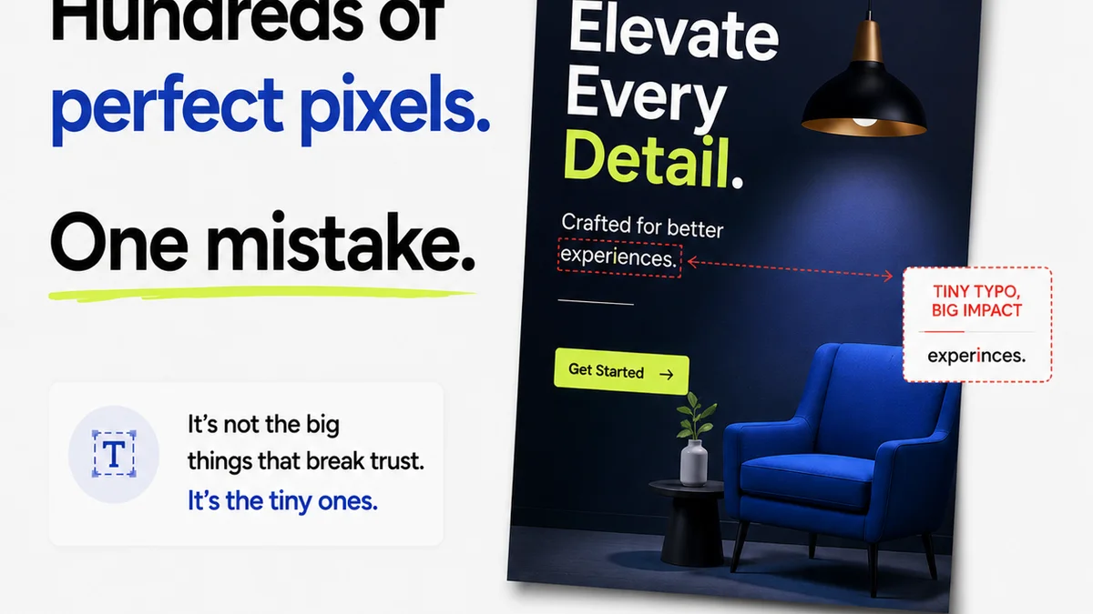
Everyone thinks typography QA is about checking if the font looks right. If the right typeface is used. If the size is readable. None of that is wrong. But it’s incomplete.
The hard truth is that true typography quality assurance goes deeper than a quick visual scan. It’s about ensuring legibility, accessibility, brand consistency, and technical correctness across all touchpoints. Sloppy typography isn’t just ugly; it’s a functional failure.
1. Legibility vs. Readability: The Foundational Difference
These terms are often used interchangeably, but they’re distinct. Getting them right is the first step in robust typography QA.
Legibility
Legibility refers to how easily individual characters (letters, numbers, punctuation) can be distinguished from one another. It’s about character recognition.
Consider these common legibility pitfalls:
- Characters that look too similar (e.g., 'I', 'l', '1'; '0', 'O').
- Typefaces with overly condensed or extended letterforms.
- Poorly designed characters with ambiguous shapes.
- Insufficient contrast between text and background.
Readability
Readability is about how easily blocks of text can be read and understood. It’s about comprehension of the whole.
Factors impacting readability include:
- Line length (too long or too short).
- Line spacing (leading).
- Word spacing and letter spacing (tracking and kerning).
- Paragraph indentation and structure.
- Typeface choice for the intended medium and audience.
QA must assess both. A typeface might be legible in isolation but create unreadable blocks of text when implemented poorly.
2. The Nuances of Typographic Hierarchy
A clear typographic hierarchy guides the reader’s eye, signaling importance and structure. Without it, content becomes a jumbled mess.
Establishing Visual Cues
Hierarchy is built using a combination of:
- Size: Larger text for headings, smaller for body copy.
- Weight: Bold for emphasis or subheadings, regular for body.
- Style: Italics for subtle emphasis or specific use cases.
- Color: Contrasting colors for links or calls to action.
- Spacing: Generous spacing around headings and between sections.
QA for Hierarchy
Your typography QA checklist should include:
- Are heading levels (H1, H2, H3, etc.) used correctly and consistently?
- Is there a clear distinction in size and weight between different levels?
- Are call-to-action elements visually distinct and easily identifiable?
- Does the hierarchy make sense for the content’s structure?
- Is the hierarchy maintained across different screen sizes and devices?
Don't just check if the H1 is bigger than the H2. Check if the *relationship* between them makes sense and serves the content.
3. Accessibility: Typography for Everyone
Typography QA isn't complete without considering accessibility. This means designing for users with a wide range of abilities and disabilities.
Key Accessibility Factors
Focus on these during your checks:
- Sufficient Contrast: Text must have adequate contrast against its background. The Web Content Accessibility Guidelines (WCAG) recommend specific contrast ratios (e.g., 4.5:1 for normal text).
- Font Size: Ensure body text is large enough to be read comfortably, especially on smaller screens. Allow users to resize text without loss of content or functionality.
- Typeface Choice: Avoid overly decorative or script fonts for body text. Sans-serif fonts are generally considered more legible on screens.
- Line Spacing (Leading): Adequate leading (typically 1.4 to 1.6 times the font size) improves readability for many users.
- Line Length: Keep lines to a reasonable length (around 50-75 characters) to prevent eye strain.
Accessibility isn’t an add-on; it’s a core requirement. Your QA process must verify these elements.
4. Technical Typography: The Unseen Details
Beyond aesthetics and readability, there are technical aspects of typography that impact rendering and consistency.
Kerning, Tracking, and Leading
These are often overlooked in basic QA but are crucial for professional typography.
- Kerning: The adjustment of space between specific pairs of letters (e.g., 'AV', 'To'). Poor kerning creates awkward gaps or overlaps.
- Tracking: The overall adjustment of space between letters in a block of text. Too tight or too loose tracking degrades readability.
- Leading: The vertical space between lines of text. Inconsistent or inadequate leading is a common readability killer.
While some of this is handled by type designers, specific pairs or blocks of text may need manual adjustment. QA should flag obvious issues.
Ligatures and Glyphs
OpenType fonts offer features like ligatures (e.g., 'fi', 'fl' combined into a single character) and alternate glyphs. QA should ensure these are enabled where appropriate and not causing rendering problems.
Font Loading and Fallbacks
On the web, how fonts load is critical.
- Are web fonts loading efficiently?
- Are fallback fonts appropriate and consistently applied?
- Are there layout shifts (Cumulative Layout Shift - CLS) caused by font loading?
These technical details directly affect user experience and perceived quality.
5. Brand Consistency Across Touchpoints
Typography is a powerful brand element. Inconsistent typography erodes brand recognition and trust.
The Brand Style Guide is King
Your typography QA must be anchored to the brand’s style guide. This document dictates:
- Approved typefaces for different uses (headings, body, captions, UI elements).
- Specific font sizes, weights, and styles for each element.
- Rules for spacing, alignment, and color usage.
- Guidelines for web vs. print typography.
Cross-Platform Checks
Typography needs to look and behave consistently across:
- Websites and web applications
- Mobile apps
- Print materials (brochures, reports)
- Presentations
- Social media graphics
A mismatch in font usage or styling across these channels signals a breakdown in QA and brand management.
Where Revue Fits In
Managing typography QA across numerous projects, clients, and deliverables can feel chaotic. This is where a centralized feedback and version control system becomes invaluable.
Revue helps streamline this by providing a single source of truth for creative assets and feedback. Instead of hunting through emails or scattered documents, your team can:
- Centralize Feedback: All comments and revisions on visual assets, including typography, are logged in one place. This ensures no feedback gets lost and everyone is working from the latest version.
- Track Revisions: See the history of changes, understand the evolution of a design, and easily revert to previous versions if needed. This is crucial for identifying when typographic errors were introduced or corrected.
- Streamline Approvals: Clear approval workflows mean that sign-offs happen with full visibility into the final creative, including the typography. This reduces the chance of errors slipping through.
- Run Quality Checks: By having all assets and feedback organized, you can conduct more thorough quality checks, including dedicated typography QA, before final delivery.
Revue doesn’t do the QA *for* you, but it creates the organized environment where effective QA can actually happen consistently.
Final Thought
Typography is more than just choosing a pretty font. It’s a critical component of communication, usability, and brand identity. Are you treating your typography QA with the diligence it deserves, or are you just skimming the surface?
Frequently asked questions
What's the difference between legibility and readability in typography?
Legibility refers to how easily individual characters can be distinguished (e.g., 'I' vs 'l'). Readability refers to how easily blocks of text can be read and understood (e.g., due to line length, spacing, typeface choice).
Why is font contrast important for accessibility?
Sufficient contrast between text and its background ensures that users, including those with visual impairments, can easily read the content. WCAG recommends specific contrast ratios.
How can a style guide improve typography QA?
A style guide provides clear rules for typefaces, sizes, weights, spacing, and color usage across all brand materials. QA uses this as the benchmark for consistency and correctness.
What are common technical typography issues to check for?
Common issues include poor kerning (space between specific letter pairs), inconsistent tracking (overall letter spacing), improper leading (line spacing), and problems with font loading or fallback fonts on the web.
How does Revue help with typography quality assurance?
Revue centralizes feedback, tracks revisions, and streamlines approvals for creative assets. This organization makes it easier to conduct thorough typography QA and ensures consistency across projects.