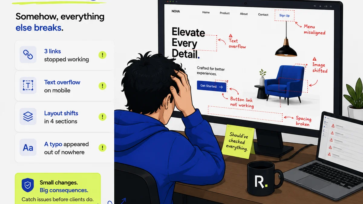
Everyone assumes typography QA is just about picking pretty fonts. That the job is done once the client approves the typeface.
None of that is wrong. But it’s incomplete.
The hard truth? Flawless typography is a critical, often overlooked, component of overall design quality. It’s not just about aesthetics; it’s about clarity, accessibility, and brand consistency. A proper typography QA checklist ensures these elements are locked down before a project ships.
1. Legibility and Readability: The Foundation
This is where most people start and stop. Is the text easy to read? Can someone scan it quickly? But these aren't the same thing.
Legibility
Legibility refers to how easily individual characters can be distinguished from one another. Think about letters like 'I', 'l', and '1', or 'O' and '0'.
- Are there clear distinctions between similar characters?
- Is the x-height appropriate for the font style and usage?
- Are ascenders and descenders distinct enough?
Readability
Readability is about how easily blocks of text can be read. This is influenced by more than just the font itself.
- Line Length: Are lines too long or too short? Aim for 45-75 characters per line for optimal reading.
- Line Spacing (Leading): Is there enough space between lines to prevent eyes from jumping? Generally, 120-150% of the font size is a good starting point.
- Text Color Contrast: Is there sufficient contrast between text and background? This is crucial for accessibility. Refer to WCAG guidelines for specific ratios.
- Font Weight: Is the chosen weight appropriate for the text's purpose? Body copy shouldn't be too light or too heavy.
- Text Size: Is the font size adequate for the intended viewing distance and medium? Mobile vs. desktop vs. print all have different needs.
Small tweaks here make a massive difference in user experience.
2. Hierarchy and Tone: Guiding the Reader
Typography is a powerful tool for establishing visual hierarchy. It tells users what's most important and guides their eye through the content.
Establishing Hierarchy
Clear hierarchy prevents users from getting lost. It ensures they consume information in the intended order.
- Are headings (H1, H2, H3, etc.) distinct from body text?
- Is there a clear visual progression from most important to least important information?
- Are call-to-action buttons and links visually distinct and actionable?
- Is the use of bold, italics, and different weights consistent and purposeful?
Maintaining Tone
The choice of typeface significantly impacts the perceived tone of a brand or project. A serif font feels different from a sans-serif, and a script font feels different again.
- Does the chosen typography align with the brand's personality and the project's goals?
- Is the tone consistent across all elements, from headlines to captions?
- Avoid using too many different font families or weights on a single page, which can create visual chaos and undermine the intended tone. Stick to a well-defined typographic system.
This isn't just about looking good; it's about communicating effectively.
3. Consistency Across Platforms and Devices
Projects rarely live on just one screen or platform anymore. Ensuring typography remains consistent is a major QA hurdle.
Responsive Typography
What looks great on a desktop might break on a mobile device. Typography needs to adapt gracefully.
- Test text rendering on various screen sizes and resolutions.
- Check for overlapping text, broken lines, or text that becomes too small to read on smaller screens.
- Ensure line lengths remain appropriate across devices.
Cross-Browser and Cross-Device Testing
Different browsers and operating systems can render fonts slightly differently. While less of an issue with modern web fonts, it's still worth a check.
- Are web fonts loading correctly and displaying as intended in major browsers (Chrome, Firefox, Safari, Edge)?
- Are there any rendering artifacts or unexpected font substitutions?
Consistency builds trust. Inconsistency breeds doubt.
4. Accessibility: Designing for Everyone
Typography plays a massive role in making digital products accessible to all users, including those with disabilities.
Contrast and Color
As mentioned earlier, sufficient contrast is paramount. This isn't just a nice-to-have; it's a requirement for many users.
- Verify text-to-background color contrast ratios meet or exceed WCAG AA standards (4.5:1 for normal text, 3:1 for large text). Use a contrast checker tool.
- Ensure color is not the *only* means of conveying information.
Font Choice and Size
Some fonts are inherently more legible than others, especially for users with visual impairments or cognitive differences.
- Avoid overly decorative or condensed fonts for body text. Prioritize clarity.
- Ensure users can adjust text size without loss of content or functionality. This is a core WCAG success criterion.
Accessible design is simply good design.
5. Brand Integrity and Licensing
Typography is a core element of brand identity. It needs to be handled with care, both creatively and legally.
Brand Alignment
Does the typography reinforce the brand's established visual language? Or does it feel like an outlier?
- Are the correct font families being used as per the brand guidelines?
- Are the correct weights and styles being applied consistently?
- Is there a clear distinction between brand fonts and functional UI fonts if separate?
Font Licensing
This is a crucial but often overlooked part of QA. Using fonts without proper licensing can lead to legal and financial trouble.
- Confirm that all fonts used in the project have appropriate licenses for the intended use (web, print, app, etc.).
- Ensure licenses cover the number of users, page views, or installations required.
- Check for any restrictions on font modification or embedding.
Don't let a licensing oversight derail a great project.
Where Revue Fits In
Managing typography QA, especially across multiple stakeholders and revisions, can become chaotic. This is where a centralized feedback and approval platform like Revue becomes invaluable.
Instead of scattered email threads or disconnected Slack messages, all feedback on typography—and every other design element—lives in one place. Stakeholders can leave precise comments directly on the design, highlighting specific text elements or font choices.
This creates a clear audit trail of revisions. You can easily track changes, see who approved what, and ensure that the final design adheres to all typographic requirements.
Revue streamlines the entire QA process, making it easier to catch typographic errors and ensure brand consistency before launch. It turns a potential minefield into a manageable workflow.
Final Thought
Typography is more than just text on a page. It's a silent communicator, shaping perception, guiding users, and reinforcing brand identity.
Is your current QA process giving typography the attention it deserves? Or are you leaving critical elements to chance?
Frequently asked questions
What are the key differences between legibility and readability in typography?
Legibility refers to how easily individual characters can be distinguished (e.g., 'I' vs. 'l'). Readability concerns how easily blocks of text can be read, influenced by factors like line length, spacing, and font size.
How does typography affect brand identity?
Typography is a core element of brand identity. The choice of typeface, its weight, and its application convey a brand's personality, tone, and professionalism. Consistent use reinforces brand recognition and trust.
Why is font licensing important in design QA?
Font licensing ensures you have the legal right to use a typeface for your intended purpose (web, print, commercial use, etc.). Using unlicensed fonts can lead to significant legal and financial penalties for your agency or client.
What are WCAG guidelines for typography?
WCAG (Web Content Accessibility Guidelines) provides standards for digital accessibility. For typography, key guidelines include ensuring sufficient color contrast between text and background (e.g., 4.5:1 for normal text) and allowing users to resize text without loss of content or functionality.