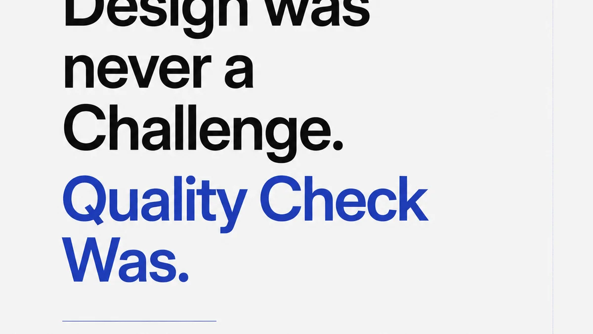
Everyone agrees that good typography is essential. It’s the bedrock of clear communication, the silent architect of brand perception. You see it everywhere: sleek digital interfaces, polished print collateral, compelling marketing campaigns. You probably assume your design and development teams nail it, hitting every kerning pair, every leading value, every typographic hierarchy with precision.
None of that is wrong. But it’s incomplete.
The hard truth? Typography QA is routinely overlooked, under-resourced, and treated as a low-priority checkbox. This neglect creates a hidden bottleneck that plagues creative teams, leading to embarrassing errors, client frustration, and unnecessary rework.
1. Why Typography QA Isn't Just About Aesthetics
Many creative professionals view typography as purely an aesthetic concern. A beautiful font choice, well-applied. Done. This perspective misses the crucial functional and technical aspects.
Poor typography QA isn't just about a slightly awkward headline. It's about:
- Broken user experiences due to unreadable body text.
- Inconsistent branding across touchpoints.
- Accessibility issues that exclude users.
- Technical rendering problems on different devices or browsers.
- A general perception of sloppiness that erodes client trust.
It’s about the cumulative impact of small errors that, together, undermine the entire project’s integrity.
The Illusion of 'Good Enough'
In the rush to meet deadlines,
Frequently asked questions
What are the most common typography errors?
Common errors include inconsistent spacing (kerning, tracking, leading), incorrect hyphenation and justification, widows and orphans, font rendering issues across devices, incorrect font weights or styles, and poor typographic hierarchy that hinders readability.
How can I improve typography quality in my team?
Establish clear typographic guidelines, conduct thorough proofreading specifically for type, use automated tools for checks where possible, train your team on typographic principles, and integrate typography QA into your project management workflow.
Is typography QA relevant for digital-only projects?
Absolutely. Digital typography has unique challenges like responsive design, cross-browser compatibility, and legibility on various screen sizes. Proper QA ensures text remains clear, readable, and on-brand across all digital platforms.
How does typography QA impact client perception?
Impeccable typography signals professionalism and attention to detail, building client confidence. Conversely, typographic errors can make your work appear careless, undermining credibility and client satisfaction.