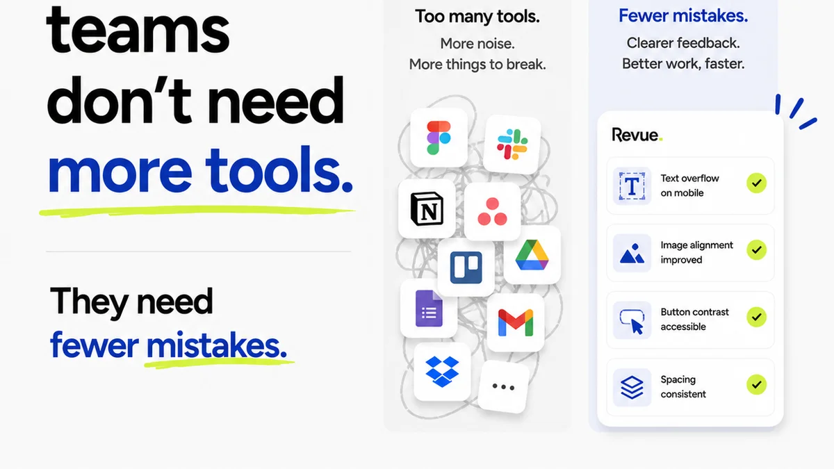
Everyone thinks good typography is about picking the right font file. That’s a piece of the puzzle, sure. But it’s not the whole picture. Not even close.
The real challenge isn't selecting fonts; it's ensuring they render flawlessly across every device, browser, and context. It's about the operational rigor to catch every kerning error, every incorrect weight, every misaligned baseline before it hits the client or, worse, the public.
That’s where specialized typography QA software comes in. It’s the unsung hero of pixel-perfect design delivery.
1. The Illusion of 'Good Enough' Typography
Many teams operate on a 'good enough' principle for typography. They eyeball it. They rely on the designer's innate sense. They assume modern browsers and design tools handle the heavy lifting.
This approach is a ticking time bomb.
Here’s why it’s a flawed strategy:
- Inconsistent rendering across browsers (Chrome vs. Safari vs. Firefox).
- Subtle differences in font smoothing and anti-aliasing.
- Variations in pixel density (Retina vs. standard displays).
- Impact of CSS properties like `line-height`, `letter-spacing`, and `font-variant-numeric`.
- Client-side rendering of dynamic content.
- Accessibility concerns related to readability.
What looks perfect on one designer's machine can appear janky, misaligned, or simply wrong on another’s, or on the client’s screen.
2. What Typography QA Really Means
Typography QA isn't just about spotting obvious errors. It's a systematic process to verify that type is:
- Legible: Easily readable at various sizes and contexts.
- Readable: Flows well for extended reading.
- Consistent: Uniform application of styles, weights, and sizes across the entire project.
- Accurate: Correctly implemented according to design specifications.
- Performant: Font files are optimized and load efficiently.
- Accessible: Meets contrast ratios and offers a good user experience for all.
This requires more than just a keen eye. It requires tools that can measure, compare, and report on these details automatically.
The Limitations of Manual Checks
Manual QA is essential, but it’s slow and prone to human error. A designer or QA specialist might:
- Miss subtle kerning issues in long blocks of text.
- Overlook minor alignment discrepancies on different screen sizes.
- Be unaware of how a font renders in a specific browser version.
- Struggle to consistently measure line heights or character spacing across dozens of pages.
This is where dedicated software moves from 'nice-to-have' to 'must-have'.
3. Essential Features of Typography QA Tools
When evaluating typography QA software, look for these core capabilities:
Automated Visual Comparison
The software should be able to compare design mockups (e.g., Figma, Sketch, Adobe XD files) against the live implementation or staging environment. It needs to highlight discrepancies in:
- Font family and style
- Font size
- Font weight
- Line height
- Letter spacing (tracking)
- Character spacing (kerning where applicable)
- Text color and contrast
- Alignment (vertical and horizontal)
- Text overflow and truncation
Cross-Browser and Cross-Device Testing
A critical function is simulating how typography appears on different browsers, operating systems, and devices. This includes:
- Rendering engines (Blink, WebKit, Gecko)
- Screen resolutions and pixel densities
- Mobile vs. Desktop layouts
- Specific browser versions
Tools that integrate with real device labs or reliable emulators are invaluable here.
Font Performance Analysis
Typography can significantly impact page load times. Good QA software should:
- Identify unused font weights or styles.
- Flag oversized font files.
- Check for proper font loading strategies (e.g., `font-display` property).
- Analyze the number of font requests.
Optimizing font delivery is a direct contributor to user experience and SEO.
Accessibility Checks
Ensuring text is accessible is non-negotiable. Look for features that:
- Verify color contrast ratios against WCAG standards.
- Check for sufficient font sizes for readability.
- Identify potential issues with text reflow on zoom.
This moves typography QA beyond aesthetics into a crucial compliance and user-centric requirement.
Integration and Reporting
The best tools integrate seamlessly into your existing workflow. This means:
- Compatibility with design tools (Figma, Sketch, Adobe XD).
- Integration with development workflows (CI/CD pipelines, staging environments).
- Clear, actionable reports that developers can easily understand and act upon.
- Ability to track issues over time and verify fixes.
4. Top Typography QA Software Categories (Not Just One 'Best')
The
Frequently asked questions
What is typography QA?
Typography QA (Quality Assurance) is the process of systematically checking and verifying that text elements in a design or application are rendered correctly, consistently, and meet specified standards across different platforms, browsers, and devices. It ensures legibility, readability, accuracy, and accessibility of type.
Why is typography QA important?
Accurate typography is crucial for brand consistency, user experience, and accessibility. Poorly rendered text can lead to brand damage, user frustration, and can exclude users with visual impairments. QA ensures that typography looks and functions as intended, maintaining professional standards and meeting accessibility guidelines.
Can I do typography QA manually?
Manual checks are a necessary part of QA, but they are time-consuming and prone to human error, especially for large projects or complex designs. Dedicated typography QA software automates many of these checks, providing faster, more consistent, and more accurate results for issues like rendering discrepancies, alignment, and spacing.
What are the key features to look for in typography QA software?
Key features include automated visual comparison against designs, cross-browser and cross-device testing capabilities, font performance analysis, accessibility checks (like contrast ratios), and seamless integration with design and development workflows, along with clear reporting.