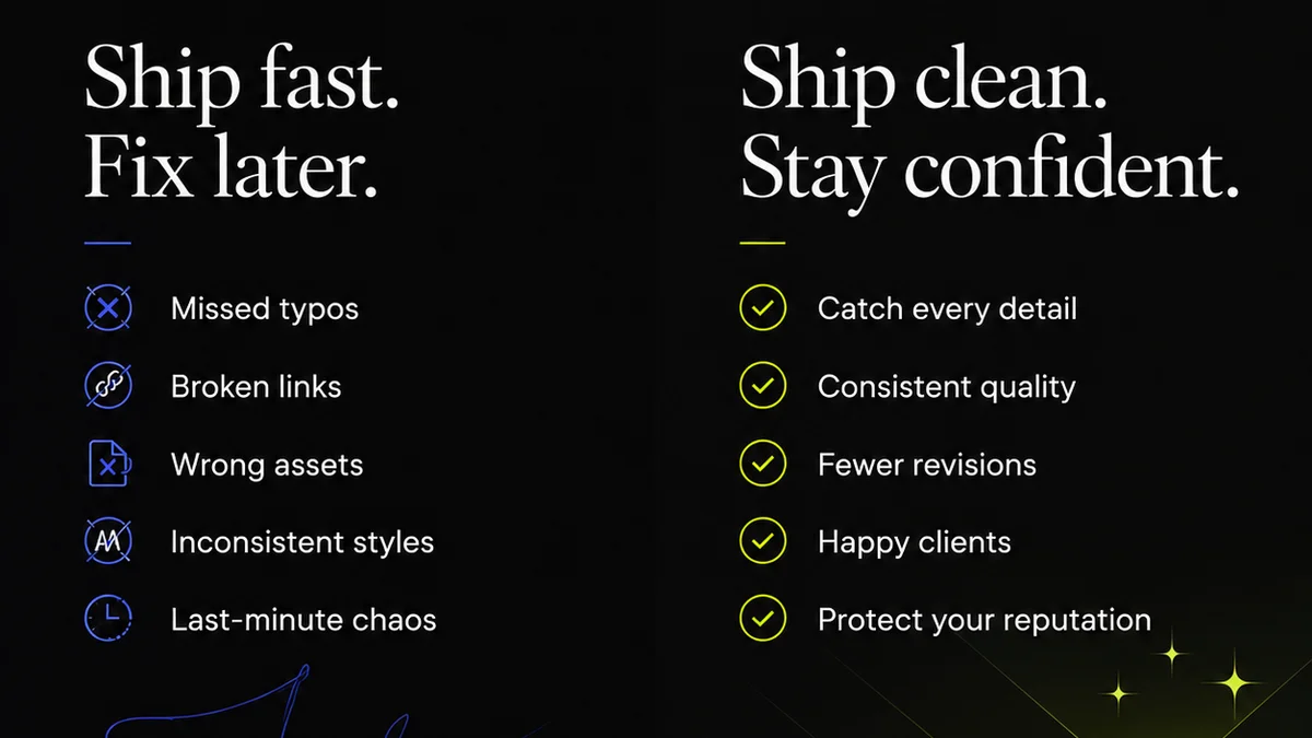
Everyone talks about typography as the soul of design. It’s the visual voice of a brand, the subtle guide to user interfaces, the bedrock of readability. And that’s all true. But focusing solely on the beauty and impact of type misses a critical operational reality: typography is a technical discipline that requires rigorous quality assurance.
Many teams assume that if the type *looks* right on screen, it *is* right. This often leads to overlooked errors that chip away at brand integrity and user experience over time.
The hard truth? Effective typography QA isn't just about aesthetics; it’s about precision, consistency, and adherence to standards across every touchpoint. And that requires specialized tools.
1. Accurate Font Rendering and Metrics
This is the absolute baseline. Your typography QA software needs to accurately display fonts as they will appear in production. This sounds obvious, but many tools fall short.
Pixel Perfection vs. Technical Accuracy
A designer might eyeball a pixel-perfect mock-up. But that doesn't guarantee the underlying font metrics—like ascenders, descenders, x-height, and kerning—are correctly implemented. These technical details impact line spacing, character spacing, and overall legibility, especially across different devices and browsers.
Look for software that:
- Renders fonts using the same engines as your target platforms (e.g., browser rendering engines).
- Allows inspection of font metrics and character spacing in real-time.
- Highlights discrepancies between design mock-ups and actual rendered type.
- Can compare font rendering across different browsers and operating systems.
This isn't about subjective
Frequently asked questions
What are the most common typography errors in digital design?
Common errors include incorrect font weights or styles, inconsistent leading (line spacing), poor kerning (space between specific letter pairs), inaccurate x-heights leading to readability issues, and improper use of faux bold or faux italics. Missing or incorrect character sets for different languages are also frequent problems.
How can typography QA software improve brand consistency?
It ensures that the correct fonts, weights, styles, and spacing are used consistently across all digital assets. By providing a standardized way to check and approve typography, it prevents variations that can dilute brand identity and create a disjointed user experience.
Is typography QA only for web design?
No, typography QA is crucial for any medium where type is used. This includes print design (brochures, packaging, signage), mobile app interfaces, software UIs, and even presentations. Consistency across all these touchpoints is key.
Can basic design tools handle typography QA?
While design tools like Figma or Adobe XD allow you to set type, they are primarily for creation, not rigorous, cross-platform QA. Dedicated typography QA software or plugins offer more specialized features for auditing and verifying technical accuracy that goes beyond visual inspection.