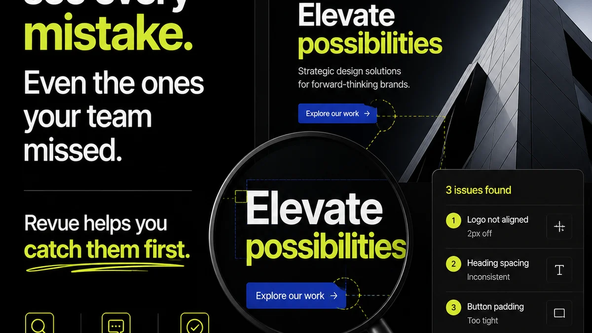
Everyone thinks UI design is about making things look good. About the latest trends, the perfect color palettes, and the sleekest animations. None of that is wrong. But it’s incomplete.
The hard truth? Great UI design isn't just about aesthetics. It's about clarity, efficiency, and a deep-seated understanding of the user's goals. It’s about removing friction, not adding decoration.
1. The Unspoken Hierarchy: Guiding the Eye (and the Brain)
Visual Weight and Flow
Think of your UI as a conversation. You need to guide the user through it, telling them what’s important, what’s next, and what they can do. This is visual hierarchy.
Elements with more visual weight—think size, color contrast, placement—draw the eye first. Use this to your advantage. Your primary call-to-action should scream for attention. Secondary actions should whisper.
Spacing is Not Empty Space
White space, or negative space, is your best friend. It’s not wasted real estate; it’s a tool for clarity. Proper spacing reduces cognitive load, making it easier for users to scan and understand content.
Generous margins and padding around elements:
- Separate distinct sections.
- Group related items.
- Improve readability of text.
- Create a sense of calm and order.
Typography as Navigation
Your fonts are more than just text carriers. They are navigational cues. Establish a clear typographic hierarchy using font size, weight, and style.
Headings should be distinct from body text. Links should be easily identifiable. Use consistent styles across your interface. This predictability builds trust and reduces confusion.
2. Consistency: The Bedrock of Usability
Internal vs. External Consistency
Internal consistency means your UI behaves the same way throughout your own product. Buttons look like buttons. Navigation is always in the same place. This is non-negotiable.
External consistency, while less critical, can help users adapt faster. If your design borrows familiar patterns from established platforms (like common form field behaviors), users will find it more intuitive. Think about how you expect a dropdown to work, or how you select multiple items in a list. Users bring those expectations with them.
When to Break the Rules
Consistency doesn't mean monotony. Sometimes, a deliberate break from a pattern signals a critical action or a change in context. But these breaks must be intentional and clearly communicated.
A common mistake is inconsistent labeling. If you call a feature
Frequently asked questions
What is the most important aspect of UI design?
Clarity and usability. While aesthetics are important, the primary goal of UI design is to make the interface intuitive and efficient for the user to achieve their goals without confusion or frustration.
How can I ensure consistency in my UI design?
Establish a design system or style guide that defines elements like typography, color palettes, spacing, and component behavior. Apply these rules rigorously across all screens and interactions.
What is the role of white space in UI design?
White space (or negative space) is crucial for improving readability, reducing cognitive load, and creating visual separation between elements. It helps users focus on content and understand the relationship between different parts of the interface.
Should UI design always follow current trends?
No. While trends can offer inspiration, they should not dictate your design. Prioritize timeless usability principles and user needs over fleeting aesthetics. Trends can quickly become dated and may not serve your specific audience or product goals.