Everyone agrees good UI design matters. It makes apps and websites look good. It’s intuitive. It helps users achieve their goals.
None of that is wrong. But it’s incomplete.
The hard truth is, your UI design isn’t just a coat of paint. It’s a core business asset that directly impacts your bottom line. It’s the silent salesperson, the tireless customer service rep, and the brand ambassador all rolled into one. Get it right, and it fuels growth. Get it wrong, and it actively hinders it.
1. The Direct Revenue Impact of UI
Conversion Rates Start with the Interface
Think about your highest-converting pages or app flows. What do they have in common? Likely, a UI that’s crystal clear. Every button, every form field, every call to action is precisely where it needs to be. Users don’t have to think; they just *do*. This frictionless experience is the bedrock of conversions.
A confusing interface, on the other hand, is a conversion killer. Users get lost. They get frustrated. They leave. They don’t buy. They don’t sign up. They don’t convert.
Optimizing for Lifetime Value
Growth isn’t just about new customers; it’s about keeping the ones you have. This is where UI shines in driving repeat business and increasing customer lifetime value (CLTV). A delightful and efficient user experience makes customers *want* to come back.
Consider the difference between a banking app that makes transferring money a chore versus one that does it in two taps. Which app do you think users will open more often? Which bank do you think they’ll trust with more of their money?
The Cost of Poor UX
Every support ticket generated by a confusing interface is a direct cost. Every lost sale due to a clunky checkout process is lost revenue. Every user who churns because the product is too difficult to use is a failure that impacts future growth potential.
These aren’t abstract metrics. These are dollars and cents bleeding out of your business because the UI isn’t pulling its weight.
2. UI as a Brand Differentiator
First Impressions Are Everything
In a crowded market, your UI is often the first point of contact a potential customer has with your brand. A polished, professional, and on-brand UI signals quality and trustworthiness. A sloppy or outdated interface screams amateurism and unreliability.
This is especially true for digital-first businesses. Your website or app *is* your storefront. What does yours say about you?
Building Emotional Connections
Beyond functionality, great UI design evokes emotion. It can make users feel delighted, empowered, or understood. This emotional resonance builds loyalty that transcends price points or feature lists.
Think about the apps you love. Is it purely about what they *do*, or is it also about how they *make you feel*? That feeling is a direct result of thoughtful UI and UX design.
Communicating Your Value Proposition
Your UI should visually communicate your unique selling proposition. If you sell premium products, your UI needs to feel premium. If you offer a simple solution to a complex problem, your UI needs to be elegantly straightforward.
The design choices—typography, color, layout, micro-interactions—all work together to tell that story before a single word of marketing copy is even read.
3. Enhancing Operational Efficiency
Streamlining Internal Workflows
It’s not just external users. Internal tools and dashboards with intuitive UIs boost employee productivity. When your team can access information and complete tasks quickly and easily, they have more time for strategic work.
Think about your CRM, your project management tools, your internal reporting systems. A clunky interface here leads to wasted hours, errors, and frustration for your own staff.
Reducing Training Overhead
A well-designed product requires less training. Users can figure things out on their own through clear affordances and intuitive navigation. This reduces the burden on your training and support teams.
Less training means faster onboarding for new employees and customers. It means fewer resources spent on repetitive explanations.
Facilitating Data-Driven Decisions
Dashboards and analytics interfaces need to be clear and actionable. If the UI makes it hard to understand key metrics, leadership can’t make informed decisions. This cripples the ability to pivot, optimize, and grow strategically.
A good UI for data visualization transforms raw numbers into insights. It makes complex information accessible and understandable for everyone, not just data scientists.
4. UI and Scalability
Designing for Future Growth
A UI that’s built with scalability in mind can adapt as your business grows. This means anticipating new features, increased user loads, and evolving business needs without requiring a complete redesign.
This foresight saves immense amounts of time and money down the line. It prevents the technical debt that comes from a rigid, short-sighted design.
Maintaining Consistency Across Platforms
As you expand to new devices or platforms (web, mobile, tablet, desktop), a consistent UI is paramount. Users expect a familiar experience regardless of where they interact with your brand. This requires a robust design system and a clear UI strategy.
Inconsistency breeds confusion and erodes trust. A unified UI reinforces your brand and makes adoption of new platforms seamless.
Adapting to User Behavior Changes
User expectations and behaviors evolve. What was cutting-edge five years ago might be standard today. A UI designed with adaptability allows you to incorporate new interaction patterns and trends without alienating your existing user base.
This agility is key to staying relevant and competitive in the long term.
Where Revue Fits In
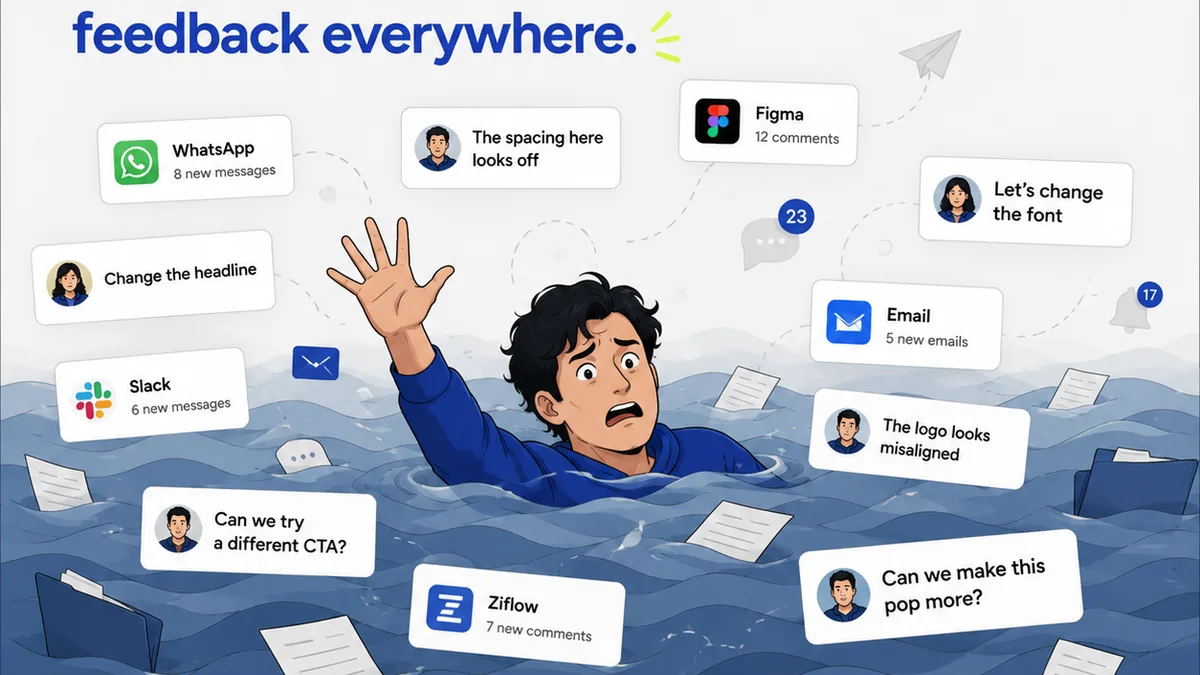
Managing creative projects involves constant iteration and feedback. Ensuring your UI design is top-notch requires a clear, efficient feedback loop.
This is where Revue becomes essential. It centralizes client feedback, making it easy to track comments, manage revisions, and get clear approvals on UI designs. No more sifting through endless email chains or scattered Slack messages.
With Revue, you can:
- Gather consolidated feedback directly on creative assets.
- Maintain a clear audit trail of all revisions and approvals.
- Ensure quality checks are systematically performed before final sign-off.
This streamlined process means your design team spends less time on administrative overhead and more time refining the UI that drives your business forward.
Final Thought
Is your UI design an investment or an expense? The answer depends on how you view it. If you see it as merely a visual layer, you're missing its true potential. But if you recognize it as a fundamental driver of revenue, brand perception, and operational efficiency, you're on the path to unlocking significant business growth.
What’s one change you can make to your UI process today to treat design as the growth engine it is?
Frequently asked questions
How does UI design directly impact sales?
A clear, intuitive UI reduces friction in the user journey, leading to higher conversion rates on key actions like purchases or sign-ups. A confusing interface causes users to abandon tasks, directly costing sales.
Can UI design improve customer retention?
Absolutely. A positive and efficient user experience makes customers more likely to return. When an app or website is easy and pleasant to use, it builds loyalty and increases customer lifetime value.
What is the relationship between UI and brand perception?
Your UI is often the first impression a customer has of your brand. A polished, professional, and consistent UI communicates quality and trustworthiness, while a poor UI can signal unreliability.
How can UI design contribute to operational efficiency?
Intuitive internal tools and dashboards reduce employee training time and boost productivity. Clear data visualization in analytics UIs also enables better, faster decision-making.