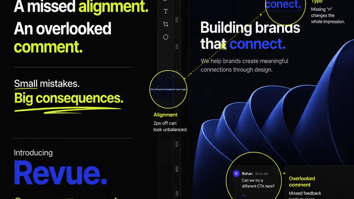
Everyone thinks they know how to give good feedback. You get a file, you jot down some notes, you hit send. Simple, right?
Wrong.
That’s the surface-level assumption. The hard truth is that most teams are leaving massive amounts of time and money on the table because their visual feedback process is fundamentally flawed. It’s not about ‘being clear,’ it’s about building a system that prevents confusion and wasted revisions before they even happen.
This isn't about subjective taste. This is about operational efficiency in creative production. Let’s break down the common visual feedback mistakes media teams make and how to fix them.
1. The Ambiguity Avalanche
This is the most common killer. Feedback is vague, contradictory, or missing crucial context. It’s the equivalent of a client saying, “Make it pop more.”
What does ‘pop’ even mean?
Symptoms of Ambiguity:
- Requests like: “It needs more energy,” “Can we try a different vibe?”, “Make it feel more premium.”
- No clear objectives for the creative asset.
- Feedback that focuses on personal preference rather than strategic goals.
- Lack of explanation for *why* a change is needed.
This leads to endless rounds of revisions because the creative team is guessing what the client *actually* wants.
The Fix: Context is King
Every piece of feedback needs a “why.”
Instead of “Make it pop,” try: “The current CTA isn't prominent enough. We need to increase click-through rates on this banner ad by 15%, so let’s make the button color contrast higher against the background and increase its size by 10%.”
This requires more upfront thinking but saves hours of back-and-forth.
2. The Email Chain Black Hole
Using email for visual feedback is like trying to build a skyscraper with a hammer and nails. It’s slow, disorganized, and prone to errors.
Feedback gets buried. Versions get lost. Important comments are missed.
Why Email Fails:
- Lack of version control. Which is the latest file?
- Difficulty tracking specific feedback to specific design elements.
- No centralized record of approvals or rejections.
- Information silos: only the sender and receiver see the conversation.
- Attachments get stripped, links break, and important context disappears.
This method actively hinders clear communication. It’s a recipe for missed deadlines and frustrated clients.
The Fix: Centralized, Contextual Platforms
You need a single source of truth. A place where feedback lives directly on the creative asset itself, visible to all stakeholders.
Tools designed for creative review allow for precise annotations, threaded conversations, and clear version history. This eliminates the need to hunt through dozens of email threads.
3. The ‘Everyone’s a Critic’ Conundrum
When feedback is open to too many people, or the right people aren’t involved, you get conflicting directions and paralysis by analysis.
Too many cooks spoil the broth. Especially when they have different recipes.
The Problem with Unmanaged Stakeholders:
- Conflicting feedback from different departments (e.g., marketing wants one thing, legal wants another).
- “Design by committee” dilutes the original vision and strategy.
- Key decision-makers are left out, leading to late-stage objections.
- Team members give feedback outside their expertise, causing unnecessary churn.
This isn't about excluding people; it's about managing their input effectively.
The Fix: Define Roles and Permissions
Clearly identify who provides feedback, who reviews, and who has final approval. Use a system that allows you to assign specific review roles and permissions.
This ensures that feedback comes from the right people at the right time, and that the final decision-maker has the ultimate say.
4. The Vague Revision Request
Even with some context, revision requests can be unclear. “Change the font” is a classic example. Which font? To what? Why?
This is a direct descendant of the Ambiguity Avalanche.
Common Revision Request Pitfalls:
- Requests that don't specify the exact element to be changed.
- Lack of clear instructions on the desired outcome.
- Failure to link the revision to the overall project goals.
- Not providing the actual assets or files needed for the revision.
This leads to the creative team spending time making a change, only for it to be rejected because it wasn't what was intended.
The Fix: Actionable, Specific Instructions
Every revision request should be a mini-brief. It needs to be concrete and actionable.
“Please update the headline font from Arial Regular to Montserrat Bold, size 24pt, to improve readability and align with the brand’s updated typographic guidelines.”
This leaves no room for misinterpretation.
5. The Approval Bottleneck
Projects stall not because of bad creative, but because approvals get stuck. Someone is out of office, busy, or simply missed the notification.
The project sits there, gathering digital dust.
Signs of Approval Bottlenecks:
- Long delays between submitting a deliverable and receiving a sign-off.
- “Waiting on approval” is a frequent status update.
- Lack of clear escalation paths for stalled approvals.
- No automated reminders for pending sign-offs.
This kills momentum and can have a ripple effect on subsequent project phases and client satisfaction.
The Fix: Streamlined Approval Workflows
Implement clear approval stages and deadlines. Use tools that can automate reminders and escalate requests if they aren’t addressed within a set timeframe.
Make it easy for approvers to see what they need to review and to give a clear yes or no.
6. The ‘It’s Done’ Mirage
The creative is approved, but is it *really* done? Often, teams miss crucial quality checks. This could be anything from incorrect copy, broken links, wrong file formats, or accessibility issues.
The final polish is often skipped in the rush to call a project complete.
Common Quality Control Gaps:
- Ignoring accessibility standards (e.g., WCAG guidelines).
- Failing to proofread final copy.
- Not testing interactive elements or links.
- Using incorrect file types or resolutions for final delivery.
- Ignoring brand guideline adherence in the final asset.
These overlooked details can lead to costly rework, damaged brand reputation, or legal issues.
The Fix: Implement a Final Quality Checklist
Before a project is considered ‘done,’ it must pass a standardized quality assurance (QA) checklist. This should cover:
- Content accuracy and proofreading.
- Functional testing (links, interactivity).
- Technical specifications (file format, resolution, dimensions).
- Brand compliance.
- Accessibility checks.
This step turns a ‘good enough’ delivery into a professional, polished one.
Where Revue Fits In
Managing visual feedback effectively requires more than just good intentions. It demands the right tools and processes.
Revue is built to tackle these exact pain points.
It centralizes all client feedback directly on the creative assets, eliminating the email chain black hole. Stakeholders can provide precise, contextual comments, and revision requests become clear and actionable.
Version control is built-in, so everyone sees the latest iteration. Approval workflows can be managed with clear stages and automated reminders, preventing bottlenecks.
Crucially, Revue supports a structured quality check process before final delivery, ensuring that all the details are right. This leads to fewer errors, faster turnarounds, and happier clients.
Final Thought
The common wisdom is that good feedback is about being polite and clear. But the real impact comes from building a robust, systematic approach to visual feedback. It’s about preventing errors and confusion, not just reacting to them.
Are you ready to stop guessing and start managing your creative feedback process with precision?
Frequently asked questions
What is the biggest mistake media teams make with visual feedback?
The biggest mistake is ambiguity. Feedback that is vague, contradictory, or lacks context forces creative teams to guess, leading to endless revisions and wasted time. For example, requests like 'make it pop' are unhelpful without explaining the desired outcome or strategic goal.
Why is email a bad tool for visual feedback?
Email creates a black hole for feedback. It lacks version control, makes it hard to track specific comments on an asset, and doesn't provide a centralized record of approvals. Important feedback can be easily lost or missed, leading to errors and project delays.
How can I ensure feedback comes from the right people?
Define clear roles and permissions for stakeholders. Identify who is responsible for providing feedback, who reviews it, and who has final approval. Using a system that allows for assigned review roles helps manage input effectively and prevents 'design by committee' issues.
What makes a revision request actionable?
An actionable revision request provides specific instructions with a clear desired outcome. Instead of 'change the font,' a good request would be 'Update the headline font from Arial Regular to Montserrat Bold, size 24pt, to improve readability and align with brand guidelines.'
How can I prevent approval bottlenecks?
Implement streamlined approval workflows. Use tools that can automate reminders for pending approvals and escalate requests if they aren't addressed promptly. Setting clear deadlines and escalation paths ensures projects don't stall while waiting for a sign-off.