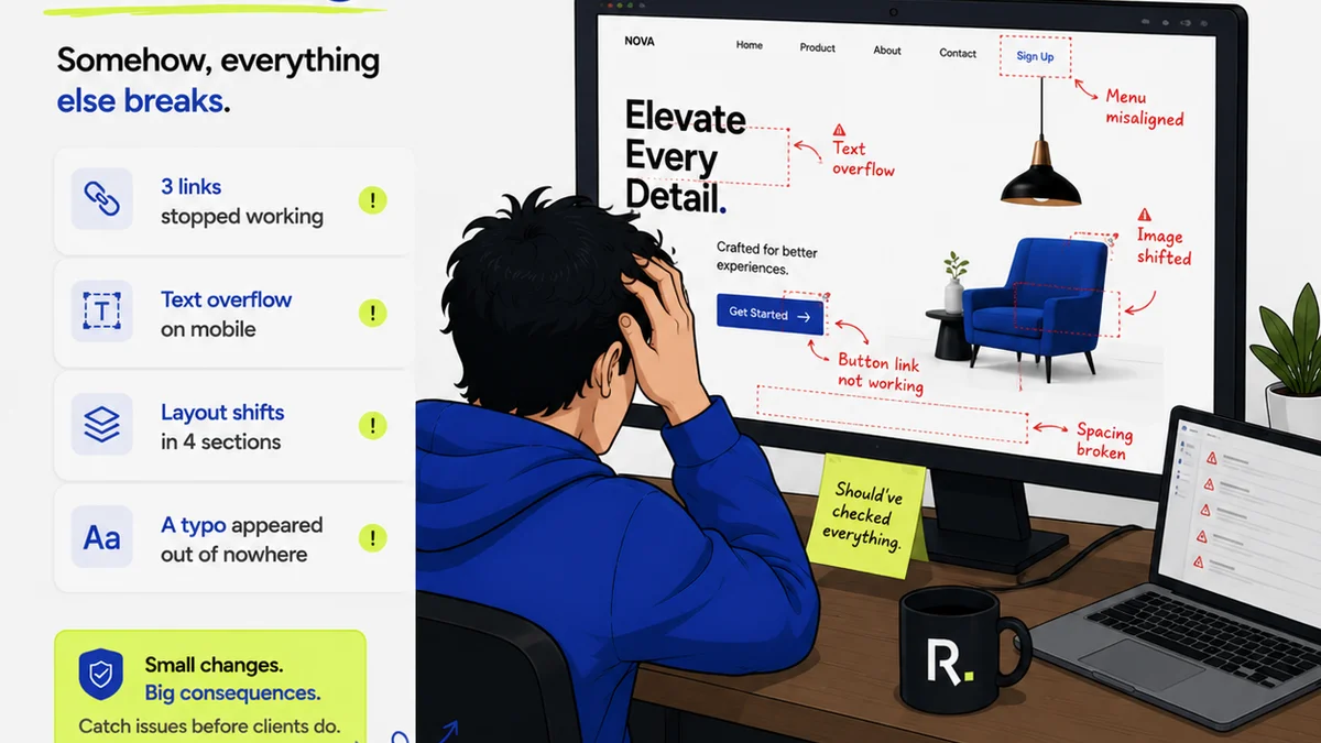
Most businesses think a strong visual identity starts and ends with a great logo. They pour resources into a beautiful mark, a slick color palette, and maybe a typeface. That’s important, sure. But focusing solely on the aesthetic is a critical mistake that costs businesses real money.
The hard truth is, a visual identity is an operational system, not just a creative asset. When that system breaks down, it causes friction, delays, and wasted resources. That’s where the real financial drain happens.
1. The "Set It and Forget It" Brand Guide
You’ve got your logo files, your brand colors, and your fonts. You probably even have a PDF style guide. Great! But how many people in your organization actually *use* it? How many understand it?
A brand guide that lives on a server, rarely opened and even less frequently enforced, is a liability. It leads to inconsistent application across marketing, sales, product, and external communications.
Symptoms of a Stale Brand Guide:
- Inconsistent logo usage (wrong color, wrong size, squashed).
- Off-brand typography in presentations or documents.
- Marketing materials that don’t quite *feel* like your brand.
- New hires guessing at brand application.
- Designers and marketers spending time re-explaining basic brand rules.
This inconsistency erodes brand recognition and trust. It’s like building a beautiful house and then letting anyone paint the walls any color they want. Customers get confused. Employees waste time trying to get it right. That’s lost productivity and lost revenue.
2. Neglecting Brand Consistency Across Touchpoints
Your visual identity needs to be a cohesive experience everywhere a customer or prospect interacts with your business. This goes far beyond just the logo on your website.
Think about every single touchpoint:
- Website and landing pages
- Social media profiles and posts
- Email marketing campaigns
- Sales decks and proposals
- Product packaging
- Customer support interactions
- Internal communications
- Physical signage
- Event materials
When these elements aren’t singing from the same visual hymn sheet, it creates a disjointed experience. It signals a lack of professionalism and attention to detail. It makes your brand feel smaller, less credible, and less trustworthy than it is.
Each instance of inconsistency is a tiny crack in the customer’s perception of your brand. Over time, these cracks can become chasms, leading to lost sales and increased churn. The cost isn't just in the wasted design hours; it's in the lost customer loyalty and market perception.
3. Treating Visual Identity as Purely a Design Problem
This is the root of many visual identity mistakes. Design teams are often tasked with creating the assets, but the ongoing management and application fall outside their direct control. This is a mistake.
A visual identity system requires buy-in and understanding from marketing, sales, product development, and even HR. Without this cross-functional collaboration, the visual identity becomes an isolated artifact, not a living, breathing part of the business.
The Operational Impact:
- Marketing campaigns that miss the mark visually, wasting ad spend.
- Sales teams using outdated or off-brand templates, undermining credibility.
- Product teams launching features with inconsistent UI elements.
- New product launches that don’t align with the established brand.
- Legal or compliance teams flagging materials for incorrect logo usage.
This siloed approach means that even a well-designed visual identity can fail to deliver its full business value. The operational friction generated by poor adoption is a hidden cost that eats into profits.
4. Underestimating the Power of Accessibility
Visual identity isn't just about looking good; it's about being usable by everyone. Ignoring accessibility in your visual identity creates significant blind spots and potential costs.
This includes:
- Color Contrast: Ensuring sufficient contrast between text and background colors so that content is readable for people with visual impairments. Low contrast is a major barrier.
- Typography Choices: Selecting fonts that are legible at various sizes and weights, and avoiding overly decorative or complex fonts for body copy.
- Iconography and Imagery: Using clear, universally understood icons and ensuring images have descriptive alt text for screen readers.
- Information Hierarchy: Designing clear visual hierarchies that guide users through content effectively, regardless of their abilities.
Failure to consider accessibility isn't just an ethical oversight; it's a business risk. It can lead to:
- Alienating a significant portion of your potential customer base.
- Non-compliance with legal standards (like the Americans with Disabilities Act in the US or similar regulations elsewhere), leading to fines and lawsuits.
- Damage to brand reputation as an inclusive and thoughtful organization.
- Increased development costs later if accessibility issues need to be retrofitted.
A truly strong visual identity is one that works for everyone. Designing with accessibility in mind from the start saves money and expands your reach.
5. Not Iterating or Evolving
The world changes, markets shift, and customer expectations evolve. A visual identity that remains static for too long will eventually look dated and out of touch.
This doesn't mean a complete rebrand every two years. It means understanding when and how to make subtle, strategic updates.
Signs Your Identity Needs a Refresh:
- Your competitors have visually evolved, and you haven't.
- Your target audience has changed, and your identity no longer resonates.
- Your visual identity is hindering your ability to communicate new product lines or services.
- Your brand feels generic or indistinguishable in your market.
The cost of *not* evolving can be a gradual decline in market relevance and customer engagement. It’s a slow bleed, but it impacts market share and profitability over time. Proactive, strategic evolution is far less costly than a reactive, panicked rebrand.
Where Revue Fits In
Managing a visual identity effectively is an ongoing operational challenge. It requires clear communication, centralized resources, and robust processes for feedback and approval.
Revue helps bridge the gap between the creative vision of your visual identity and its consistent, accurate application across your organization.
- Centralized Feedback: Ensure all feedback on creative assets, from internal stakeholders to clients, is captured in one place. This prevents misinterpretations and ensures everyone is working from the same brief and the same approved visuals.
- Revision and Approval Visibility: Track every version of a design, understand who approved what, and when. This creates an auditable trail and reduces the chances of outdated or incorrect assets being used.
- Quality Checks: Implement clear approval gates and use the platform to ensure final deliverables meet brand standards before they go live. This minimizes costly errors and rework.
By treating your visual identity as a system that needs continuous management and clear oversight, you can prevent the costly mistakes that stem from inconsistency and miscommunication.
Final Thought
Is your visual identity a powerful, unified force driving your business forward, or is it a collection of assets causing friction and confusion? The difference often comes down to how you manage it, not just how it looks.
Frequently asked questions
What is the biggest financial cost of poor visual identity management?
The biggest financial cost is often lost productivity and wasted resources due to inconsistency. This includes time spent correcting errors, redoing work, and the missed opportunities from a diluted brand message that fails to convert customers.
How does accessibility relate to visual identity mistakes?
Ignoring accessibility in visual identity, such as poor color contrast or illegible fonts, alienates potential customers, can lead to legal non-compliance, and damages brand reputation. It's a critical aspect of effective, inclusive branding.
Is a full rebrand always the answer to visual identity problems?
No, a full rebrand is often a costly and disruptive overreaction. Many visual identity issues stem from poor management and inconsistent application of existing guidelines. Focusing on operationalizing your brand strategy and ensuring consistent use is usually more effective and less expensive.
How can a creative agency ensure consistent visual identity with clients?
Creative agencies can ensure consistency by using platforms like Revue to centralize client feedback, manage revisions with clear approval workflows, and maintain a single source of truth for brand assets. This reduces miscommunication and ensures the final deliverables align with the agreed-upon visual identity.