Everyone thinks they’re a Figma expert now. You’ve mastered components, auto-layout, and maybe even published a design system. You’re ready to rock.
None of that is wrong. But it’s incomplete.
The real advancement in Figma workflow isn’t about knowing more features. It’s about understanding how those features directly impact your agency’s bottom line: speed, clarity, and profitability. It’s about building a system, not just a file.
1. Beyond the Handoff: Designing for Seamless Integration
The old way was simple: design it, then figure out how to hand it off. Figma changed the game, but many teams still operate with that same fragmented mindset. Handoff is no longer a separate step; it’s baked into the design process from the start.
This means thinking about your developers *while* you’re designing. It means structuring your files so they’re not just visually coherent, but programmatically understandable.
1.1. Structured Components as Building Blocks
Your component library isn’t just a collection of UI elements. It's your agency’s codified design language. Each component should be built with intent, anticipating its use across multiple contexts and states.
- Naming Conventions: Consistent, logical naming is paramount. Think `Button/Primary/Default`, `Input/Text/Error`.
- Variants for Every State: Don’t just use overrides. Leverage variants for different interaction states (hover, active, disabled), content variations (with icon, without), and sizes. This drastically reduces the number of unique components needed.
- Properties for Flexibility: Use properties to control spacing, alignment, and other dynamic aspects within a component. This allows for granular control without exploding your library.
This isn't just about aesthetics. This is about reducing ambiguity for developers and QA. A well-structured component library is a single source of truth.
1.2. Auto Layout as a Development Blueprint
Auto layout is more than just responsive design within Figma. It’s a direct representation of how elements will behave in code. Treat it as such.
Understand the difference between Hug Contents, Fill Container, and Fixed Width. These directly map to how elements will flex and adapt in a live environment.
Use Auto Layout frames to group related elements. This creates logical containers that developers can easily translate into divs or other layout structures.
1.3. Constraints for Predictable Scaling
While Auto Layout handles internal spacing, constraints dictate how elements behave within their parent frame when the frame is resized. Master these for truly adaptable layouts.
Left & Right constraints are your friend for elements that should stretch. Top & Bottom for those that should pin. Center is useful for elements that should remain fixed in the middle.
Think about how a desktop layout might scale down to a tablet or mobile. Your constraints should reflect that intended behavior.
2. File Architecture: The Unsung Hero of Collaboration
A messy Figma file is a productivity black hole. It breeds confusion, slows down iteration, and makes onboarding new team members a nightmare. Your file structure needs to be as deliberate as your component structure.
This isn’t about rigid rules; it’s about logical organization that everyone can understand and follow.
2.1. The Single Source of Truth Principle
For any given project or client, aim for a single, well-organized Figma file that acts as the master. Avoid fragmented files scattered across different projects or folders.
This file should contain your primary design system components (linked from your central library), all artboards for the project, and any necessary documentation or style guides.
2.2. Page Organization for Clarity
Within your master file, use pages to segment different aspects of the project.
- `_Cover` or `_Readme` Page: A dedicated page at the top with project overview, key contacts, and links to relevant documentation or shared libraries. Use an underscore prefix to ensure it stays at the top of the page list.
- `_Components` Page (if not linked): If you’re building project-specific components that aren’t part of your main library, keep them organized here.
- `Styles` or `Tokens` Page: Documenting your color styles, text styles, effects, and grid systems.
- `_Work in Progress` / `_Drafts` Page: A sandbox for new ideas or features that aren't ready for prime time.
- `_Final / Production` Pages: Clearly labeled pages for released or near-release designs.
- `_Archive` Page: For older versions or designs that are no longer active but might be needed for reference.
Keep artboards within pages logically grouped and consistently named. Use frames to delineate sections on a page.
2.3. Naming Artboards and Frames with Purpose
This cannot be stressed enough. Ambiguous names like “Screen 1” or “Homepage v2” are useless. Use a clear, hierarchical naming convention.
A good pattern: `[Section/Feature] - [Screen Name] - [State/Variant]`. For example: `Header - Homepage - Logged In`, `Product Detail - Mobile - Default`, `Checkout - Form - Error State`.
This clarity ensures that when you’re looking for a specific screen or discussing it with a stakeholder, there’s no confusion.
3. Collaboration & Feedback: Turning Chaos into Clarity
Figma’s real-time collaboration is powerful, but without a clear process, it can quickly devolve into a noisy, unmanageable mess of comments and conflicting feedback.
The goal isn't just to get feedback; it's to get *actionable* feedback that moves the project forward efficiently.
3.1. Establishing Clear Feedback Channels
Don’t let feedback live solely within Figma comments if it’s critical. Use comments for immediate, contextual notes, but have a defined process for consolidating and acting on feedback.
- Use @mentions strategically: Tag specific people for specific questions or actions.
- Comment resolution: Ensure comments are resolved once addressed. This keeps the comment stream clean.
- Designate a feedback owner: For larger projects, have one person responsible for consolidating feedback from various sources (Figma, email, Slack) and presenting it clearly.
3.2. Utilizing Prototypes for Context
Static screens are rarely enough. Use Figma’s prototyping features to demonstrate user flows and interactions. This provides crucial context for stakeholders and reduces the need for lengthy explanations.
Link your artboards logically to create navigable flows. Add simple transitions and animations to simulate the real user experience.
A well-built prototype can answer many questions before they’re even asked.
3.3. Version History: Your Safety Net
Figma automatically saves versions, but don’t rely solely on auto-save. Establish a habit of creating named versions at key milestones.
Think: “V1 - Initial Concepts,” “V2 - Client Revisions Incorporated,” “V3 - Final Polish.” This allows you to easily revert to a previous state if a new direction proves unworkable or if feedback leads to unintended consequences.
It’s a crucial safety net that prevents the dreaded “Where did that go?” moments.
4. Quality Assurance (QA): Designing for Defect Prevention
QA in design is often an afterthought, a quick check before development. But a truly advanced workflow integrates QA principles throughout the design process.
Your goal should be to catch issues *before* they ever hit development, saving time and costly rework.
4.1. Design System Audits
Regularly audit your design system components against the latest UI patterns and accessibility standards. Are components still behaving as expected? Are they accessible?
Use plugins like Stark or A11y – Color Contrast Checker to flag potential issues directly within Figma.
4.2. Cross-Browser and Cross-Device Checks (Simulated)
While Figma isn’t a live browser, you can simulate many cross-device considerations.
- Use Frame presets: Design for common device dimensions using Figma’s built-in frame presets.
- Test Resizing: Manually resize frames or use plugins to test how layouts adapt.
- Component State Testing: Ensure all variants and states of your components are designed and functioning correctly.
This proactive approach reduces the burden on development QA and ensures a more consistent user experience.
4.3. Documentation as a QA Tool
Clear documentation about how components should be used, their limitations, and their expected behavior acts as a form of QA. Developers and other designers can refer to it, ensuring consistency.
This is where your design system documentation becomes critical, linking directly to Figma components.
Where Revue Fits In
Figma is a powerful design tool, but it operates in a vacuum if feedback and approvals aren’t managed effectively.
This is where a tool like Revue becomes essential. It bridges the gap between design creation and client or stakeholder approval.
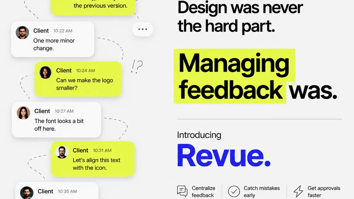
Instead of scattered email threads, endless Slack messages, or buried Figma comments, Revue centralizes all client feedback.
- Contextual Feedback: Link feedback directly to specific design versions or screens.
- Revision Tracking: Clearly see what’s been changed, what’s pending, and what’s approved.
- Streamlined Approvals: Formalize the approval process, reducing ambiguity and ensuring everyone is on the same page.
- Quality Check Integration: Use Revue to manage your internal QA process, ensuring designs meet standards before client review.
By integrating Revue into your Figma workflow, you move beyond basic collaboration to a truly managed, transparent, and efficient creative process.
Final Thought
Is your Figma workflow truly advanced, or are you just using more features? The difference lies in whether your process drives efficiency, clarity, and profitability, or simply creates more complex files. The real advancement is in the system you build around the tool.
Frequently asked questions
How do I structure my Figma files for better collaboration?
Organize your master Figma file with dedicated pages for cover/readme, components, styles, work-in-progress, final designs, and archives. Use clear, hierarchical naming conventions for artboards and frames (e.g., 'Section - Screen Name - State').
What's the best way to manage client feedback in Figma?
While Figma comments are useful for immediate notes, centralize critical feedback using tools like Revue. Use @mentions strategically in Figma, resolve comments once addressed, and designate a feedback owner to consolidate input from various channels.
How can I use Figma's Auto Layout for development handoff?
Treat Auto Layout frames as a blueprint for code. Understand Hug Contents, Fill Container, and Fixed Width, as these directly map to responsive behavior in development. Group related elements using Auto Layout to create logical containers for developers.
What is the role of version history in Figma workflow?
Version history acts as a safety net. Regularly create named versions at key milestones (e.g., 'V1 - Initial Concepts', 'V2 - Client Revisions') to easily revert to previous states if needed, preventing data loss or unintended consequences.
How can I improve QA within my Figma design process?
Integrate QA by regularly auditing your design system components for function and accessibility, using plugins for checks. Simulate cross-device behavior using frame presets and testing resizing. Ensure all component states are designed and functioning correctly.