Everyone thinks they know how to give feedback. Just tell them what you want, right? Point out what’s wrong, suggest a fix, and move on. Easy.
None of that is wrong. But it’s incomplete. And it’s why so much feedback lands with a thud, or worse, sends designers down a rabbit hole of unproductive revisions.
The hard truth? Giving *good* feedback isn’t about having opinions. It’s about understanding the *why* behind the design and communicating your needs clearly, concisely, and constructively. It’s an operational skill, not just a subjective one.
1. Define the Goal First, Always
Before a single pixel is critiqued, everyone needs to be crystal clear on what the design is supposed to *do*. What problem is it solving? Who is it for? What action should the user take?
This sounds obvious. But in the rush to get to the visuals, it’s the first thing to get glossed over. Without a shared understanding of the objective, feedback becomes a guessing game.
The Symptoms of Unclear Goals
- Feedback that contradicts itself from one review to the next.
- Designers endlessly tweaking elements that don’t impact the core objective.
- Stakeholders saying, “This isn’t what I wanted,” even though the design technically meets the brief.
- A general feeling of “throwing spaghetti at the wall.”
When you don’t define the goal, you’re not giving feedback on the design; you’re just reacting to aesthetics. And aesthetics are meaningless without purpose.
2. Separate Observation from Interpretation
This is where most feedback goes off the rails. You see something, you feel something, and you state it as fact. But your feelings are just that: yours.
Good feedback starts with objective observation. What do you *actually see*?
Then, and only then, do you add your interpretation or suggestion, linking it back to the goal.
Observation vs. Interpretation Examples
- Bad: “This button looks boring.” (Subjective opinion)
- Good: “The call-to-action button is visually similar to surrounding elements, making it difficult to identify quickly. *Because our goal is to increase sign-ups, we need this button to be more prominent.*” (Observation + Interpretation linked to goal)
- Bad: “I don’t like this font.” (Subjective opinion)
- Good: “The chosen typeface has a very high x-height, which might make it harder for older users to read quickly. *Given our target audience of seniors, we should explore options with better legibility at smaller sizes.*” (Observation + Interpretation linked to goal)
Your interpretation is valuable, but it needs to be framed by what’s actually happening on the screen and why it matters for the project’s success.
3. Be Specific and Actionable
Vague feedback is the enemy of progress. “Make it pop more,” “It needs more energy,” “Can we make this feel more premium?” These phrases are useless.
Designers need to know *what* to change and *why*. The more specific you are, the faster they can implement the change and the more confident you can be that it’s the *right* change.
How to Get Specific
- Identify the element: Instead of “the header,” say “the main navigation bar.”
- Describe the issue: Instead of “it’s cluttered,” say “the spacing between navigation items is too tight, making them hard to tap on mobile.”
- Propose a concrete solution (or ask for one): “Consider increasing the padding between nav items to 16px,” or “Can we explore reducing the number of items in the main navigation?”
- Link to the goal: “This will improve usability on smaller screens and reduce bounce rate.”
If you can’t be specific, ask clarifying questions. “What is this section intended to achieve?” or “What’s the primary user journey here?” This forces you to think critically before you speak.
4. Prioritize and Group Your Feedback
Not all feedback is created equal. Some changes are critical, others are nice-to-haves. Some issues are bugs, others are stylistic preferences.
Bombarding a designer with a massive list of minor tweaks alongside major structural changes is overwhelming. It’s hard to know where to start.
A Better Approach
- Categorize: Group feedback into critical issues (must-fix), important improvements (should-fix), and minor suggestions (could-fix).
- Prioritize: Clearly indicate which items are the highest priority.
- Contextualize: Group feedback by page, section, or feature. Don’t jump from the homepage hero to the footer on page three.
Think of it like a bug report. Severity levels are crucial. If everything is a P1, then nothing is.
5. Understand the Designer’s Perspective
Design is not magic. It’s a process of problem-solving, iteration, and technical execution. Designers are not mind-readers.
They are working within constraints: brand guidelines, technical limitations, budget, timeline, and the brief itself.
When you give feedback, consider what it means for their workflow.
Considerations for Feedback Givers
- Technical Feasibility: Is the suggested change something that can actually be built within the current scope and technology?
- Time Investment: How long will this change realistically take to implement and test?
- Impact vs. Effort: Is the proposed change worth the time and resources it will consume?
- Original Intent: Have you considered why the designer made the choices they did? There might be a good reason.
Assume positive intent. Designers are trying to create the best solution, just like you are. Work *with* them, not *against* them.
6. Choose the Right Medium for the Message
A quick Slack message might be fine for a minor clarification. A long, rambling email can get lost. A screenshot with red arrows can be helpful, but it lacks context.
The complexity and sensitivity of the feedback should dictate the medium.
When to Use What
- Quick clarification/confirmation: Chat message or brief comment.
- Detailed critique/suggestions: A dedicated feedback tool, a structured document, or a scheduled meeting.
- Complex or sensitive issues: A video call or in-person meeting. Tone and nuance are lost in text.
- Visual annotations: Use tools that allow comments directly on the design, but always add context.
Resist the urge to fire off feedback impulsively. Take a moment to consider the best way to deliver your message for maximum clarity and minimum friction.
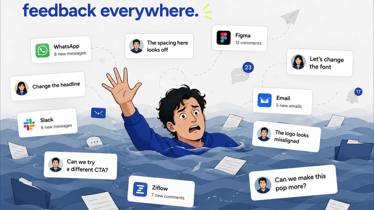
Where Revue Fits In
Managing feedback across multiple stakeholders, projects, and revisions can quickly become chaotic. Emails get buried, Slack threads fragment, and crucial context is lost.
Revue acts as the central nervous system for your creative feedback process.
It allows you to centralize all client and stakeholder feedback in one place, attached directly to the relevant design version. This means no more hunting through inboxes or deciphering conflicting comments.
You can easily track revisions and approvals, ensuring everyone is working from the latest version and that sign-offs are clearly documented. This visibility reduces ambiguity and speeds up the cycle.
Furthermore, Revue helps maintain quality control by providing a clear audit trail of feedback and revisions, ensuring that all agreed-upon changes are implemented before final delivery.
Ultimately, it streamlines the entire feedback loop, transforming a potentially messy operation into a controlled, efficient workflow.
Final Thought
Giving great design feedback isn't about being critical; it's about being collaborative and clear. It’s about elevating the work by providing direction, not just opinions.
Are you treating feedback as an operational necessity or just an opinion poll?
Frequently asked questions
What’s the biggest mistake people make when giving design feedback?
The biggest mistake is giving vague, subjective feedback without linking it to the project's goals. Comments like 'make it pop' or 'I don't like this' are unhelpful because they don't explain what problem the design is failing to solve or what objective it's not meeting.
How can I make my feedback more actionable?
Be specific. Instead of saying 'the layout is messy,' describe what's messy ('the spacing between these cards is inconsistent') and suggest a concrete improvement or ask a targeted question ('Could we increase the padding here to 16px?'). Always tie your feedback back to the project's objectives.
Should I give feedback on aesthetics or functionality first?
Always prioritize feedback related to the project's goals and functionality. Ensure the design is effectively solving the core problem for the target audience before diving into purely aesthetic preferences. Critical functionality issues should always come before minor visual tweaks.
How can I avoid overwhelming designers with too much feedback?
Prioritize and group your feedback. Categorize comments into critical issues, important improvements, and minor suggestions. Group feedback by page or section. Clearly indicate the most important items so designers know where to focus their efforts first.