Everyone agrees that catching design errors before they hit production is crucial. That’s why you have QA. That’s why you have client reviews. That’s why you have multiple rounds of revisions.
None of that is wrong. But it’s incomplete.
The hard truth? Most teams are only catching the *visible* errors. The glaring typos. The misaligned buttons. The colors that are *way* off. These are the low-hanging fruit, the easy wins.
What about the errors that lurk beneath the surface? The ones that don't break the UI but cripple the user experience? The ones that only manifest under specific conditions? Those are the real project killers. And they’re almost always missed.
1. Beyond the Pixel-Pushing: The Real Cost of Invisible Errors
We often associate design errors with aesthetic flaws. A slightly off-center logo. A font size that’s a point too small. These are easy to spot, easy to fix, and usually have minimal impact on the bottom line.
But the truly dangerous errors are the ones that affect functionality, performance, accessibility, and user flow. These are the invisible saboteurs.
The Functional Fissures
These errors don't stop the page from loading, but they prevent key interactions from working as intended. Think:
- A form field that accepts invalid input without error messaging.
- A dropdown menu that doesn't close when an option is selected.
- A modal that can be dismissed by clicking outside of it, but not by pressing the ESC key.
- A button that’s technically clickable but its hover state is missing, making it look inactive.
These bugs create friction. They frustrate users. They lead to abandoned tasks and lost conversions. And they often go unnoticed because the core functionality *appears* to be working.
The Performance Pitfalls
Design choices have a direct impact on load times and responsiveness. Large, unoptimized images. Excessive custom fonts. Complex animations that bog down older devices. These aren't bugs in the traditional sense, but they are design decisions that lead to poor performance.
A site that takes 10 seconds to load is functionally broken for 40% of users. That’s a massive design failure, even if every pixel is perfectly aligned.
The Accessibility Abyss
This is where many invisible errors truly hide. Designs that fail accessibility standards can exclude significant portions of your audience. This isn't just an ethical issue; it's a legal and business one.
Consider:
- Insufficient color contrast ratios between text and background.
- Lack of proper ARIA labels for interactive elements.
- Keyboard navigation that skips over critical components.
- Images missing descriptive alt text.
These aren't visible on a standard screen with a mouse. But for someone using a screen reader or navigating solely by keyboard, these are insurmountable barriers.
The Contextual Crimes
Designs that work perfectly on a desktop might crumble on mobile. A layout that looks fine in Chrome might have rendering issues in Safari. A feature that’s intuitive for a power user might be baffling for a novice.
These are context-dependent failures. They require testing across different devices, browsers, and user personas to uncover.
2. The Illusion of Completeness: Why Your Current Process Fails
You have a process. You have sign-offs. So what’s going wrong?
The problem lies in how feedback is gathered and acted upon. It’s often fragmented, subjective, and lacks a clear audit trail.
The “Gut Feeling” Trap
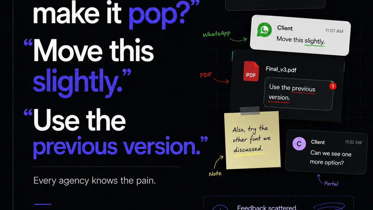
Client feedback, especially subjective feedback, can be a minefield. “I don’t like it.” “Make it pop more.” These comments are hard to act on because they lack specificity. They can also mask underlying, more concrete issues that the client can’t articulate.
Your team might spend hours tweaking a color because a client has a “gut feeling,” while ignoring a critical accessibility flaw that’s plainly visible to someone with a visual impairment.
The Email Chain Black Hole
Feedback buried in endless email threads is a recipe for disaster. Important comments get lost. Revisions are made based on outdated versions. The context of *why* a change was requested disappears.
This makes it impossible to track the evolution of a design and ensure that all critical points have been addressed. It’s like trying to assemble a complex machine with missing pages from the manual.
The Static Snapshot Syndrome
Reviews often happen on static mockups or even exported JPEGs. This doesn't replicate the actual user experience. Interactive elements are hard to test. Animations are impossible to evaluate. Dynamic content is absent.
You’re reviewing a photograph of a car, not driving the car itself. You’ll miss how it handles on the road.
The “Someone Else Will Catch It” Mentality
There’s a dangerous diffusion of responsibility. Design thinks development will catch bugs. Development thinks QA will catch them. QA thinks the client will spot the obvious flaws. The client thinks the designer knows best.
When everyone assumes someone else is the final safety net, the net develops holes. Big ones.
3. Building a Deeper Quality Net: Practical Strategies
Catching invisible errors requires a shift from reactive checking to proactive, systematic quality assurance integrated throughout the workflow.
Standardize Your Review Criteria
Move beyond subjective preferences. Develop a checklist based on objective criteria. This includes:
- Functionality: Does every interactive element work as expected?
- Performance: Are load times within acceptable limits?
- Accessibility: Does it meet WCAG AA standards?
- Responsiveness: Does it adapt correctly across key breakpoints?
- Consistency: Are UI patterns and branding applied uniformly?
- Content Accuracy: Is all copy and imagery correct and approved?
This checklist becomes your baseline. It removes guesswork and ensures that every review covers the essential bases, visible or not.
Implement Interactive Prototyping and Testing
Static mockups are insufficient. Use prototyping tools that allow for realistic interaction. Test these prototypes rigorously.
Simulate user flows. Test edge cases. Get real users (or internal team members acting as users) to interact with the prototype before development begins.
This is where many functional and usability flaws surface naturally. It’s far cheaper to fix a prototype than live code.
Adopt a Multi-Browser, Multi-Device Testing Strategy
Assume nothing about your users’ environments. Test across:
- Major browsers (Chrome, Firefox, Safari, Edge).
- Different operating systems (Windows, macOS, iOS, Android).
- A range of device sizes (desktop, tablet, mobile).
Automated cross-browser testing tools can help, but manual testing on physical devices is still invaluable for catching subtle rendering or interaction bugs.
Integrate Accessibility Testing Early and Often
Don't treat accessibility as an afterthought. Build it into your design and development process from day one.
- Use browser extensions for quick contrast checks and keyboard navigation tests.
- Incorporate automated accessibility scans into your build process.
- Train your designers and developers on accessibility best practices.
Making accessibility a core requirement means fewer errors slip through and a more inclusive product for everyone.
Establish Clear Feedback Channels
Centralize all feedback. Avoid scattered email chains and Slack messages.
Use a platform where feedback is tied directly to the design asset, with clear annotations, version history, and discussion threads. This ensures context is maintained and nothing gets lost.
Define “Done” Rigorously
What does it mean for a design task to be truly “done”? It means it has passed all functional, performance, accessibility, and cross-browser checks. It means it has received formal approval.
This definition needs to be clear to everyone on the team. It’s the standard that prevents premature releases and rushed sign-offs.
Where Revue Fits In
Managing this level of detail and ensuring consistency across a project can feel like herding cats. Especially when feedback is scattered across emails, Slack, and random documents.
Revue is built to bring order to that chaos. It acts as your single source of truth for creative feedback and approvals.
Instead of hunting through email chains, all client comments are centralized, linked directly to the specific version of the design asset they refer to. This provides undeniable context and eliminates the “lost in translation” errors.
Our version control ensures that everyone is reviewing the latest iteration, and the history of revisions is always visible. This transparency helps identify patterns in feedback and track the resolution of issues, both big and small.
Furthermore, Revue’s structured review and approval workflows mean that specific quality checks can be built into the process. Instead of relying on tribal knowledge or a forgotten checklist, you can ensure that functional, accessibility, and cross-browser considerations are explicitly addressed before a design is signed off.
This structured approach helps move beyond simply catching typos to actively preventing those invisible, yet damaging, design errors from ever reaching production.
Final Thought
The most critical errors aren’t the ones you can see. They’re the ones that erode user trust, tank performance, and exclude audiences without anyone realizing why.
Are you building a process that catches the obvious, or one that builds resilience against the hidden threats?
Frequently asked questions
What are examples of invisible design errors?
Invisible design errors include issues that don't break the interface but harm user experience, such as insufficient color contrast for accessibility, unoptimized images causing slow load times, form validation that doesn't provide error messages, or interactive elements that are difficult to navigate with a keyboard.
Why are invisible errors more dangerous than visible ones?
Visible errors (like typos or misaligned elements) are often easily caught and fixed. Invisible errors, however, can lead to user frustration, abandoned tasks, lost conversions, and exclusion of user groups (e.g., due to accessibility issues), causing significant business impact without an obvious cause.
How can I prevent invisible design errors in my projects?
Preventing invisible errors requires a proactive approach: standardize review criteria beyond aesthetics, use interactive prototyping for testing, test across multiple browsers and devices, integrate accessibility testing early and often, and establish clear feedback channels and a rigorous definition of 'done'.
How does centralized feedback help catch these errors?
Centralized feedback platforms like Revue ensure that all comments are tied to specific design assets and versions, maintaining context and preventing crucial details from getting lost in scattered communications. This allows for systematic tracking and resolution of issues, including those that are not immediately obvious.