Clients are supposed to be easily impressed, right? A great concept, a slick execution, and boom – they’re sold. That’s the common wisdom, anyway. But it’s a dangerously incomplete picture.
The hard truth is, clients, especially savvy ones, notice the small stuff. The tiny details that signal sloppiness or a lack of professional rigor. They might not articulate it as “poor kerning” or “inconsistent line weights,” but they feel it. And that feeling can tank a project before it even gets out of the gate.
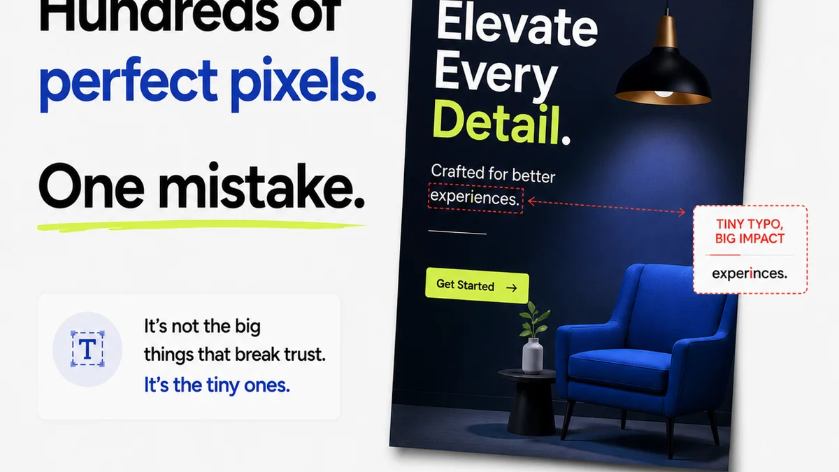
1. Typographic Fumbles
This is ground zero for client perception. Even if they don’t know the lingo, they know when text looks wrong.
Bad Kerning & Tracking
Letters jammed together or spaced too far apart? It’s jarring. It looks rushed. Like you didn’t care enough to get it right.
Inconsistent Leading
Line spacing that varies wildly between paragraphs or even within a single block of text? It’s a visual mess. It screams amateur hour.
Awkward Widows & Orphans
A single word hanging alone at the end of a paragraph or a heading left stranded on its own line? It’s an aesthetic blight. It breaks the flow.
Font Pairing Fails
Throwing together clashing fonts or using too many? It’s visual noise. It makes the design look cluttered and unprofessional.
Legibility Issues
Text too small, too light, or on a background that makes it impossible to read? Clients might squint, but they’ll likely just dismiss it as bad design.
2. Color Calamities
Color is powerful. When it’s wrong, it’s screamingly wrong.
Poor Contrast Ratios
Text that blends into the background makes things unreadable. Accessibility isn’t just a buzzword; it’s a sign of thoughtful design. Clients notice when they can’t read it.
Muddy or Off-Brand Colors
Colors that look dingy, desaturated, or just plain *wrong* for the brand? It undermines the entire visual identity. It looks cheap.
Inconsistent Color Application
Using the same shade of blue here and a slightly different one there? It’s a subtle sign of carelessness that clients pick up on.
Overuse or Underuse of Color
A design that’s too monochromatic and boring, or a riot of clashing colors? Both signal a lack of restraint and clear thinking.
3. Layout & Composition Blunders
How elements are arranged matters. A lot.
Bad Grid Adherence
Elements that don’t align, text that’s not on a baseline grid, or a general sense of visual chaos? Clients see a lack of structure.
Uneven Spacing & Margins
Are your margins inconsistent? Is the space between elements haphazard? It looks accidental, not intentional.
Lack of Visual Hierarchy
When everything screams for attention, nothing gets it. Clients can’t quickly grasp what’s important. It’s confusing.
Overcrowding or Too Much White Space
A design that’s crammed full of stuff or feels emptier than a desert? Both extremes signal a lack of editorial judgment.
Poor Image Placement
Images that are awkwardly cropped, too low-res, or just don’t fit the composition? They drag the whole design down.
4. Iconography & Imagery Issues
The smaller visual elements tell a story too.
Inconsistent Icon Styles
Mixing outlined icons with filled icons, or different stroke weights? It looks like a hodgepodge, not a system.
Low-Resolution Images
Pixelated images? Enough said. It’s the fastest way to look unprofessional.
Generic Stock Photos
Overused, cheesy stock photos scream “lack of originality.” Clients want unique, not cliché.
Misaligned or Poorly Scaled Icons
Icons that aren’t perfectly centered or are scaled inconsistently? Small details, big impact.
5. UI/UX Friction Points (Even in Static Designs)
Some design mistakes hint at deeper usability problems.
Unclear Calls to Action (CTAs)
If a client can’t tell what you want them to do, the design has failed. Buttons that don’t look like buttons? Big red flag.
Confusing Navigation (Implied)
Even in static mockups, if the flow or intended navigation isn’t intuitive, clients will sense it. Where do I click next?
Inconsistent Interactive Elements
Hover states that don’t make sense, or inconsistent button styles? It suggests a lack of attention to detail that will translate to a poor user experience.
Where Revue Fits In
Catching these 25 mistakes isn’t about guesswork. It’s about process. It’s about having a system that catches errors before they reach the client.
Revue centralizes feedback. Instead of scattered emails and Slack messages, all comments live on the asset. This means fewer missed details and a clearer audit trail.
Revision and approval tracking in Revue means you always know the status of a design. No more hunting for sign-offs or wondering what changed. This visibility helps prevent last-minute errors from slipping through.
Automated quality checks and clear version history built into the workflow mean you can be confident that what the client sees is polished and professional. It’s about building trust through meticulous execution.
Final Thought
Clients hire you for your expertise. They expect you to sweat the small stuff so they don’t have to. When they see these minor errors, they question your expertise. They wonder if you’re truly in control of the project.
Are you treating every pixel with the respect it deserves? Or are you hoping the client won’t notice?
Frequently asked questions
What is the most common design mistake clients notice?
While clients notice many things, typographic errors like bad kerning, inconsistent spacing, and illegible text are often the most immediately apparent and undermine credibility.
How can I prevent clients from noticing low-resolution images?
Always use high-resolution images sourced appropriately. Implement a review process where image quality is checked before presenting to the client. Never use images that are pixelated or clearly compressed for web on print materials.
Does Revue help catch these design mistakes?
Revue helps by centralizing feedback, tracking revisions, and providing clear version history. This structured process reduces the chance of small errors being missed during the review cycle before client presentation.
Why do clients notice small design details?
Clients notice small details because these elements reflect the professionalism, attention to detail, and overall quality of the work. Even if they can't name the mistake, they perceive it as a lack of polish or care.