Everyone talks about design consistency. They say it’s about brand recognition. About looking professional. About making sure the logo is the right color and the fonts match across all touchpoints.
None of that is wrong. But it’s incomplete.
The real reason design consistency matters, especially for agencies and in-house teams, is far more operational. It’s about efficiency, clarity, and ultimately, profitability. It’s a competitive advantage you’re probably leaving on the table.
The Hard Truth: Consistency Is About Workflow, Not Just Looks
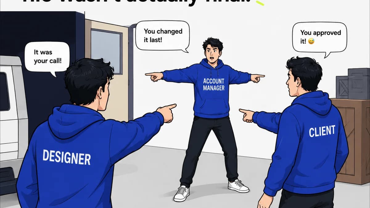
Think about your last project. How much time was spent clarifying what “finished” looks like? How much back-and-forth happened because a stakeholder didn’t recognize the visual language from one deliverable to the next? How many revisions were requested based on subjective feelings rather than objective brand guidelines?
This isn't about lazy clients or difficult stakeholders. It’s about the inherent complexity of creative production and the friction that arises when visual direction isn’t ironclad.
Design consistency, when properly implemented and managed, isn't just a nice-to-have. It’s a system for reducing ambiguity, streamlining approvals, and building predictable, high-quality output. It’s how you move faster without cutting corners.
1. Reducing Cognitive Load for Everyone
Our brains are wired to seek patterns and predictability. When a brand’s visual elements are consistent, they become instantly recognizable and trustworthy. This applies not only to the end-user but critically, to the internal team and the client.
Internal Clarity
For your design team, a well-defined system of consistency means less guesswork. They don't have to reinvent the wheel for every banner ad or social post.
- Clear typography rules save time on font selection and sizing.
- A defined color palette prevents endless debates over shades.
- Established layout grids ensure predictable composition.
- Iconography and illustration styles provide a unified voice.
This clarity translates directly into faster production cycles. Designers can focus on creative problem-solving, not on basic stylistic decisions they’ve already made.
Client Confidence
For clients, consistent visuals build trust. It signals professionalism and attention to detail. But more importantly, it makes their job easier during the review process.
When a client sees a deck that looks like other decks they’ve approved, or a website that feels like a natural extension of their existing marketing materials, they don’t have to re-learn your visual language. They can focus their feedback on the strategic message and the core creative idea.
Inconsistent design forces them to take a step back and ask, “Is this still us?” That’s a distraction you don’t need.
2. Streamlining Revisions and Approvals
This is where the operational advantage truly shines. Inconsistency is a breeding ground for subjective feedback and endless revision cycles.
The “Make it Pop” Phenomenon
When visual guidelines are loose, feedback often devolves into vague requests like “make it pop” or “I don't like it.” These aren't actionable critiques; they’re expressions of discomfort because something feels *off*.
Often, what feels “off” is a deviation from the established visual system. A color is slightly too vibrant, a font is a bit too playful, or a layout feels unbalanced against previous examples.
When your design system is robust and consistently applied, these vague critiques are easier to address. You can say, “Okay, you want it to pop more. Which element? The headline font is currently from our ‘bold’ set. Would you prefer the ‘display’ font, or should we adjust the color contrast within the existing palette?”
Visible Progress, Not Random Tweaks
Consistency provides a benchmark. When reviewing new assets, stakeholders can compare them against established standards and previous work. This makes it easier to identify genuine issues versus minor aesthetic preferences.
It also helps manage scope. If a client requests a change that falls outside the established design system, it’s easier to flag it as a scope change or a departure from the agreed-upon direction, rather than just another tweak.
3. Building a Scalable, Predictable Workflow
For agencies and in-house teams aiming to grow, consistency is the bedrock of scalability.
Onboarding New Talent
Bringing new designers or account managers up to speed is significantly easier when there’s a clear, documented system of visual communication. They don't need to intuit the brand's DNA; they can learn and apply the established rules.
This reduces the ramp-up time and ensures that new team members can contribute effectively from day one, maintaining the quality and consistency of output.
Managing Multiple Projects
As your team juggles more clients and projects, maintaining consistent quality across the board becomes a challenge. A strong design system, reinforced by consistent application, is your best defense against drift.
It allows project managers and leads to oversee multiple streams of work with greater confidence, knowing that the foundational visual elements are sound. This reduces the risk of a junior designer making a critical error on a high-profile client.
Client Retention and Referrals
Consistently delivering high-quality, on-brand work builds a reputation. Clients who experience a smooth, predictable creative process, with results that always feel aligned with their brand, are more likely to return and to recommend your services.
They aren’t just buying a logo or a website; they’re buying peace of mind and a reliable creative partner. Consistency is the tangible proof of that reliability.
4. Enhancing Brand Equity and Recognition
Let's circle back to the obvious, but with a workflow lens.
When a brand’s visual identity is consistently applied across every single touchpoint—from a business card to a global campaign—it creates a powerful, unified presence. This isn’t just about aesthetics; it’s about building a recognizable and memorable entity in the marketplace.
The Power of Repetition
Think about iconic brands. Their logos, colors, and typography are instantly recognizable because they are used relentlessly and consistently. This repetition doesn’t bore the audience; it anchors the brand in their minds.
For your clients, this means their marketing efforts become more effective over time. Each consistent touchpoint reinforces their brand message, making it more impactful and memorable.
A Unified Brand Story
Design is a form of storytelling. When the visuals are consistent, the story being told is coherent and strong. When they are inconsistent, the story becomes fragmented and confusing.
A consistent visual narrative helps to communicate the brand’s values, personality, and promise in a clear, unambiguous way. This builds deeper connections with the target audience.
Where Revue Fits In
Managing design consistency, especially across multiple projects and stakeholders, requires robust systems. This is precisely where a tool like Revue becomes invaluable.
Revue helps centralize client feedback, making it easier to track discussions and decisions related to design direction. When feedback is consolidated, it’s simpler to ensure that all changes align with the established brand guidelines.
Moreover, Revue provides clear visibility into the revision and approval process. This means you can easily see which assets have been approved, which are pending, and what feedback has been given. This transparency is crucial for maintaining consistency throughout the project lifecycle.
By keeping all communication and asset versions in one place, Revue acts as a single source of truth. This significantly reduces the chances of misinterpretation or a team member working off an outdated or incorrect asset, thereby safeguarding your design consistency.
Final Thought
Design consistency is often framed as a marketing concern. It’s time to reframe it as an operational imperative.
When you treat consistency as a core workflow principle, you unlock greater efficiency, clearer communication, and more predictable, high-quality creative output. It’s not just about making things look good; it’s about building a more resilient, profitable, and competitive creative business.
How much operational friction could you eliminate by truly embedding design consistency into your team's daily workflow?
Frequently asked questions
What's the difference between brand recognition and operational consistency?
Brand recognition is the outcome – people remember your brand. Operational consistency is the process – the predictable, standardized way you apply visual elements internally and externally, which leads to better brand recognition and more efficient workflows.
How can I enforce design consistency with clients who have subjective feedback?
Establish clear brand guidelines upfront. When subjective feedback arises, refer back to these guidelines. Frame discussions around how proposed changes align or deviate from the agreed-upon system, making it easier to manage expectations and steer feedback toward objective criteria.
Does design consistency apply only to visual elements like logos and colors?
No. While logos, colors, and typography are key, design consistency also extends to layout, tone of voice, imagery style, iconography, and even user interface patterns. It's about creating a unified experience across all communication channels.
How does a tool like Revue help maintain design consistency?
Revue centralizes feedback, making it a single source of truth for all discussions and decisions. This transparency ensures everyone is working from the same understanding, reducing misinterpretations and deviations from established design standards during revisions and approvals.